Quantcast
Channel: Cambridge | Bible Buying Guide
Viewing all 43 articles
Browse latest View live

David Norton Interview

$
0
0

I recently had the opportunity to interview Professor David Norton, editor of the New Cambridge Paragraph Bible. Professor Norton graciously put up with my questions and has provided us with a detailed look at the purpose and need for an edited edition of the KJV. I personally consider the New Cambridge Paragraph Bible to be one of the most important KJV’s ever published and this interview will explain why. On to the interview.

Image – David Norton. 2004. In Victoria University of Wellington, NZ, library, with a 1640 KJB open at Daniel 11. This was the last page-for-page printing of the first edition by the King’s Printer, Robert Barker.

Tell us a little about yourself.

On my mother’s side I am a descendant of one of the founders of Methodism, Daniel Rowland. There were various Bibles at home, two of my mother’s favourites being Phillips and Moffatt. She also had Bates’s The Bible Designed to be Read as Literature and Oursler’s The Greatest Story Ever Told. So I grew up knowing that there were various Bibles, and knew that some people thought it not only a great religious but a great literary work.

At Cambridge University I remember one of my tutors saying that the Song of Solomon was one of the finest love poems ever written, and I knew that one of the Professors had written a book about the Bible as literature.

Such things lay as a sediment in my consciousness. Meanwhile I studied English literature, and taught for a year in California, where I met my wife. Back at Cambridge I wrote a thesis on D.H. Lawrence, then became a lecturer in English at Victoria University of Wellington, New Zealand.

Lawrence, who once described himself as ‘a passionately religious man,’ stirred up my biblical sediments. I needed to know more about the Bible to write the book I wanted to write on him, so I read the Bible, and I read about the Bible, especially what people had written about it as literature. This became an absorbing—because untold—story. So I abandoned Lawrence and set out to tell the story. 13 years later, the result was A History of the Bible as Literature (Cambridge University Press, chosen in 1994 by the Conference on Christianity and Literature as their book of the year).

At this time CUP was thinking about re-setting its text of the KJB, but did not know what the basis of this text was, nor whether anything needed doing to it. I knew that the text (as with all the modern printings except the facsimiles) had changed from the 1611 translators’ original, sometimes in ways that were questionable. I suggested that a new setting was an opportunity to edit the text in light of the first edition, other material from the translators, and the history of the text. Something that was truer to the translators’ own work could be created. This was also an opportunity revise the incidental details of the text, that is, the spelling, punctuation and presentation.

CUP, which is one of the official British guardians of the KJB text, asked me to do what I had described. This was an almost overwhelming privilege: to edit one of the most important texts in English in a way that would make it both more authentic and more alive for its readers.

After a decade, The New Cambridge Bible was published simultaneously with A Textual History of the King James Bible, my account of the history of the text and of the work that I had done. Penguin Books published the paperback version, for which I wrote a new introduction and brief notes.

One of the most personally pleasing outcomes of this accidental career as a biblical scholar was my father’s delight in the scholarly work and my mother’s pleasure in reading this descendant of those Bibles she had loved.

I have written one more book about the Bible, The King James Bible: a Short History from Tyndale to Today (CUP, 2011), and, in retirement, have now almost finished a book on Jane Austen.


David Norton, FRSNZ

Emeritus Professor of English

Victoria University of Wellington

New Zealand


You’re the editor of the New Cambridge Paragraph Bible. What does that mean and what was involved?

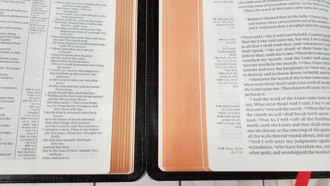
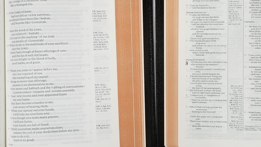
I had to know everything I could about the KJB, especially about the history of English Bible translation and about the making of the KJB and its subsequent history. Building on the work of others, I created a list of the changes in the text between 1611 and the present. To this I added all that could be gleaned from a Bishops’ Bible in the Bodleian Library, Oxford: in this there are manuscript annotations that make up a draft of the KJB Old Testament: after the first edition, this, I discovered, is the closest we can get to the translators’ decisions. No other edition had ever made use of this material. Among its revelations was that ‘shewed’ in ‘therefore have I shewed them by the Prophets’ (Hosea 6:5) was not a printing error for ‘hewed.’ Now, there is a simple case that ‘hewed’ is right: it means much the same as ‘cut down,’ which is the reading in the text they were revising and is also the literal meaning of the Hebrew. However, ‘shewed’ is what a KJB translator wrote and the printer of the first edition faithfully reproduced. Working through such problems required some knowledge of Hebrew, Greek and Latin, and a great deal of help from others. In this case, a friend who had edited Hosea knew that one of the Targums had a reading corresponding to ‘shewed.’ Together with an annotation in the Geneva Bible, this gave a rationale for the translators’ reading. Such considerations went into all decisions about variant readings. They also made for a general case that first edition readings should be retained unless they were clearly printer’s errors.

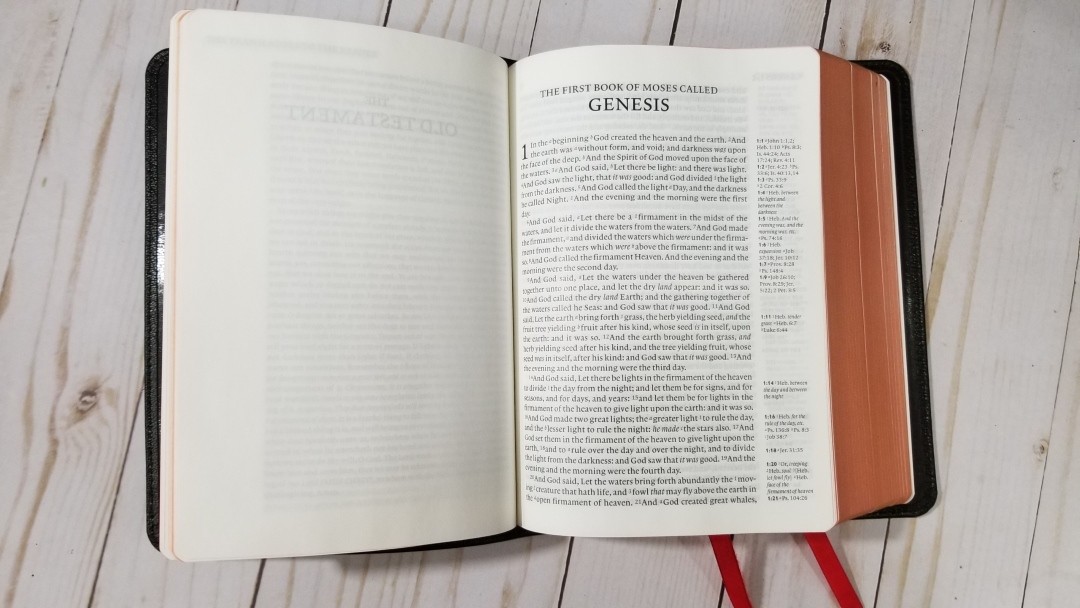
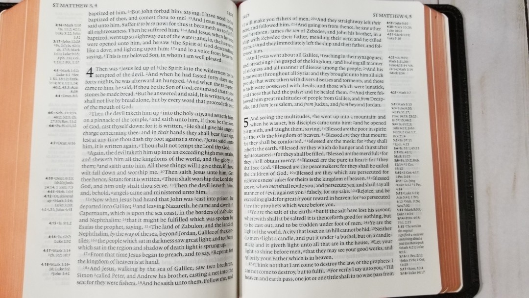
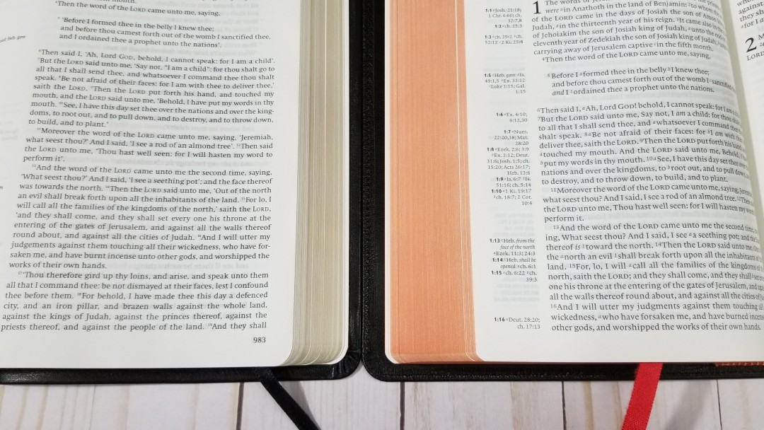
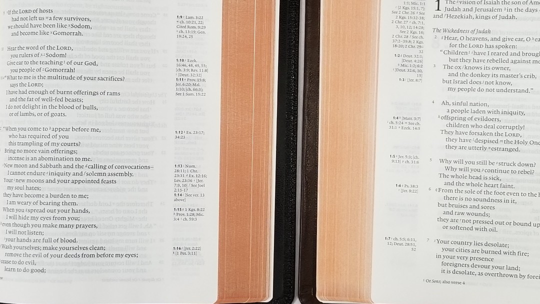
Work on what I have called the incidental details of the text was sometimes almost as tricky. Standard KJBs give a partly-modernised text that makes it more difficult to read than it needs to be, and even sometimes changes or obscures the meaning. I compiled a complete wordlist of the KJB’s English, considered the spellings one by one, in light of modern spelling and historical meaning. The seemingly simple word, ‘instead,’ shows how the meaning can be obscured. The translators always give it as ‘in stead,’ meaning in the place of. ‘Stead,’ place, is a normal part of the KJB’s vocabulary. NCPB’s restoration of ‘in stead’ helps to bring back meaning to ‘the LORD God…tooke one of his ribs, and closed vp the flesh in stead thereof’ (Genesis 2:21). Of course, one wouldn’t want to keep ‘tooke’ and ‘vp.’ Modernising spelling means changing such words to ‘took’ and ‘up,’ but never making a change that misrepresents the meaning.

Punctuation, including paragraphing and speech marks, was another huge challenge. In general, I followed 1611’s punctuation, which is more like modern punctuation than the 18th-century punctuation of most KJBs.

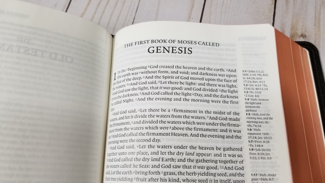
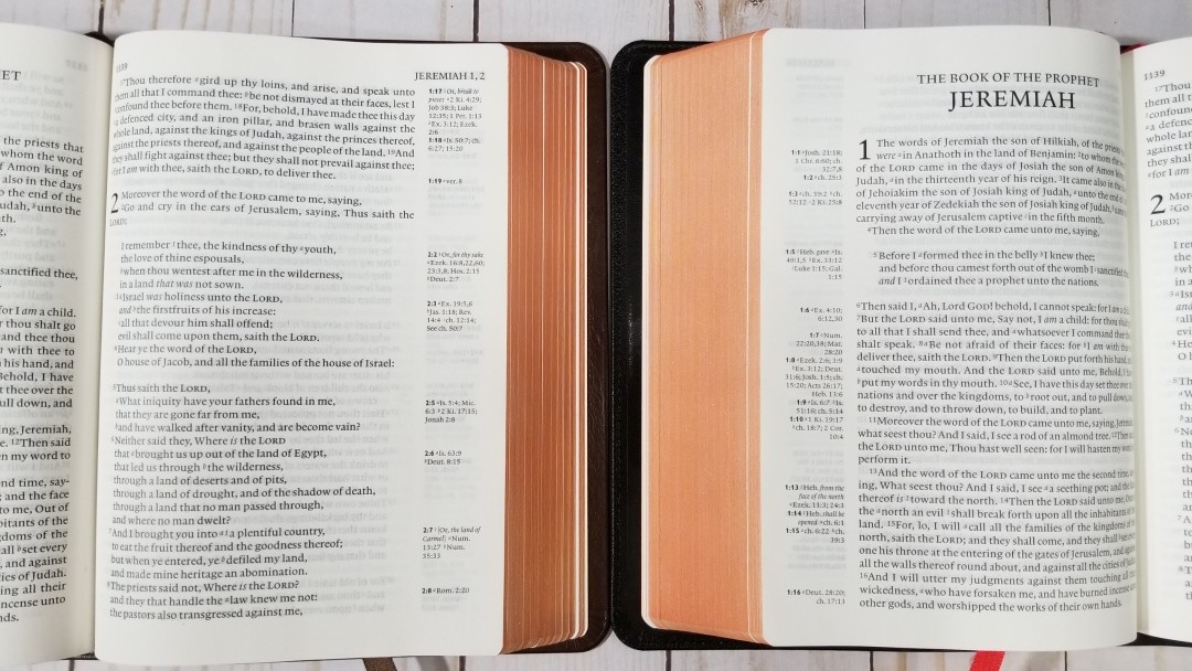
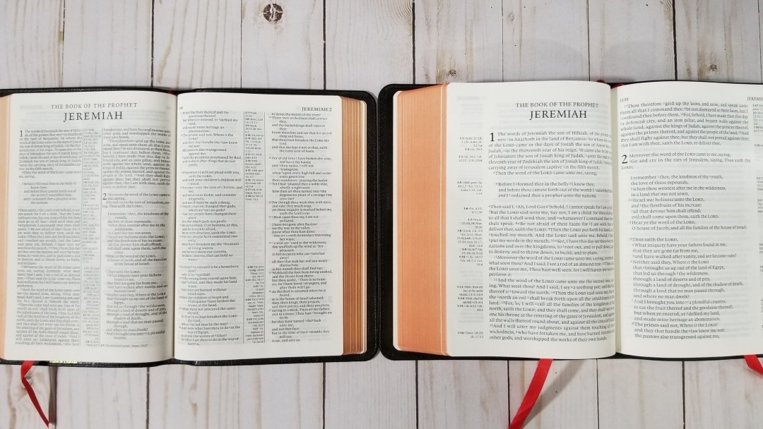
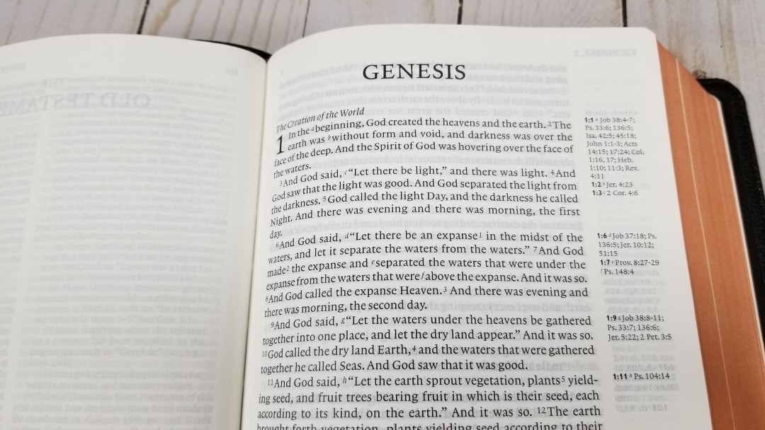
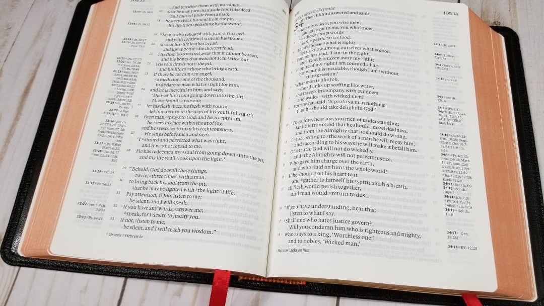
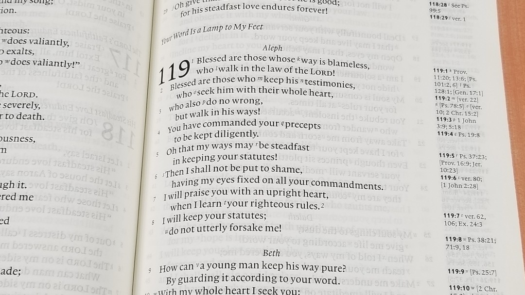
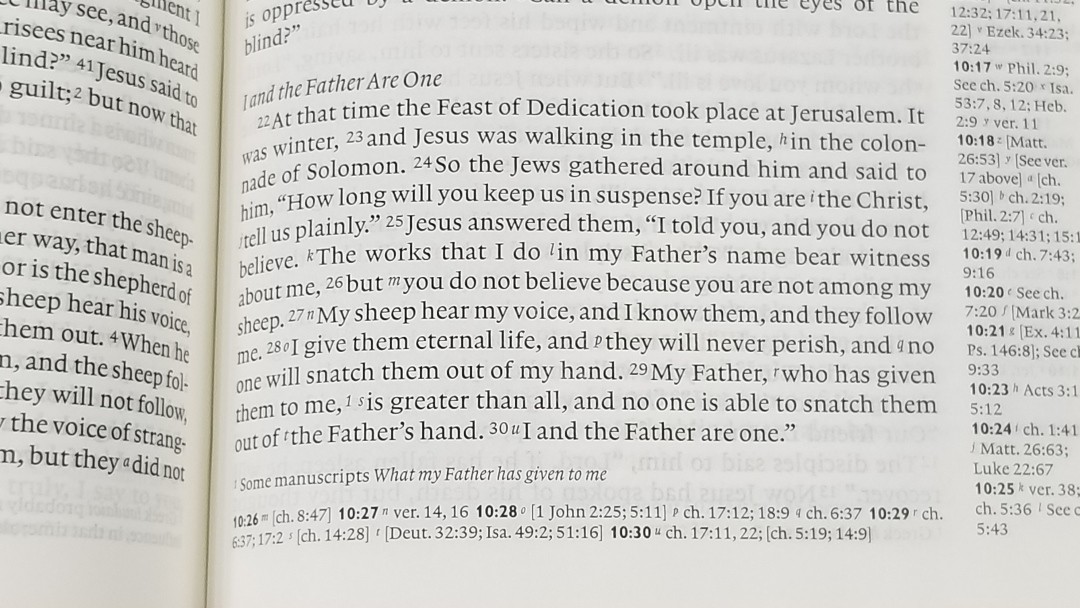
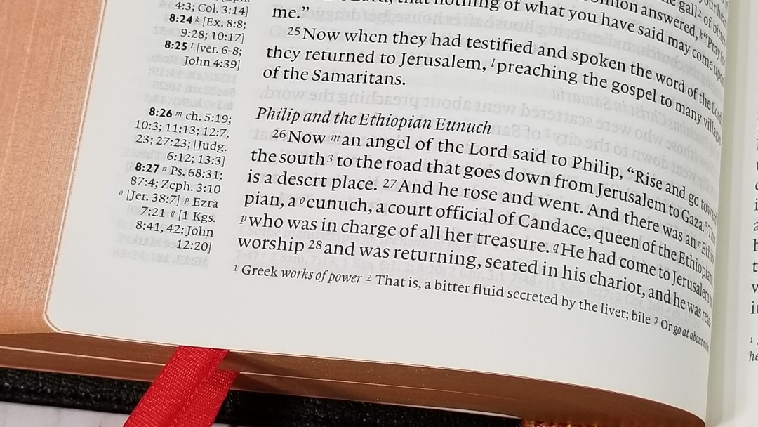
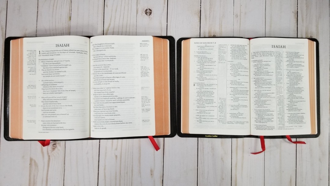
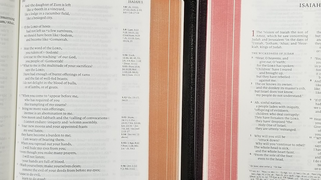
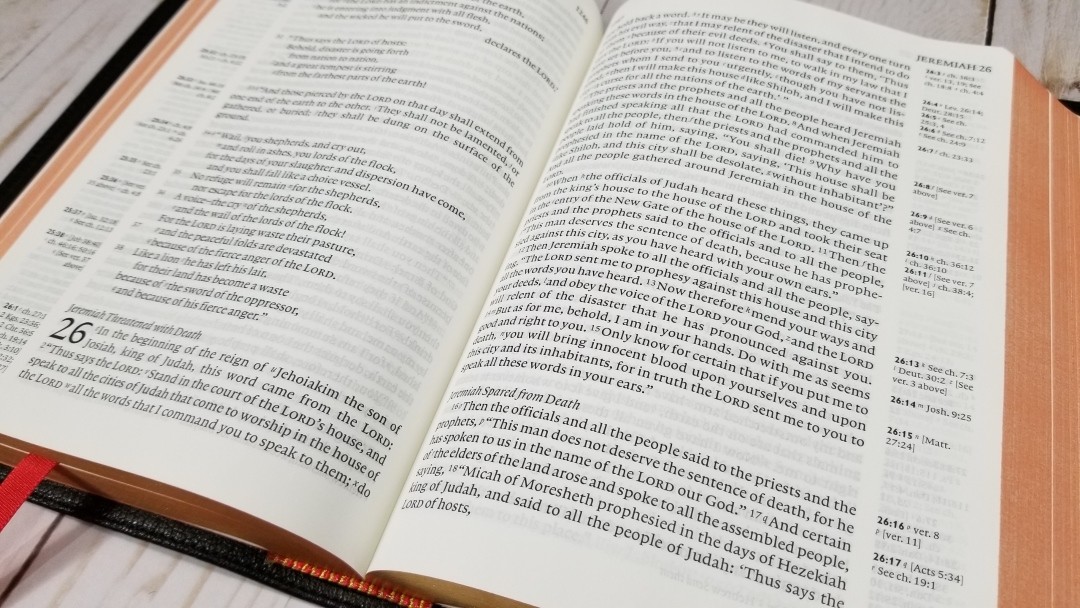
A persistent problem in the KJB (and many other Bibles) is its presentation in verses. Each verse looks like a new paragraph—or sometimes, more justifiably, a poetic line. This damages what Tyndale, the greatest hero of the English Bible, called ‘the process, order and meaning’ of the text. As in some other Bibles, I have tried to minimise this damage by using paragraphs. The verse numbers are there, quietly superscript, for reader to use when needed.

I’m very pleased with the NCPB’s presentation. CUP, true to its fine history as a Bible printer, did a superb job with the printing.


This sounds like a large scholarly project. How long did the project take?

Ten years.


Why was an edit needed?

One could say it wasn’t needed. CUP’s text was an accurate representation of what had become the traditional British text (American texts are slightly different). That traditional text is essentially what Oxford made it in its 1769 edition—a text with 150 years of changes in it, and clothed in 18th-century garments. But when something so good and so important as the KJB is not given as well and as truly as it could be, an edit was needed.


How does it relate to the 1873 edition by Scrivener and what are some of the major differences?

NCPB is a successor to Scrivener’s Cambridge Paragraph Bible, as its title indicates. I greatly respect what he did, but beg to differ in his treatment of the variant readings. He thought an editor should try to perfect the text in light of the originals. This allows for continuous ‘improvement:’ at some point, the text becomes a new version. I have less respect for his treatment of spelling, which is quirky, old-fashioned and inconsistent.


What were some of the difficulties you faced and how did you make the difficult decisions?

I have already described some of these. I thought hard, assembled all the evidence I could get, and constantly asked for advice. After the NCPB came out, correspondents pointed out errors (and made some suggestions). I was sometimes mortified by the errors, and all were corrected, with a list of the corrections posted by CUP. I am very grateful to all the correspondents. The subsequent CUP and Penguin printings have benefitted from their careful reading.


Were the edits received by scholars and the public as you expected?

The reception was very pleasing. I have looked back at some of the reviews, and find things like this: ‘It is hard to overstate Norton’s achievement: it is a work of colossal and magnificent scholarship and devotion to the text of sacred Scripture. Like a conservationist bringing back to life the colours of a faded and damaged painting, Norton has shed new light on an old treasure’ (Baptist Times).

The KJB is a traditional text, and, like the translators themselves, I expected some objection to change. This there was. It’s worth noting that CUP prints both the NCPB and the traditional text.


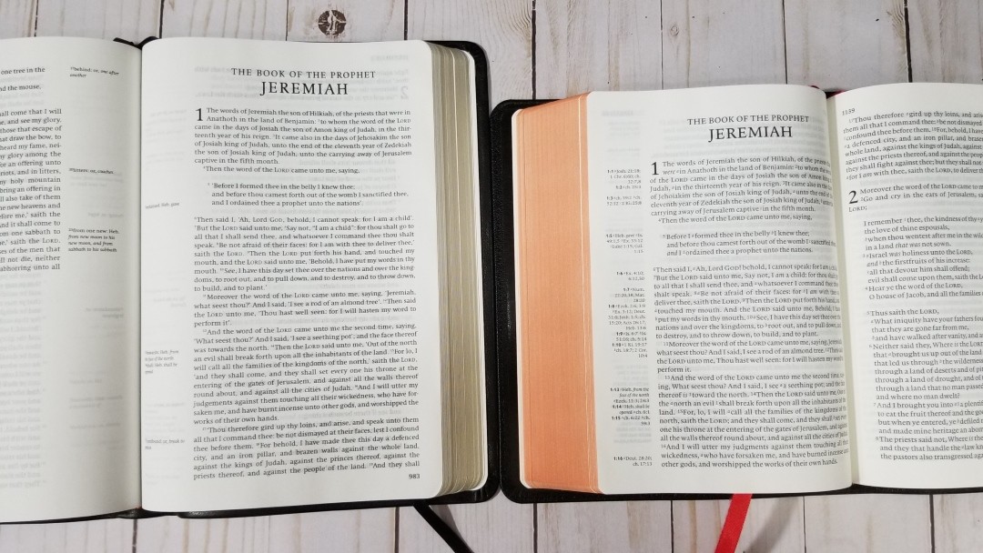
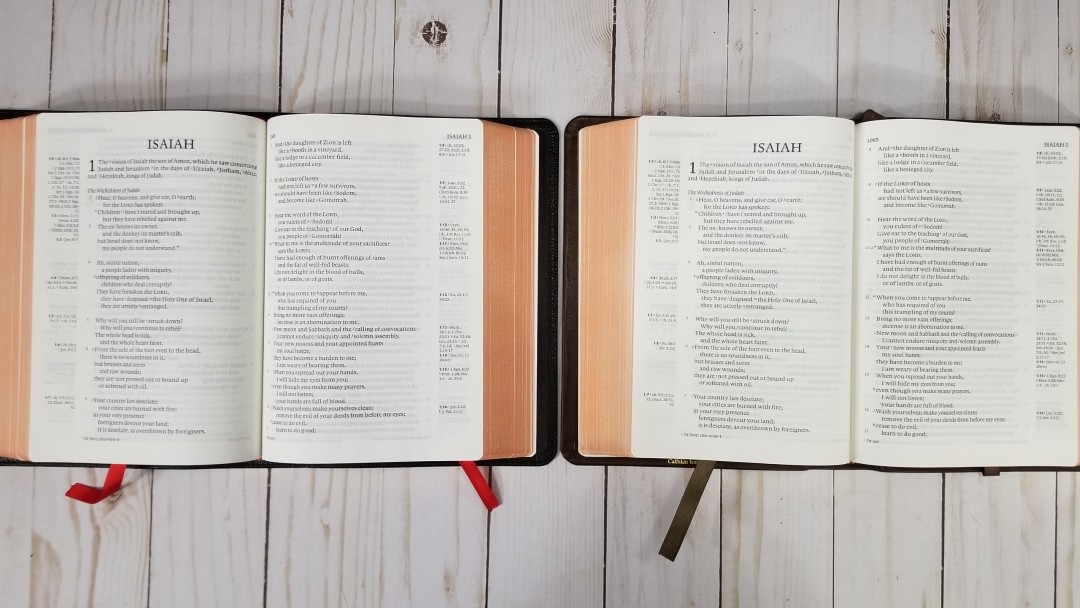
The paragraph format allows you to fix broken sentences. Many paragraph KJV’s have left the first word of a verse as a capitol but you’ve corrected it as if there were no verse divisions. My favorite fix for the layout is Psalm 98:8, 9. What are some of your favorites or some you consider the most important?

Thanks for identifying that piece of layout. Hosea 6:5, discussed above, was probably the most interesting reading because so much was involved in the presence or absence of a single letter: every jot and tittle matters. I wouldn’t single out any individual changes as especially important. Rather, it was the effect of the whole that mattered: a KJB that honours the work of the translators, and speaks their truth to the reader more clearly than ever before.


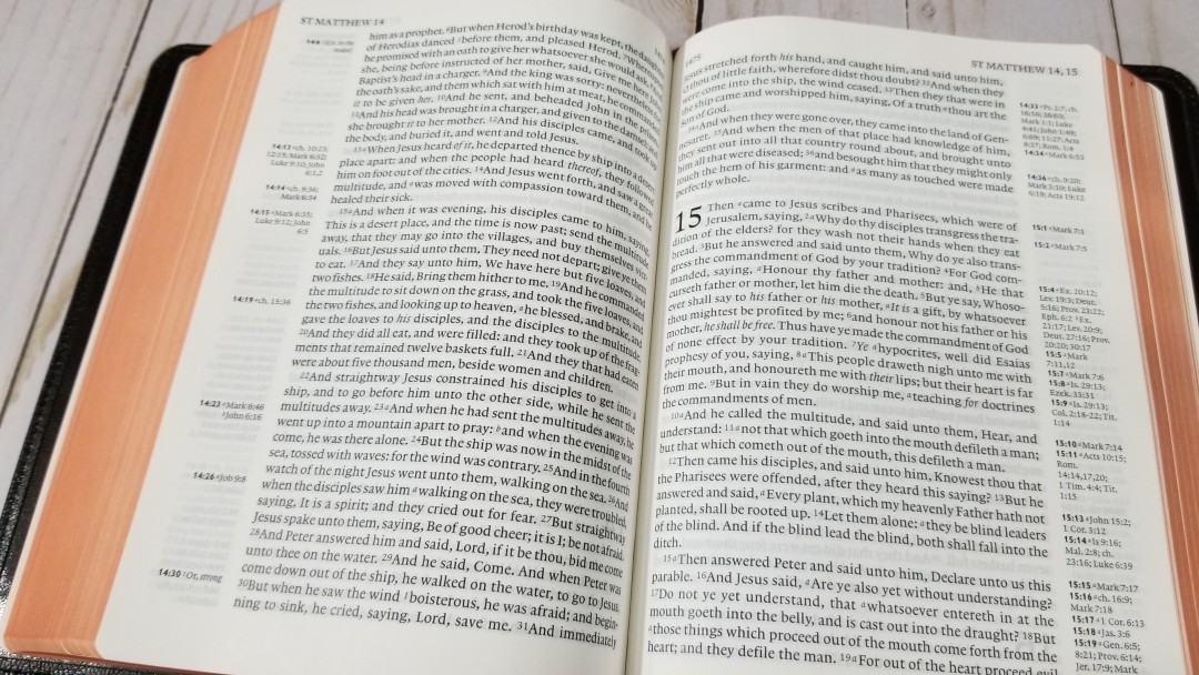
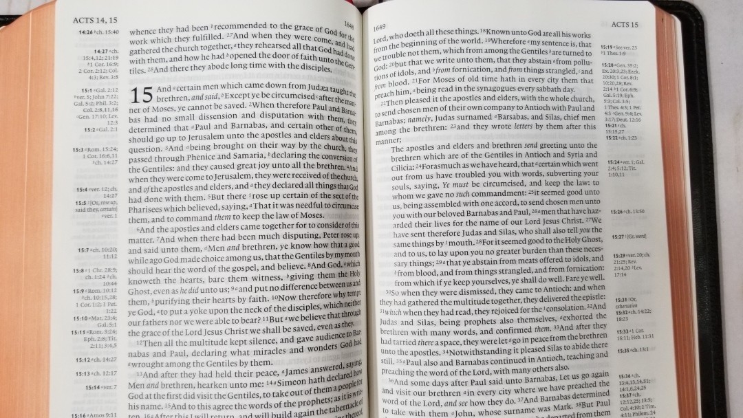
The New Testament includes a lot more paragraphs than is normally seen in a KJV (including those using pilcrows). How did you decide where to break the paragraphs?

The first edition has no paragraph marks after Acts 20, only one in Psalms, and six in the Apocrypha. I suspect that the paragraphing was part of the final work on the text, possibly done as it was being printed. It seems that whoever was doing it did not have time to complete what was a very substantial task (their base text, was unparagraphed). Most editions simply leave things unchanged, which is irresponsible.

I made my decisions using my own judgement. I based this on the flow of the text, the pilcrows or paraphs in the first edition, and decisions made by other editors (Scrivener, Bates, etc.), and other translators.


Other translations have included poetic settings in the New Testament, but the New Cambridge Paragraph Bible doesn’t. What are your thoughts on this?

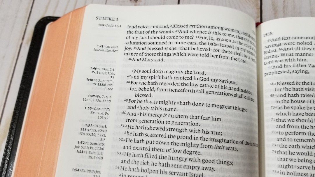
I did use poetic form in Luke 1 and 2 where there are songs. Wouldn’t it have been nice, at Luke 1:66, to have put ‘And Mary said’ in bold type and centered, as the heading to a poem? This is what Tyndale did in 1526.


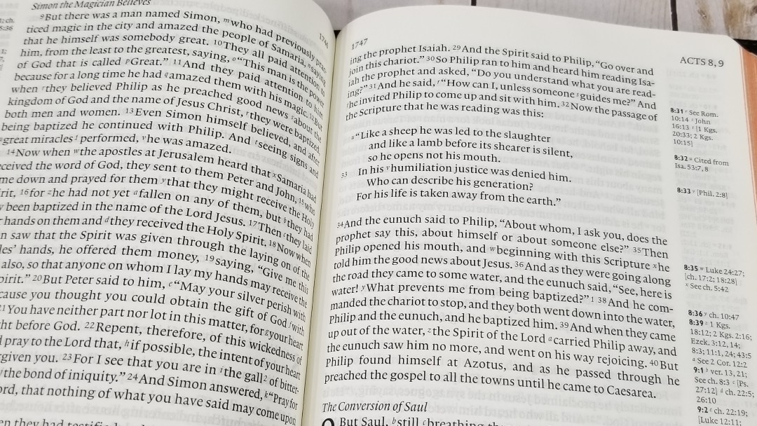
Dialog has been placed in quotations. This is unusual for a KJV. Can you elaborate on this?

Most KJBs, like the first edition, indicate speech only by the use of a capital letter. Nothing shows where a speech finishes. I hope the quotation marks help readers to follow the text.


The verse numbers are small enough to not notice them when reading. Is reading the primary purpose of the New Cambridge Paragraph Bible? Do you also see it as good for preaching, study, etc.?

Yes, yes. Are we not all readers, whether silent or aloud or studying? And study is better when one sees not just a few words, but the words around them.


You’ve included the translator’s footnotes. Can you talk about their importance?

They show something of the translators’ understanding of the text, so I think they are worth having. As in the first edition, I have placed them in the margin. For the same reason, I included the translators’ preface. I think it is an integral part of the first edition, and it says a lot about the translators’ view of their work.


Some complain if the footnotes are included while others complain if they’re not. Do you consider the translator’s footnotes to be part of the translation that the translators intended for publisher to include?

The 8,422 notes are distinctive to the KJB and come from the translators. They give more literal translations and alternative readings, both of which form part of their understanding of the text. They also show that the translators did not consider their text alone—or any translation alone—was the final truth. They are explicit about this in the preface: ‘the very meanest translation of the Bible in English set forth by men of our profession…containeth the word of God, nay, is the word of God.’ They aimed to make ‘one principal good [translation], not justly to be excepted against.’ It was to be the main translation of the Church, made as well as could be.

The notes, which also include miscellaneous information, are, therefore, part of their understanding not just of particular texts but of how one should think of the Bible as a whole. They were a necessary inclusion in the NCPB.

In passing, we shouldn’t think of a publisher. The King’s Printer worked for the translators rather than the other way round. He printed what they gave him, including the notes and the preface. He did add several things that may or may not have had an input from them, the Calendar, the Genealogy and the map.


You’ve removed italics for supplied words. It seems like there were a lot of supplied words that were not in italics to begin with. Can you talk about the advantage of removing them compared to what is lost?

The italics are an editorial marking of the text, designed to show the reader where words not found in the original were added because English demanded them. So, English frequently has to supply the verb ‘to be’ in the Old Testament. The first edition, and many subsequently, used small roman type rather than the surrounding large black letter type for such words, effectively de-emphasising them: ‘and darkness was upon the face of the deep.’ Italics, however, draw attention to these words.

There is a second problem: they are, as you indicate, badly done (Scrivener was much more scathing and made a valiant attempt to reform them).

The reader or student who wants to discover the connections between the English and the original languages now has far better tools than the italics could ever be. There are Strong’s numbers, there are interlinear texts and there are digital texts such as those produced by Logos.


Even though you’ve updated spelling and punctuation, would you say the New Cambridge Paragraph Bible the most accurate KJV available?

Yes, taking ‘accurate’ as meaning, true to the work of the translators.


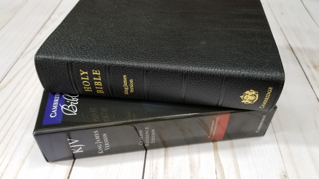
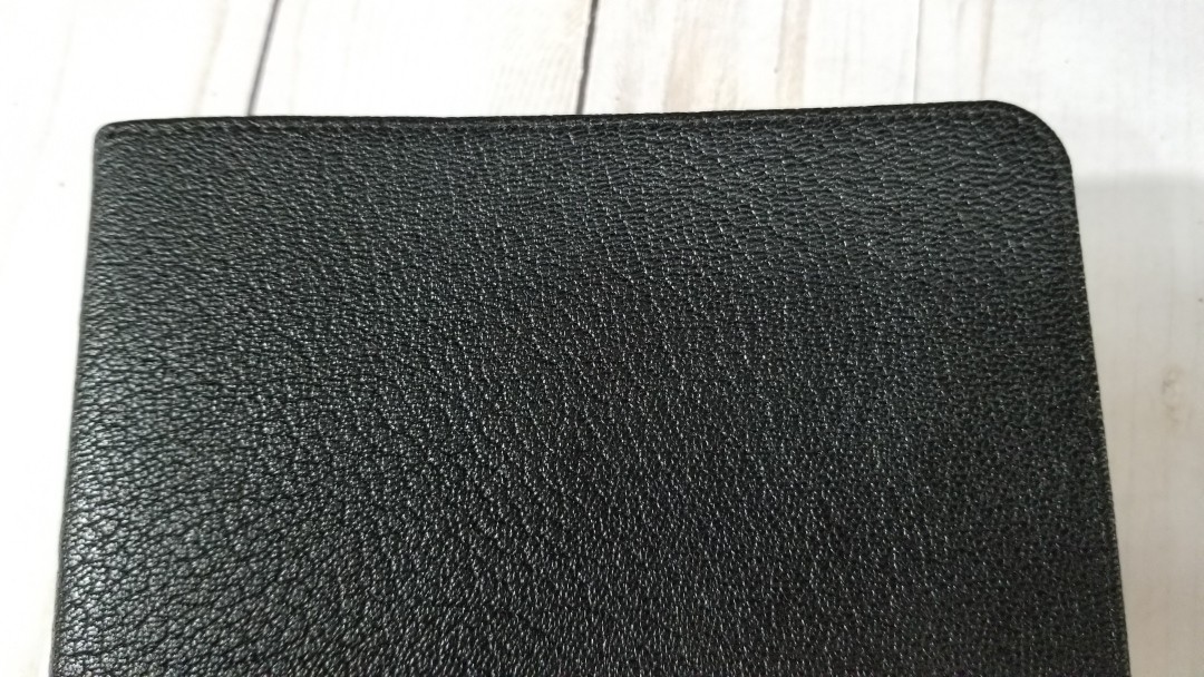
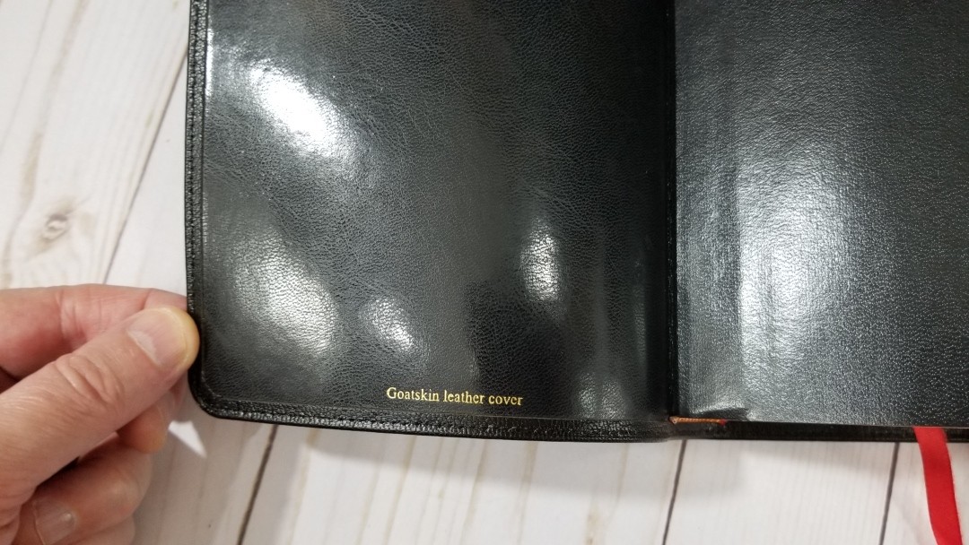
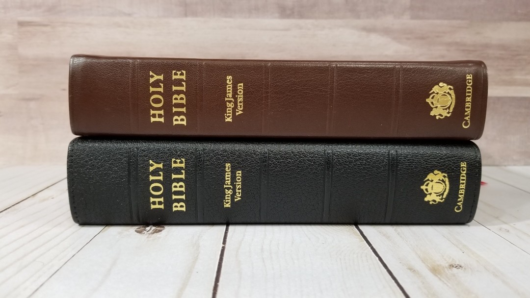
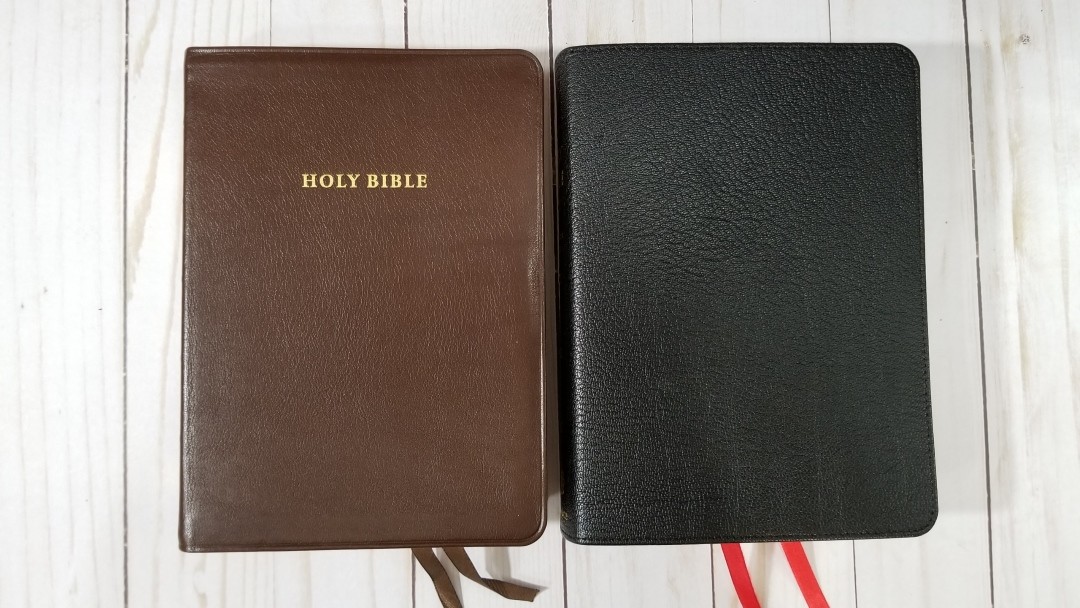
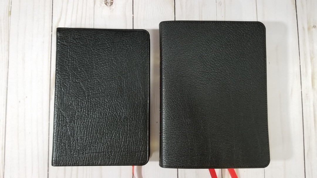
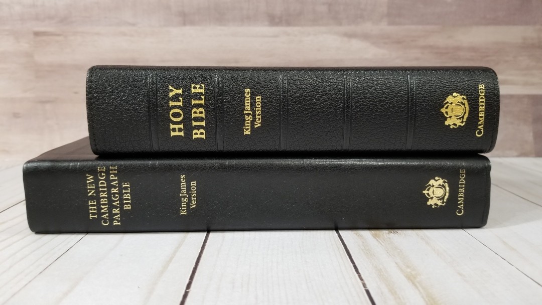
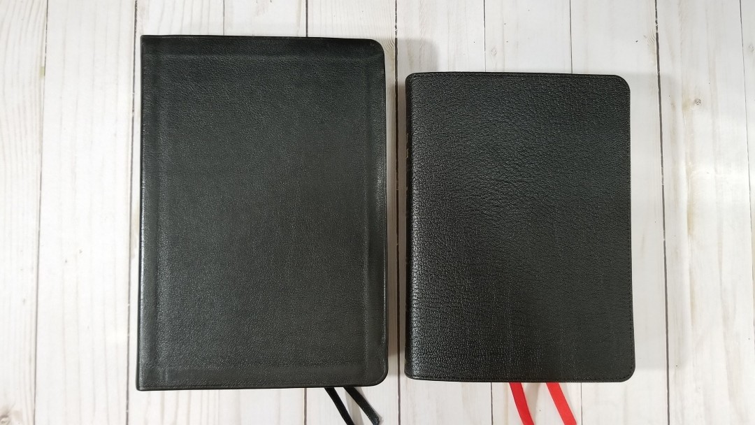
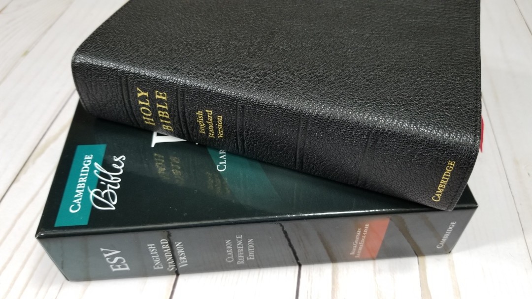
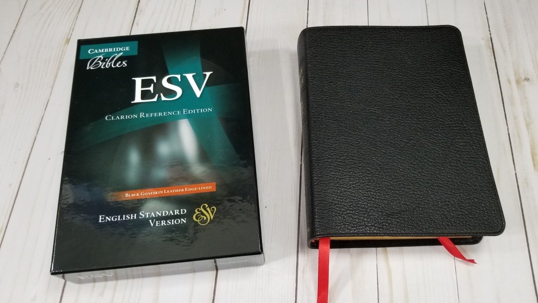
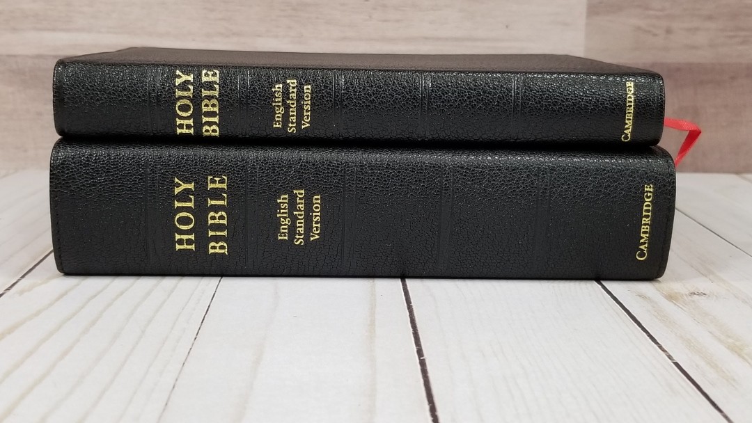
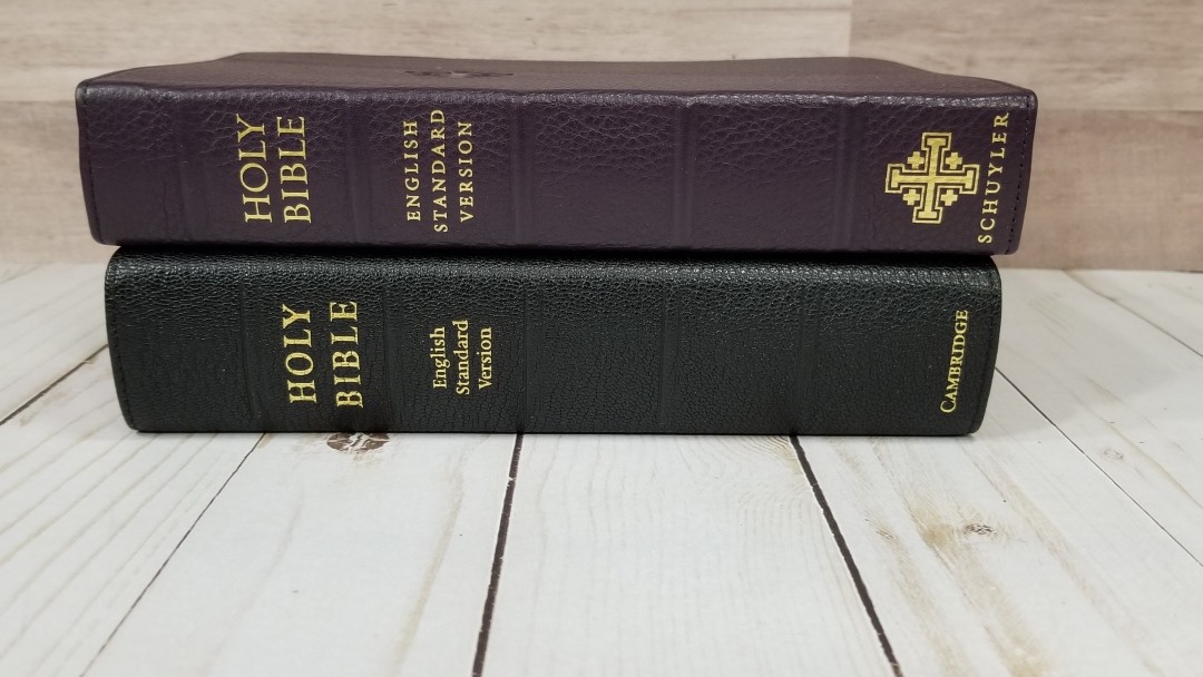
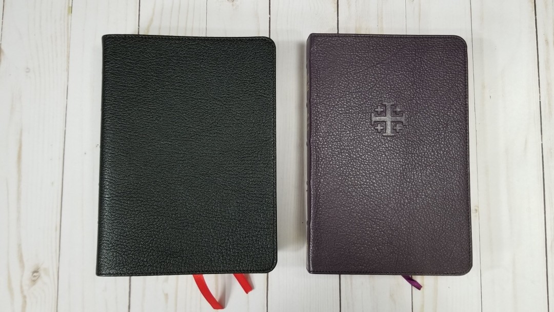
The New Cambridge Paragraph Bible is available in large print (currently out of print), a two-volume folio edition, a Penguin Classics paperback, and a personal size edition in both calfskin and hardcover with and without the Apocrypha. Did I miss any editions? What is your favorite edition of the New Cambridge Paragraph Bible?

For all that it has reminders of my human failures as an editor, the first edition, leather bound, is my favourite: a beautiful, first-born child.

I’m not sure what you mean by ‘a two-volume folio edition’—perhaps the Folio Society Bible (2008), which I have only seen as a single volume. There was also a diamond-encrusted Folio Society printing in 2011, but I have never seen it.


Is there anything else you’d like our readers to know about the New Cambridge Paragraph Bible or any other projects you’ve worked on?

My Textual History gives an account of how the KJB text was created and then changed over time. It shows how the received text of 1769 was created, and how it differs from 1611. It gives a full account of the principles used in making the NCPB, and it gives, with discussion, every variant reading. I hope this is of use to anyone interested in the exact nature of the KJB text.

Special Thank You

I’d like to say a special thank you to Professor Norton for agreeing to this interview. I know how hard it can be to revisit your thought process of a project from a decade ago and he put a lot of time into these answers.

For more books from David Norton, see his Amazon author page.

Here’s my review of the New Cambridge Paragraph Bible. I’m currently working on a new review of this Bible and will post a link here.

Some links are affiliates.

The post David Norton Interview appeared first on Bible Buying Guide.


Coming Soon – Cambridge KJV Turquoise Reference Edition

$
0
0

Cambridge Turquoise – image from Cambridge

A Bible that I’ve been looking forward to from Cambridge is the KJV Turquoise Reference Edition. The Turquoise was originally published in the 1920’s and has been a popular reference edition among those who prefer large print. It’s a verse-by-verse double column setting with center column references. The Turquoise is a great choice for preachers or anyone preferring a large print KJV.

The new edition will have the words of Christ while on earth in red letter. It includes a sewn binding with either goatskin or calf-split leather, India paper (I suspect it will be the same paper as the current Pitt Minion and Clarion line), new concordance, maps, Translator’s to the Reader, 2 ribbons, and more.

Release Date

There’s no official release date yet. The Turquoise is currently in production. They’ve produced the text-blocks and they’re currently at the binding stage. We should expect to see them published within a few months, before the end of 2017.

Specs

  • India paper
  • Presentation page
  • Red-letter text
  • Cross-references
  • Pronunciation marks
  • Translators’ Preface
  • Concordance
  • 15 maps
  • Two ribbon markers
  • Gilt or art-gilt edges
  • Page size: H 9 Actual size 1⁄ 4 W 6 inches § H 234 W 152 mm
  • Page extent: 1680 pp.
  • Spine width: c. 32 mm § 11⁄ 4 inches
  • Typography: 10 | 11 point Antique Old Style No. 3

Covers include:

The Turquoise will be available in goatskin and calf-split.

Goatskin leather
KJ676:XRE Black, Art-gilt edges, Full leather lining
978-1-108-40462-4 c. $220.00

Calf split leather
KJ674:XR Black Gilt edges
978-1-108-40146-3 c. $195.00

The post Coming Soon – Cambridge KJV Turquoise Reference Edition appeared first on Bible Buying Guide.

Cambridge NKJV Pitt Minion Reference Bible – Review

$
0
0

The Cambridge NKJV Pitt Minion Reference Bible is a nice little reference Bible in the popular Pitt Minion setting from Cambridge. It’s easy to see why this setting is so popular: it’s a full reference edition with concordance and maps, all within a thin Smyth sewn book-block that’s easy to carry, and wrapped in a high-quality leather cover. It is available in calf split and goatskin. Both are excellent editions. In this review I’m taking a look at the black calf split leather. 

This Bible was purchased for review. I was not in any way influenced by the publisher to give a positive review. My opinions are my own.

Pros

  • Easy to carry
  • Complete reference edition

Cons

  • Font small for many readers

Features

  • NKJV
  • Calf split leather
  • Sewn
  • 6.75 font
  • Red-letter
  • 2 column
  • Paragraph
  • Center-column references
  • Translation footnotes
  • Concordance
  • Maps with index
  • 1 ribbon
  • Overall size = 7 3/8 x 5 1/8 x 15/16″
  • Textblock size = 6 15/16 x 4 7/8 x 3/4″
  • ISBN: 9781107691223
  • Model NK444:XR
  • MSRP $120
  • Printed and Bound by Royal Jongbloed in the Netherlands.

____________________________

Buy from Amazon

____________________________

Cover

This edition is calf split. It’s not as soft and has a duller finish that the goatskin covers. Like the goatskin editions it has paste-down vinyl liner and is almost as flexible. It has a pebbly grain that looks great. The front of the cover has no writing. The spine has Holy Bible, New King James Version, and Cambridge in gold. It has five tooled ribs.

The text-block is sewn and has no trouble lying flat or open to any page. It has a black ribbon and red and gold head/tail bands.

I love the size of this Bible. It’s easy to carry and hold for long periods of time. It’s great for trips, visitations, etc.

Paper

The paper is India Paper, which makes it around 28gsm. It’s highly opaque for how thin it is. It has a slight cream color and no glare under direct light. The calf-split edition has gold gilt (the goatskin has art-gilt). I had no issues turning pages. It has 1147 pages not counting maps and front materials. Depending on your location you might get some page-curl during certain weather conditions. Here in TN I get page-curl during the winter months (heat rising, air-flow, and all of that).

I’ve heard some complaints about 28gsm paper, but in order to get 1150 pages in 3/4″ you have to use thin paper. In my opinion the size of the Pitt Minion is part of its value. I’ll take the 28gsm paper. The issue isn’t how thin the paper is. It actually goes deeper than that. It includes texture, opacity, color, sheen, how well it takes print, how easy it is to turn, etc. The paper in the NKJV Pitt Minion satisfies on all accounts regardless of how thin it is. The thickness of the Pitt Minion is one of its strengths.

Typography

The text is presented in double-column paragraph with poetry in stanzas (even in the NT), letters are indented, and OT quotes in oblique type. References and footnotes are placed in the center column. The header has the book name and chapter number over the outer margin and the page number over the inner margin.

The font is Lexicon Number 1. from Blue Heron Bookcraft and measures 6.75-point with 7-point leading. The font is sharp and clear and is printed with line-matching to improve readability. It’s semi-bold, which seems to be the perfect boldness for this font. The sharpness of the font helps make up for how small it is. The red letter is about a medium/dark red and is one of my favorite reds for a red-letter edition. Red continues through Revelation. Both the black and red-letter are consistent throughout. The columns have 38 characters across with around 8-10 words per line. The spine is thin enough that the text doesn’t bend into the gutter.

This is a small font and many will have trouble reading it. It isn’t for everyone. Even though the font is small I love reading from it. I wear bifocals and write for a living, so I’m always staring at a screen. I have no issues reading this typeface unless my eyes are tired from writing all day. The lines are close together, so it does take more concentration than normal to focus on the text. Increasing the leading would help readability but that would disrupt the perfect portions of the text-block.

Section headings are in italics. There are lots of them throughout the text. They stand out just enough to not be a distraction and still be useful. Verse numbers are small and can be difficult to find. The footnote and reference keys are also small. This helps me ignore them if I just want to read.

Poetry is a difficult setting to design in double column formats. The poetry in the NKJV Pitt Minion indents the line if it continues from the previous poetic line. The narrow column causes a lot of lines to have a single word. I don’t have any issues reading this to myself but it can be difficult for reading aloud. I think it would look better if the lines were cut where the pacing of the thought breaks (like a song) rather than continuing the line all the way to the end. I only say this because there is enough room on the lines that have a single word to do this. As it is it’s still readable and does the job.

I’d love to see the entire Pitt Minion line available in large print. I think the NKJV would especially benefit from a large print edition as there are only a small handful of quality NKJV’s available. If it’s one or the other though, I’ll take it in KJV as there isn’t a Large print reference KJV in paragraph.

References and Footnotes

These are the standard references and footnotes for the NKJV. They’re placed in the center column, but if there are too many to fit the rest are placed under the last verse on the page. The only problem is this means there are two places to look for them. It’s not that bad though and they are easy enough to find. The references and footnotes for the left column are placed at the top and are left-justified, while those for the right are at the bottom and are right-justified. Verse numbers are in bold to help you find them easier.

Cross references are keyed to the text with letters. Here are some example references to help you compare:

  • Genesis 1:1 – Ps 102:25; Is 40:21; Jn 1:1-3; Heb 1:10; Gen 2:4; Ps 8:3; 89:11; 90:2; Is 44:24; Acts 17:24; Rom 1:20; Heb 1:2; 11:3; Rev 4:11
  • Deuteronomy 6:4 – Deut 4:35; Mark 12:29; John 17:3; 1 Cor 8:4, 6
  • Isaiah 9:6 – Isa 7:14; Luke 2:11; John 1:45; Luke 2:7; John 3:16; 1 John 4:9; Matt 28:18; 1 Cor 15:25; Rev 12:5; Judg 13:18; Titus 2:13; Eph 2:14
  • Matthew 17:20 – Mat 21:21, Mk 11:23, Lk 17:6, 1 Cor 12:9
  • Mark 11:23 – Matt 17:20; 21:21; Luke 17:6
  • Mark 12:29 – Deut 6:4, 5; Is 44:8; 45:22; 46:9; 1 Cor 8:6
  • John 1:1 – Gen 1:1; Col 1:17; 1 John 1:1; John 1:14; Rev 19:13; John 17:5; 1 John 1:2; 5:20
  • John 2:19 – Mat 26:61, 27:40, Mk 14:58, 15:29, Lk 24:46, Acts 6:14, 10:40, 1 Cor 15:4
  • Acts 2:38 – Luke 24:47
  • 1 John 1:1 – John 1:1; 1 John 2:13, 14; Luke 1:2; John 1:14; 2 Pet 1:16; Luke 24:39; John 2:27; John 1:1, 4, 14

Footnotes are keyed to the text with italic numbers. The numbers are small and since they’re in italics I don’t confuse them with verse numbers.

They are the standard NKJV footnotes. They include literal renderings from Hebrew and Greek. I’ve always found the NKJV footnotes to be interesting and helpful for study. One of the strengths of the NKJV is that it includes manuscript variances from the Nestle-Aland / United Bible Societies, Majority Text, Septuagint, Targum, Vulgate, and Syriac. There may be others, but these are the most prominent.

Concordance

The concordance is 82 pages with 3 columns per page. It has a decent amount of entries to help in study. Here are some example entries and the number of references they provide:

  • Christ – 13
  • Christian – 1
  • Christians – 1
  • Christs – 1
  • Faith – 56
  • Faithful – 26
  • Faithfulness – 9
  • Faithless – 2
  • God – 70
  • Goddess – 2
  • Godhead – 2
  • Godliness – 6
  • Godly – 6
  • Gods – 7
  • Praise – 38
  • Praised – 6
  • Praises – 5
  • Praiseworthy – 1
  • Praising – 3
  • Pray – 22
  • Prayed – 3
  • Prayer – 21
  • Prayers – 8

Maps

There are 15 colorful maps printed in thick, non-shiny paper. They include cities, routes, Scripture references, distance, topography, water, heartlands, locations for events, fortresses, mountain peaks, dates, where forces clash, location of sermons, etc.

Maps include:

  1. The Biblical World of the Patriarchs
  2. Palestine: Political Regions
  3. The Route of the Exodus
  4. The Twelve Tribes of Israel
  5. Kingdoms of Saul, David & Solomon
  6. The Divided Kingdom: Israel & Judah
  7. The Assyrian Empire
  8. The Babylonian Empire
  9. The Greek Empire
  10. Old Testament Jerusalem
  11. New Testament Jerusalem
  12. The Ministry of Jesus
  13. The Missionary Journeys of Paul
  14. The Spread of Christianity
  15. Modern Israel

There is an 8 page index to maps to help in your searches. I’m always glad to see the index included.

Using It

You can’t tell from the photos, but I’ve used this Bible quite a lot. Here are some of the ways I’ve put it to use.

Reading

The NKJV Pitt Minion is a joy to read. I like holding it in one hand out in front of me so I don’t have to look down to read. It’s so lightweight that I can hold it for long periods of time with no problems. The font does become more difficult to focus on if my eyes are tired – especially if I’ve stared at a screen all day. Other than that I can read it all day.

Carry

This is a small Bible that’s lightweight, making is great for carry. It fits perfectly inside my suit coat pocket. I’ve used it for hospital visitations, carrying to Churches, funerals, and travel. As long as I don’t feel the need for larger print it’s the Bible I grab.

Study

It’s a complete reference edition with cross references, translation footnotes, a large concordance, and maps with an index, so it does have a good bit of material to help with study.

Preaching

I typically preach from larger fonts, but I’ve preached from it a couple of times with no issues. The verse numbers are hard to find quickly, so for me this is better for carry and reading than preaching. If I needed to preach from it I would without hesitation, but if I had a Bible with a larger font I would probably choose it instead.

The Wide Margin and Pitt Minion Combo

The Cambridge wide margin NKJV uses the exact same layout, which makes a great combo (the NKJV, NASB, and ESV having matching Pitt Minion/wide margin editions, and the Concord wide margin has both the regular and personal size editions.). This means you can use a single layout and pagination and have a wide margin edition to match. For the wide margin review, see the article Cambridge NKJV Wide Margin.

Other Editions

I’ve also reviewed the Pitt Minion in other translations. Here are links to the other Pitt Minion reviews:

Conclusion

I love the size of the Cambridge NKJV Pitt Minion Reference Bible. Even though it’s small, nothing is missing. It has enough tools to make it an excellent Bible for personal study, reading, and carry. It’s great for preaching if you’re used to preaching from smaller fonts. If you’re interested in a small Bible that’s easy to carry, designed well, and made to last without having to sacrifice features, the Cambridge NKJV Pitt Minion is the best choice. You can’t go wrong with either calf-split or goatskin. Both are high quality and should last for many years.

____________________________

Buy from Amazon

____________________________

This Bible was purchased for review. I was not in any way influenced by the publisher to give a positive review. My opinions are my own.

The post Cambridge NKJV Pitt Minion Reference Bible – Review appeared first on Bible Buying Guide.

New Cambridge Paragraph Bible Personal Size Calfskin Review

$
0
0

The New Cambridge Paragraph Bible is a revision of the King James that, instead of revising the later revisions, returns back to the 1611 edition in an effort to produce a text the translators had in mind. Spelling and punctuation is updated to today’s English. The original New Cambridge Paragraph Bible was produced in 2005. The 2011 personal size edition makes several corrections and, as the name suggests, reduces the size to something more manageable for every day use.

The New Cambridge Paragraph Bible is basically a text edition with translator’s footnotes that sets the standard for a modern KJV layout design. It includes David Norton’s preface, the Epistle Dedicatory, and Translator’s to the Reader, but it has no other tools. You won’t find a glossary, concordance, or maps. It’s available in hardcover and calfskin, both with and without the Apocrypha. I’m reviewing the black calfskin edition without Apocrypha, ISBN: 9780521190633, made in Italy by L.E.G.O.

__________________________________

Buy from:

Amazon

Cambridge

Evangelical Bible

__________________________________

Cambridge provided this Bible free for review. I was not required to give a positive review – only an honest review. My opinions are my own.

David Norton’s Revision

The purpose of this revision was to go back to the 1611 printing and produce an edition that was closer to what the KJV translators intended. This means that later revisions are ignored and the original words are restored. The punctuation was restored and updated where needed to modern standards. Spellings were also updated where it doesn’t change the word. Words with -eth endings have not been changed. We’ll look closer at the revisions throughout the review. Professor Norton discusses the revision in my interview with him: David Norton Interview

Cover and Binding

The cover is calfskin with a vinyl paste-down liner. It has a fine natural grain. A line is tooled into the perimeter. The leather is thin enough that you can see the edges folded under. The reason for this is it doesn’t have a card between the outer cover and the liner. This creates squared off ridge that I don’t find appealing, but it also makes the cover soft and highly flexible even with the paste-down liner. At the same time it isn’t so floppy that it’s difficult to manage. It’s easy to hold open in one hand for reading (which is my preferred reading method). I’ll keep that squared ridge in order to have this flexibility.

Nothing is printed on the front. The spine has THE NEW CAMBRIDGE PARAGRAPH BIBLE, King James Version, the official seal, and CAMBRIDGE printed in gold. Five spine ridges are marked into the spine. They’re not raised but they do look good.

Of course it’s Smyth sewn. I thought it was going to take a while to break in but it’s so flexible out of the box that it feels like I’ve used it for several years already. The first few pages do want to close but I can already tell the difference in just a few days. I’m sure it will lay completely open on page one in no time.

The overall size is 8.6 x 6 x 1.3″ and it weighs 1 lb 14 oz. I like the size of this Bible. It doesn’t fell too large to carry and use. It’s about the perfect size for me. It’s around the size of a Concord. I prefer this height to thickness ratio to the Clarion (which can feel a little too chunky for its height).

It has 2 black ribbons and red and yellow head/tail bands. They look great against the black calfskin.

It comes in a slip case that has the box art on the front and back and matches the dust jacket on the hard cover edition. It’s fairly sturdy and is great for standing the Bible upright on a shelf.

I love that it’s available in hard cover. This makes it more affordable to those that can’t purchase a premium edition. It’s also available with and without the Apocrypha.

Paper

Cambridge classifies this paper as “Bible Paper”, and describes this as “over 30-gsm” which means this paper is 31gsm or above. It’s definitely thicker than the 28gsm of the Clarion. It’s white in color. It does have some show-through that’s mostly noticeable in the poetic settings or on the first page of every book. It has 1863 pages of text and 1904 pages all total, including front mater and several blank pages at the end of the Old Testament. I found the pages easy to turn.

The gold gilt isn’t even. It has a smeared pattern that looks like it wasn’t applied evenly or possibly the edges have a variation to the texture that reacts to the gilt differently. The edges were stuck together from the gilting. They were easy to separate. They were mostly stuck in the corners, which are bent as if they were placed within a jig that wasn’t completely flat when they were cut. This creates a bent edge within the corner that can be a little difficult to grab while turning pages. I usually grab the pages just past the corner, so it didn’t cause any issues for me. It isn’t enough to keep me from using it, but I wanted to point it out.

I had no page-curl when using this Bible at times when I did have page-curl with my Clarion. The extra paper thickness helps.

Typography

The text is presented in single-column paragraph format, poetry is set to stanzas, and letters are indented. The header shows the book name and chapter number in the outer margin. The footer shows the page number in the outer margin. Footnotes are placed within the inner margin. Needless to say this isn’t a typical design for a KJV. The layout was designed for optimal readability.

The font is 8.7 Swift with a 10.9 leading. I like the design of the font. It reads a touch smaller than the Clarion, but not by much. It’s sharp and is about medium/dark, and consistent throughout. It has around 68 characters per line with 12-14 words per line and 48 lines per page. The text is clean of distractions and is highly readable.

Most pages are printed with line-matching. There are a few pages here and there without line-matching, but the main pages without it are the first page of each book. Show-through is distracting on those pages. I don’t notice it on other pages except for in the poetic settings, which doesn’t bother me much. I do find the show-through on the first page of each book distracting though. Psalms lines up nicely. Proverbs could be improved.

Verse numbers are tiny. This makes them extremely easy to ignore. It also makes them hard to find. I prefer this for reading but it can be difficult to find verses quickly. Reading is what I do the most, so this works for me.

There are no footnote keys in the text, keeping the text clean of distractions. The footnotes are in the margin next to the verses they correspond to and they include the words that the footnote belongs with, but there’s nothing in the text drawing you to them. I like this because it’s easy enough to keep reading without it feeling like someone is trying to disrupt your reading time – making it better for reading that study. Footnotes are placed in the inner margin, keeping the text on the flat part of the page. I like that they keep the text out of the gutter, but I almost want them in the outer margin so I can use the extra space for notes.

Poetry in the Old Testament and Mary’s song in Luke are set to stanzas. The poetic settings look amazing. Poetry looks better in single column and this is an excellent example. One of the things I like is the next line starts with a small letter. I find it awkward when the next line in poetry is a capital letter when it continues a sentence (like those in the NKJV). Once I read Psalms in this format it’s hard to read it verse-by-verse. There are a few places where the line will continue past the normal width of the column, but not to an extent that it looks awkward. This keeps the line from having a hyphen, being crowded, or having too much space between the words. I like this. There are a few places where this isn’t used even though there’s enough room for it. This could be  an effort to keep consistence line-spacing. That’s just a guess though.

Supplied words are not in italics. The reason for this is italics draws attention and emphasizes the words to modern readers. They aren’t complete anyway (take a look at the Hebrew and Greek and you’ll see how many words are not in italics even though they’re not found in the original languages), plus we have digital tools, Strong’s Concordances, interlinears, and other tools that are far better for study of the underlying texts than the italics can provide. Again, the focus is on readability rather than study.

Dialog is placed within quotation marks. It’s the British style of using a single quote rather than the American style of using double quotes, which is to be expected considering this is a British production. Some don’t like the use of quotation marks because we can’t always know when someone is talking, when their speech ends and the narration begins, etc. However, even the 1769 edition identifies dialog. It uses an older style of identifying dialog by printing the beginning of dialog in a capitol letter. That method of identifying dialog was acceptable several hundred years ago, but this is not how a modern reader understands when the text is identified as dialog. Capital letters in the middle of a sentence confuses the modern reader and hampers readability.

Punctuation follows modern style and is more similar to that of the 1611 than later revisions are. Today’s readers don’t really understand how to interpret the colons and semi-colons that we’ve seen for the past few centuries. Colons within parenthesis look like smileys to today’s reader. I like this update. I appreciate seeing the modern punctuation that I’m used to.

Broken verses have been fixed. This includes the thousands of verses that usually start with capital letters but should be lower case because they continue a sentence, and several places where there’s an unnatural break in the middle of a sentence such as Psalm 98:8-9, Col. 1:21-22, and Acts 21:40-22:1. These are where a sentence continues through verses or chapters. Breaking them up breaks the flow of thought or dialog. I’m pleased to see them fixed as this improves readability. This is why I prefer reading paragraph editions over verse-by-verse.

The purpose of the spelling changes is to create an edition that’s faithful to the 1611 while at the same time easy to read for today’s audience. The spelling updates look and read much better for modern readers. If it doesn’t change the word then I prefer to use today’s spelling. For example, I’m glad we don’t spell son as fon. I prefer ‘show’ to ‘shew’ (such as Ps 19:1). When I see ‘shew’ I pronounce it as ‘show’ anyway, so it looks better to me to have the spelling updated. It’s the same word. ‘Shew’ is how show was spelled in 1611 and there have been a lot of changes in spelling since then, and even since the 1769 edition.

There are a few updates that do feel out of place (not that I would argue with David Norton – I’m just pointing out what I’m used to). For example, thine and mine have been changed to thy and my. I’m so used to reading thine and mine that I read it as the older words instead of the updated words. Thine and mine sound more familiar to me.

The  most controversial spelling change is Hosea 6:5 where Professor Norton used shown (the modern spelling of shewn) rather than hewn. Professor Norton makes the case that the notes from the translators use shewn and it’s the word they wanted.

Books start on a new page (mostly, but there are a few exceptions), which leaves several blank pages on the left side. These can be used for lists, notes, sermon outlines, etc.

Footnotes

The original footnotes from the translators are included as well as footnotes that were added in later editions. They’re placed in the inner margin and include the verse number (which can be used to help you find verses quicker) and the word or phrase within the verse they related to. The original footnotes are printed in regular text and the notes that were added through later editions (such as the 1769 Blayney) are printed in brackets.

None of the footnotes are from David Norton, and none are critical of the text. In other words, David Norton did not add footnotes to the text. They are the footnotes that we’ve seen in respectable KJV’s for years. They’re just identified as to which footnotes are which (something that isn’t usually done in KJV’s). They cover alternate renderings, explanations of the Hebrew and Greek, and literal renderings.

Comparisons

Here’s a look at how the New Cambridge Paragraph Bible compares to the KJV Clarion, ESV Legacy, Thomas Nelson Single Column, and the Cambridge Concord.

Clarion

The Clarion is obviously shorter, but the font size doesn’t suffer for it. I prefer the color of the Clarion’s paper, but the footnote and reference keys within the text make it less readable. It doesn’t include the fix for Acts 21:40-22:1 that the NCPB has, but it does include the fix for Ps 98:8-9 and it has poetry in stanzas, letters indented, and small letters at the beginning of a verse when it continues a sentence.

I prefer the references and footnotes in the outer margin like the Clarion. I use them to help me find the verses faster. If you want a reference edition with concordance/dictionary and maps the Clarion is a great choice.

Legacy

The Legacy from Crossway is very similar to the NCPB. The primary difference in the layout is the location of the margin. In my opinion this layout is easier on the eye and is better for notes. This paper is more opaque, but that also makes this Bible is larger.

Single Column

Thomas Nelson’s Single Column has a similar design to the NCPB. For KJV’s I’d say it’s the closest in size and paper quality. It doesn’t fix broken verses like Ps 98:8-9, but it is a very readable text – especially where the lines match on both sides of the page.

Concord

I included the Concord because they’re almost identical in size. The Concord, like the Clarion, has references, footnotes, etc., and material in the back. I prefer the color and texture of the Concord’s paper (at least the goatskin edition) but I’ve had more page-curl with the Concord than with the NCPB.

Using the New Cambridge Paragraph Bible

Here are a few ways that I used the NCPB and my thoughts for each.

Reading

I love reading from the NCPB. The overall size is excellent for holding and reading. The font doesn’t feel too small to my almost 50 year old eyes (I have to use my bifocals though). The layout is nothing short of beautiful. The verse numbers are so small that they didn’t distract me when reading. It’s almost like a reader’s edition. Reading is what I recommend the NCPB for the most. My only complaint with reading is the show-through. It isn’t bad enough to keep me from reading it, but if I could change one thing I’d make the paper more opaque.

Carry

I carried the NCPB around and it performed as nice as most of the Bibles I use of the go. Its size and shape is about the equivalent of carrying a Concord. Holding it in the car (usually when sitting in a parking lot) was easy to handle even with the floppy cover. It never felt too heavy to hold or carry.

Preaching

I was surprised at how easily I found the verse numbers, but I do have bright lighting above my pulpit so that helps. I usually prefer larger fonts for preaching but I didn’t feel a strong need for a larger font the few times I preached from it.

I don’t think most people would notice the revisions if you taught or preached from it. I already say “show” and update words to make them easier to say. My Church would just assume I’m saying it differently and wouldn’t give it a second thought.

If you wanted everyone in your congregation to use a standard edition then the NCPB wouldn’t be a good choice for you. It’s only available in one font size in three different covers counting the Penguin Classics paperback. It’s only published by one publisher and there aren’t any editions such as a large print, compact, wide margin, thinline, reference, or pew Bibles available. The hard cover isn’t expensive, but it’s probably more than most Churches would spend for a pew Bible. The paperback edition is priced right, but it’s too thick to fit within the Bible-slots of pews and many Churches prefer large print for pew Bibles. For these reasons, I can’t recommend using the NCPB as your Church’s standard edition.

Ending Thoughts on the New Cambridge Paragraph Bible

I’m far more impressed with the personal size New Cambridge Paragraph Bible in calfskin than I expected to be. I’ve read the hardcover edition but the calfskin makes this feel like a completely different Bible. The calfskin is soft and flexible and the overall size is within my range of perfection for my primary Bible. The font is clean and decently dark and I completely love this layout. The NCPB seems like a reader’s edition. I didn’t miss references or a concordance but I wouldn’t mind having a glossary and maps.

To me the revision doesn’t seem overdone. I especially like the updates to spelling and punctuation as they don’t change the meaning of words. Each time the KJV has been revised, spelling and punctuation was updated to current standards of the time. This is what the NCPB does with spelling and punctuation.

Regardless of what we think about the changes in the text, the effectiveness of the layout to readability can’t be overstated. The NCPB sets a standard for the KJV in layout design that’s sadly lacking in modern Bible publishing. While other translations are seeing beautiful layouts that focus on readability, the KJV still gets the standard 400-500 year old verse-by-verse layout that isn’t made for reading.

I’d like to pose a challenge to Bible publishers to rethink KJV Bible design and take a close look at the NCPB’s layout. At best they produce the KJV without interruptions in the text. At worst it retains capital letters for every verse regardless of whether it starts a new sentence, sentences are broken in the middle, chapters are broken in the middle of a sentence, the text is cluttered with numbers, letters, and pronunciation marks, some even add section headings to break up thoughts (sometimes in the middle of a thought), and on and on.

It’s time that KJV’s were made to be read. I want a KJV with a layout that’s readable. It wouldn’t seem as archaic and difficult to read if it was presented in a readable format. The KJV can be a readable translation, but it’s made unreadable by it’s design. The NCPB fixes the design issues, presenting the KJV in a highly readable format. A glossary would help though – especially for words that have changed meaning but we don’t notice because it seems to fit the context.

The New Cambridge Paragraph Bible gets my vote for an affordable multi-volume set and a Jongbloed goatskin edition. I’d love to see this Bible with high-end paper, goatskin cover, elegant ribbons, and a multi-color interior with red Psalm headings (okay, I got carried away, but this is close to my dream Bible). As it is it’s a nice functional Bible that’s made well. I especially like that it’s available in a hard cover edition as well as calfskin, making it available in an affordable edition and a higher quality edition.

I consider the NCPB to be the hidden gem of KJV Bible design and recommend it to every KJV reader. I’d like to see this exact layout available in the 1769 edition (the last official update to the KJV) for those who prefer it to a newer revision. I especially recommend this edition to anyone that’s used to modern layouts but are new to the KJV.

__________________________________

Buy from:

Amazon

Cambridge

Evangelical Bible

__________________________________

Photography by hannah C brown

Cambridge provided this Bible free for review. I was not required to give a positive review – only an honest review. My opinions are my own.

The post New Cambridge Paragraph Bible Personal Size Calfskin Review appeared first on Bible Buying Guide.

Cambridge Heritage Edition Review

$
0
0

The Prayer Book and Bible Heritage Edition is an edition from Cambridge to commemorate the 350th anniversary of the Book of Common Prayer and the 400th anniversary of the King James Version of the Bible. I’m reviewing the black calfskin edition, ISBN: 9781107032699,  It was printed and bound in Italy by LEGO.

This Bible was purchased for review. 

_________________________________________________________

This book is available at (includes some affiliate links)

Amazon

and many local Bible bookstores

_________________________________________________________

COVER AND BINDING

The cover is black calf-split with paste-down liner. Just like all the calf-split editions from Cambridge, the cover feels tough but looks good at the same time. It has a pebbly grain. It has nothing printed on the front. The spine has COMMON PRAYER, HOLY BIBLE, the KJV seal, and CAMBRIDGE printed in gold. The spine includes 5 tooled non-raised ridges. It’s Smyth sewn. It will need to be broken in before it stays open in the front or back.

It has two thin blue ribbons and blue and white head/tail bands. They look great against the black cover. The overall size is 7.5 x 5.25 x 1.75″. It’s the same footprint as the Pitt Minion, but it’s thicker than the Clarion. It comes in a nice slip case so it will stand upright on the shelf easily.

PAPER

The paper is 45gsm Primapage paper made by Papeteries du Lemain (PDL in France). This is much thicker than the standard Cambridge, which ranges from 27-31gsm. The paper has an off-white color and is extra opaque, making the small text far more readable. The pages are easy to turn. I saw no page-curl even when the paper in other Bibles were curling. The pages are a nice shiny gold gilt. I love this paper.

BOOK OF COMMON PRAYER

The first half of the book is the 1662 edition of the Book of Common Prayer. The text is printed in large print using 11.6 Lexicon No. 1 A. It’s dark and looks great on this paper. The text is printed in single column.

The Prayer Book is primarily prayers for liturgy and Catholic services, but it has had an impact on Christianity for hundreds of years. We’ve all heard something from the Book of Common Prayer. The line I’m the most familiar with is “Ashes to ashes, dust to dust…” It includes morning and evening prayers, charts, order of services and prayers for services  such as baptisms, births, ordinations, funerals, etc. It also includes a few amendments: Clergy Measure 1964, Prayer Book Measure 1965, and Prayer Book Measure 1968.

My favorite part of the Prayer Book is the Psalms (as morning and evening prayers) printed in large print. It’s in verse by verse rather than a poetic setting, but it’s still nice to read. The Psalms are a little different from the standard KJV. For example, Ps 119:11 reads “Thy words have I hid within my heart : that I should not sin against thee.”

KJV BIBLE

The second half of the book is the Bible. Specifically, it’s the KJV Pitt Minion, 2nd. edition. Like most Cambridge reference editions, this is the 1769 (Oxford/Blayney) edition of the KJV. It’s presented in double-column paragraph format with poetry in a poetic setting. The font is black letter 6.75 point Lexicon No. 1 A with 7 point leading. I think the print is the same darkness as the regular Pitt Minion, but the thicker paper makes it seem darker and much more readable. The text does include footnote and reference keys. It’s printed with line-matching. It does have some show-through, but it’s mostly noticeable in the poetic settings.

Cambridge gets the KJV paragraph setting right. All verses that continue a sentence start with lower case letters (as they should), and verses such as Ps 98:8-9 are fixed. Acts 21:40-22:1 isn’t fixed, but that’s the only one I could find that wasn’t. There are a lot of verses in the poetic settings that have one word per verse. This edition is thick, so the text does bend into the gutter a little bit.

The Pitt Minion has footnotes and references in the center column. If there are too many to fit, the rest are placed under the last verse on the page. There is nothing else included with the Scripture portion of this book, so you won’t find the Translator’s to the Reader, Epistle Dedicatory, or tools such as the Reader’s Companion or maps.

REFERENCES AND FOOTNOTES

It has 45,000 cross references from Zondervan. They’re placed in the center column with the verses for the left column at the top and the references for the right column at the bottom. They have the chapter and verse number in bold.

Here are some example verses with their references to help you compare:

  • Genesis 1:1 – Jn. 1:1, 2; Heb 1:10; Ps 8:3; Is 44:24; Ac 17:24; Rev 4:11
  • Deuteronomy 6:4 – Jn 17:3; 1 Cor 8:4, 6
  • Isaiah 9:6 – ch 7:14; Lk 2:11; Jn 3:16; Mat 28:18; 1 Cor 15:25; Judg 13:18; Titus 2:13; Eph 2:14
  • Matthew 17:20 – ch 21:21; Mk 11:23; Lk 17:6; 1 Cor 12:9; 13:2
  • Mark 11:23 – Mat 17:20; 21:21; Lk 17:6
  • Mark 12:29 – Dt 6:4; Lk 10:27
  • John 1:1 – Pr 8:22; 1 Jn 1:1; Pr 8:30; ch 17:5; 1 Jn 5:7
  • Acts 2:38 – Lk 24:47; ch 3:19
  • 1 John 1:1 – Jn 1:1; 14; 2 Pet 1:16; Lk 24:39; Jn 20:27

The original translator’s footnotes are mixed within the cross references. They give information about Greek and Hebrew words, alternate renderings, etc. I’m glad they’re included as they are considered part of the translation.

Pitt Minion Comparison

Here’s a look at the Heritage Edition compared with the Pitt Minion.

FINAL THOUGHTS ON THE CAMBRIDGE HERITAGE EDITION

The Cambridge Prayer Book and Bible Heritage Edition is an interesting book. I personally don’t use the prayer book, but this is a good edition of it. The large print is easy to read and the index in the front makes everything easy to find.

The paper makes this the easiest to read Pitt Minion text I’ve seen. I’m tempted to split this as two individual volumes and have them rebound. The Pitt Minion would be thicker than normal and wouldn’t have the tools in the back, but this paper is worth it. It’s so readable that I want to grab it over larger print editions.

If you’re interested in a handy sized edition with the Book of Common Prayer and a paragraph Bible combo, the Prayer Book and Bible Heritage Edition from Cambridge is an excellent choice.

_________________________________________________________

This book is available at (includes some affiliate links)

Amazon

and many local Bible bookstores

_________________________________________________________

Photography by hannah C brown

This Bible was purchased for review. 

The post Cambridge Heritage Edition Review appeared first on Bible Buying Guide.

Return of the Cambridge Turquoise

$
0
0

Photo from Evangelical Bible

The Turquoise is back, and Schuyler Bibles has joined with Cambridge to produce exclusive editions in blue or brown goatskin. It will also be available in black goatskin or calfsplit.

Here’s the list of features from Evangelical Bible:

Features include: (more info. found with each Bible)

Red under gold art gilt (blue under gold for the blue goatskin)
Full leather linings for the black, blue and brown goatskin editions.  Paste off for the calfsplit.
Two ribbons
Red-letter text
28 gsm Indopaque paper
Translator’s Preface
Pronunciation marks
Italics for inserted words
References and concordance
Family record section and presentation page
Map section
Smyth Sewn

Typography: 10/11 point Antique Old Style No. 3

Page size: 9.2′ x 6′ x 1.3′ (234 mm x 152 mm x 32 mm)

The Turquoise is available for pre-order. Visit the pre-order page for more photos. Be sure to watch for our review coming soon.


The post Return of the Cambridge Turquoise appeared first on Bible Buying Guide.

Cambridge Turquoise Review

$
0
0

The Cambridge Turquoise (named for the gem, like many older Cambridge editions) is a large print KJV reference edition from the 1920’s. It’s been one of the standard premium reference Bibles for many generations and is a favorite among preachers because of the large dark typeface. The Turquoise has been out of print for several years and now Cambridge has re-released this traditional vintage design in a premium edition with top of the line materials. It includes the Translators to the Reader, a newly redesigned concordance, and colorful maps.

It’s available in black, brown, or blue goatskin with a calfskin line (the brown and blue editions are evangelicalbible.com exclusives), and black calfsplit with a paste-over (also called paste-off or paste-down). It comes in the standard Cambridge clamshell box. I’m reviewing the blue goatskin, ISBN: 9781108440639, Model KJ676:XRL, made by Royal Jongbloed in the Netherlands.

______________________________________________________________

The Cambridge Turquoise is now available in blue or brown at EvangelicalBible.com

Also available in black goatskin or black calf split at Amazon (affiliate links)

______________________________________________________________

Video Review

Cover and Binding

The cover is navy blue goatskin. The blue (and the brown) were produced in collaboration with Schuyler Bibles and are exclusive to EvangelicalBible.com. It has a deep pebbly natural grain with excellent texture and a shiny finish. It’s flexible enough to roll like a newspaper but not so flexible that you can’t hold in open in one hand (my preferred method because I don’t like holding the paper). It has enough structure to hold its shape but it’s not stiff at all. It has perimeter stitching with blue thread that blends with the cover.

The text on the cover is gold. The front of the cover has HOLY BIBLE while the spine has HOLY BIBLE, KING JAMES VERSION, RED LETTER EDITION, the Cambridge KJV seal, and CAMBRIDGE. It also includes 5 raised spine ribs (which helps protect the text on the spine from scuffs. It smells great.

The text-block is Smyth sewn. The liner is edge-lined calfskin leather with a thick vinyl-coated paper glued to the leather edge-lined tab (hinge). At first, I thought the hinge was a little stiff, but once I turned to Genesis 1 the hinge allowed the pages to lie flat out of the box with no trouble. It didn’t have to break in before I could read or preach from the first page of Genesis 1 (which I did the first time I preached from it).

It includes two 8mm dark blue Berisfords ribbons. It also has silver and blue head/tail bands. The text-block size: 9.2 x 6 x 1.3″. The overall size is 9.8 x 6.37 x 1.37″. It weighs 2lbs, 5.8 oz. Even though this is larger and heavier than most Bibles that I carry, I had no trouble carrying this one and holding it for reading.

Paper

The paper is 28gsm Indopaque from Papeteries du Léman, Thonon-les-Bains, France. It has an ivory color and is extremely opaque – which is especially impressive considering how thin it is. To my fingers though, it feels thicker than the 30+gsm in the Concord. It has no glare or shine under direct light. I love the color of this paper. It’s white without being too bright, and it isn’t so off-white that it looks dirty, gray, or yellow. This is my favorite color for Bible paper. It makes me want to read it.

Even though it’s 28gsm, I had no issues turning pages. The paper is smooth but still has enough texture that I can separate the pages easily with one hand. The page edges are art-gilt with blue under gold. The blue looks great while reading.

Typography

This is a vintage setting with the text presented in the traditional verse-by-verse double column layout with center column references. The header includes the book name and range of chapters on that page in the outer margin and two page-summaries in the inner column (one summary for each column). It only includes the books that start on that page. I think showing the range of books would have been helpful too, but there is limited space so it makes sense why they wouldn’t. The footer has the page number in the center. The page counts start over in the New Testament.

Rather than producing a digital edition, Cambridge has gone back to the old metal-press style. This edition looks to be a scan of a clean edition. I haven’t seen many broken fonts or smears that are typical of metal press printings or typical of scans of later editions. It does have a few (very few) places where ink didn’t cover the font 100% perfectly, but the few I saw are very small and is a reminder that this is a vintage setting- not a digital setting. The scan itself is so clean that it doesn’t look like a scan at all. Nothing from the back side of the page was copied. If they told me they got out their metal plates and printing press I’d almost believe them. Even the tiniest text in the center column is clean and legible.

The typeface is a bold Antique Old Style No. 3 at 10/11 point (10-point for just the font, and 11-point when you include the leading (space between the lines)). This is a heavy font which makes it darker than most fonts. This is the largest print I’ve seen in a premium reference edition. Due to the typeface design, it actually reads more like an 11 point. It has a lot of white space around the text (more than most reference KJV’s), making this text easy to read. In my opinion, this is the easiest text to read of any premium KJV.

This is a red-letter edition. The red is dark and easy to read. There’s no fading with either the red or the black. Being a bold font makes it great for reading in bad lighting. I could almost read this by moonlight. At the same time, it’s not so dark that it hurts my eyes to read for long periods of time. This is the perfect font for my 50-year-old bifocaled eyes.

This is a self-pronouncing text. There’s a guide in the front that shows how to pronounce each of the symbols. I like that it isn’t overdone. It has a few names I don’t need but it doesn’t include common names like Jesus, David, Israel, Judah, and Jerusalem. This is most helpful for public reading. Italics are used for supplied words. Paragraphs, all the way to Acts 20, are marked with pilcrows.

One thing unique about this design is that chapters are numbered. Next to the chapter number is a bracket with a number that shows which chapter this is in the Bible. It’s interesting to know that John chapter 3 is the 1000th chapter in the Bible (at least in the common English book order), but I’m not really sure that I can use this information for anything valuable. I did mention the chapter number when preaching though, just in case. I actually do find it interesting.

Although I don’t think it’s on purpose, the text is mostly line-matched (meaning the lines on both sides of the page line up to each other- which improves readability). This greatly improves readability. Even where they don’t line up, the paper is opaque enough that the show-through of this dark print is minimal.

It has around 32 characters across, making room for around 5-7 words per line. This layout was done by hand, so there are a few places where the words are jammed together a little too close, and there are places where there’s a little extra space between the words. This is noticeable but I never had any issues reading it. Even when preaching from it I haven’t had to think about what the words are.

It does have footnote and reference keys within the text. The keys (numbers for footnotes and letters for references) are large. This makes them easy to see, but it also makes them difficult to ignore. I have to check the footnotes out of curiosity almost every time. That’s not a complaint though.

It has .5″ margins, which helps bring the text out of the gutter and even provides a little space for small notes or symbols. Instead of bending out of view, the text stays almost perfectly flat.

I’ve found the large print to be perfect for preaching. It’s the perfect size for reading too, but the KJV vbv layout doesn’t work as well for reading (look at Ps 98:8-9, Col 1:21-22, the thousands of sentences that start with capital letters even though they continue a sentence, and many others for examples).

References and Footnotes

Cross-references and footnotes are placed next to the verses they correspond to, making them easy to find at a glance. This is my preference. Many verses have a little bit of space in the center column that can be used for small notes. They include the letter or number keys. Unlike the Concord, which places the verse number on the side of the column it matches, there’s no way to tell at a glance which column they go to. This actually keeps the center column a little cleaner when you consider that it includes the keys. They’re labeled within the text from left to right- across both columns. This means you might have a, b, and d in the left column and c and f in the right column.

I’m not sure how many references there are, but it’s probably in the 45k range. It does have enough for some basic study and sermon prep. Here are some example references to help you compare:

  • Genesis 1:1 – Ps 136:5; Jn 1:1-3; Col 1:16,17; He 1:8-10; 11:3; Jer 4:23
  • Deuteronomy 6:4 – Mk 12:29; Isa 42:8; Jn 17:3; 1 Co 8:4,6
  • Isaiah 9:6 – Lk 2:11; Isa 7:14; Mt 28:18; Judg 13:18; Eph 2:14
  • Matthew 17:20 – Mt 21:21; Mk 11:23; Mt 13:31; Mt 17:9
  • Mark 11:23 – N/A
  • Mark 12:29 – Deu 6:4,5
  • John 1:1 – Ge 1:1; Jn 17:5; Col 1:17; 1 Jn 1:1; Jn 1:14; Rev 19:13; 1 Jn 1:2; Phil 2:6
  • John 2:19 – Mt 26:61; 27:40; Mk 14:58; Jn 10:18
  • Acts 2:38 – Lk 24:47; Acts 3:19; 20:21; 8:15,16; 22:16; Mt 26:28; Acts 10:45
  • 1 John 1:1 – Jn 1:1; 1 Jn 2:13,14; Rev 1:2; Jn 1:14; Lk 24:49; Jn 1:4

The footnotes are those from the translators and include alternate renderings and explanations from the original languages. I’m glad to see they’re included. For me that makes this Bible that much more valuable for study.

Family Records

In the front are several thick, non-shiny, pages for family records. It includes a personal page to show who this Bible belongs to, the family record of the father and mother, children, marriages, grandchildren, and deaths. All of the pages have blue highlights, except for the deaths page which has black.

Concordance

The concordance is 112 pages with 3 columns per page. This is a newly typeset version of their older paragraph concordance using a digital font. It retains the paragraph setting but has three columns instead of two and the keywords are not in bold. The entries are still indented to help the keywords stand out.

I find the three columns easier to use than the two-column concordance. Although, I am kind of surprised to see Cambridge go back to the standard concordance. I actually expected to see the Reader’s Companion that’s found in the Clarion and Pitt Minion. It makes sense though, considering that the Turquoise is a vintage edition, for it to include the vintage tools. With this in mind though, I would have liked for them to have included the glossary and possibly the dictionary that many of the vintage editions had.

Words with more than one part of speech are marked with their part of speech and have separate entries for each. For example, praise can be either a noun or a verb. Both are included separately and marked with (n) or (v).

Here are a few examples with their number of entries:

  • Christ – 36
  • Christian – 3
  • Faith – 54
  • Faithful – 27
  • Faithfully – 3
  • Faithfulness – 6
  • Faithless – 4
  • God – 76
  • Goddess – 3
  • Godhead – 3
  • Godliness – 4
  • Godly – 2
  • God-ward – 3
  • Praise (n) – 11
  • Praise (v) – 14
  • Pray – 45
  • Prayer – 22

Maps

It has 15 pages of maps on thick, semi-glossy, paper. The maps are bright and colorful. These are the same maps from my goatskin Concord, but the semi-glossy paper makes the colors much more vibrant. They cover borders, import commodities, dates, routes, passes, settlements, distance, topography, mountains, cities of refuge, cities, tribes, vegetation, kingdoms, battle sites, satrapy, cities walls, city gates, older city walls, seven Churches of Asia, and more.

It doesn’t show any of the possible Exodus routes at all, so there’s Red Sea crossing highlighted. I’d rather see this than for them to show a route without it or a route that took them to the Reed Sea.

It includes an 8-page color-coded index to maps. The colors show settlements, political (nations, provinces, and regions), physical land, physical water, travel, and Jerusalem. I’m glad they included this. I prefer maps to have an index and I find the Cambridge color-coded index to be one of the most useful.

Maps include:

  1. The Ancient Near East in the Late Bronze Age
  2. Regions of Palestine and Surrounding Areas
  3. Sinai and Canaan at the Time of the Exodus
  4. Israel within Canaan
  5. The United Monarchy of David and Solomon
  6. Israel and Judah: The Divided Monarchy
  7. The Assyrian Empire
  8. The Babylonian Empire
  9. The Persian Empire
  10. The Hellenistic World after Alexander
  11. Jerusalem in Old Testament Times
  12. Jerusalem in New Testament Times
  13. Palestine in New Testament Times
  14. The Roman Empire
  15. The Eastern Mediterranean in the First Century AD

Comparisons

Here are a few comparisons with the most prominent premium KJV’s. These are not the best photos (sorry about that). I’m planning a much more extensive comparison article that will give a better view of each Bible and include a few more than I’ve included here.

Longprimer

Canterbury

Schuyler Westminster

Concord

Final Thoughts on the Cambridge Turquoise

I’m glad to see the Turquoise back. I’ve been looking forward to the return of the Turquoise for many years and Cambridge has exceeded my expectations. My main concern was the paper and print quality, and I’m glad to say that both are of the highest quality. Together they make the perfect combination for readability.

Even though it doesn’t have cross-references in the 6-digit range, it is a good reference edition and the concordance helps make up the difference. I like that the references and footnotes are next to the verses they correspond to. This makes them much easier to find at a glance. The maps are well-drawn and it has an extensive index to maps. I would like to have a glossary for words that have changed their meaning or are out of use. The Concord has this and I see it as one of its strengths.

It still looks like an old Bible, and I believe that will appeal to many KJV readers that prefer the traditional verse-by-verse layout. The large, dark typeface combined with the Indopaque paper is perfect for reading in public, making the Turquoise an excellent preacher’s Bible, and is a great choice for anyone interested in a large print reference KJV in red letter with the traditional layout, footnotes, and italics for supplied words. I highly recommend the Cambridge Turquoise.

My personal preference has leaned toward large and dark fonts and the Cambridge Turquoise, and especially this EvangelicalBible.com exclusive blue goatskin, is my favorite choice. I’ll be using this Bible for many years. I’d like to thank Cambridge for making the Turquoise available again and Evangelical Bible for making it available in blue and brown goatskin.

______________________________________________________________

The Cambridge Turquoise is now available in blue or brown at EvangelicalBible.com

Also available in black goatskin or black calf split at Amazon (affiliate links)

______________________________________________________________

Photography by hannah C brown

Evangelical Bible provided this Bible free for review. I was not required to give a positive review, only an honest one. All opinions are my own.

The post Cambridge Turquoise Review appeared first on Bible Buying Guide.

Cambridge NLT Pitt Minion in Blue Calf Split Leather

$
0
0

The blue calf split NLT Pitt Minion has released and I wanted to share some photos and thoughts on this edition. I’ve reviewed the NLT Pitt Minion in goatskin, you can see that review for internal and size details. The copyright for the text is 2007.

The blue on this is bright. It stands out a little bit more than most blue editions that I’ve seen. The calf split has a slightly rougher feel and a more pebbly grain than the goatskin edition. I love the look and feel of this leather. It has the same black paste-down liner, but it’s a little harder to open. Of course it just came out of the box so hopefully it will break in with use.

The text on the spine is printed in gold. It also has gold gilt, one blue ribbon, and blue head/tail bands. The blue calf split Pitt Minion in NLT is an excellent addition to the Pitt Minion line. I hope Cambridge produces other editions in blue. I’d also like to see other colors as well, but this is a great start.

For more information about the NLT Pitt Minion see my review of the goatskin edition here.

You can purchase the NLT Pitt Minion in blue calf split leather at Amazon (contains affiliate link, although I think it’s out of stock at the moment). You can also get it from Evangelical Bible.

Photography by hannah C brown

The post Cambridge NLT Pitt Minion in Blue Calf Split Leather appeared first on Bible Buying Guide.


Cambridge NASB Clarion Bible Review

$
0
0

The Cambridge Clarion has been one of my favorite Bible designs for many years. The size and layout create a reference Bible that’s easy to carry and use for study and reading without sacrificing features or readability. It’s available in several translations. I’m reviewing the NASB Clarion in brown calfskin, model NS485:X, ISBN: 9781107604131, which was printed and bound in the Netherlands by Royal Jongbloed.

_______________________________________________

Buy from (includes affiliate links)

Amazon

Barnes & Noble

Books-A-Million

Evangelical Bible

and a few local Bible bookstores

_______________________________________________

Cambridge University Press provided this Bible free in exchange for an honest review. I was not required to provide a positive review. My opinions are my own. 

VIDEO REVIEW

COVER

The cover is a soft smooth calfskin with a nice grain. It has a paste-down liner that keeps the cover from being floppy. It’s sewn and lies open in Genesis after a little use. It’s easy to hold open in one hand a read for long periods of time. I love the soft feel of the leather.

The spine has Holy Bible, New American Standard, and Cambridge printed in gold. It has Holy Bible printed on the front. It includes 5 tooled spine ribs (not raised). It also has tooling around the perimeter of the cover.

It includes 2 brown ribbons and brown and gold head/tail bands. The overall size is 7.5 x 5.5 x 1.5″. It weighs 1lb, 11oz. The size does feel a little chunky but I like the dimensions when it’s opened. It’s like a wide screen phone or tablet in landscape mode. It’s light enough to carry and hold for long periods of time.

PAPER

The paper is 28gsm. It’s smooth to the touch and ivory or eggshell in color. It’s decently opaque and contrasts the ink beautifully. Show-through is mostly noticeable in the poetic settings. The edges are art-gilt with red under gold. I found the pages easy enough to turn even though the paper is thin. I did see a little page-curl but it was never bad enough to keep me from using it.

TYPOGRAPHY

The text is presented in single-column paragraph format with poetry set to an indented poetic setting and Old Testament quotes in all caps. Letters are indented. It includes section headings. Side-column references and footnotes with some appearing under the last verse on the page. The header shows the book name and chapter numbers in the outer margin and page number in the inner margin.

The font is 8.75 Lexicon No. 1 with a 10.5-point leading. It’s black letter and printed in a medium to dark and is highly consistent throughout. Lexicon No. 1 is a highly readable font that legibility shines in every Clarion I’ve seen. Like all Clarions, it’s printed with line-matching. The lines match up really well.

Each column has around 68 characters across with 12-13 words on average. The words have enough space between them that they don’t run together. It has enough inner margin, and the Bible is thin enough, that the text doesn’t get lost in the bend of the gutter. The text includes footnote and reference keys using the traditional numbers and letters. They’re small enough to ignore easily.

There are a few places first letter of each paragraph is bold. This happens when the paragraph doesn’t start at the beginning of a verse. This is a carry-over from the NASB in verse-by-verse format to indicate paragraphs. It isn’t needed in a paragraph edition but it’s still used. To me it looks out of place. I’d like to see it removed since it’s unnecessary. There aren’t that many of them though.

REFERENCES and FOOTNOTES

It has 96,000 references in the outer margins. There are more of them than the KJV Clarion, so my trick for finding verses fast doesn’t work as well with the NASB because they’re not always near the verses they correspond to. The reference verse numbers are in bold. If there are more references that will fit in the side column they’re placed under the the last verse.

Footnotes appear in the outer margin with the references and include alternate renderings, literal renderings, manuscript variants, explanatory equivalents, explanations of Greek, Hebrew, and Aramaic words, weights, measures, time, etc. They’re helpful for shedding light on the wording in the original languages.

Here are a few examples of references to help you compare:

  • Genesis 1:1 – a Ps 102:25; Isa 40:21; Jn 1:1, 2; Heb 1:10; Ps 89:11; 90:2; Acts 17:24; Rom 1:20; Heb 11:3 c Job 38:4; Is 42:5; 45:18; Rev 4:11
  • Deuteronomy 6:4 – a Matt 22:37; Mk 12:29, 30; Luke 10:27 b Deut 4:35, 39; John 10:30; 1 Cor 8:4; Eph 4:6
  • Isaiah 9:6 – x Lit be a Is 7:14; 11:1, 2; 53:2; Luke 2:11 b  Jn 3:16 c Matt 28:18; 1 Cor 15:25 d Is 22:22; e Is 28:29 f Deut 10:17; Neh 9:32; Is 10:21 g Is 63:16; 64:8 h Is 26:3, 12; 54:10; 66:12
  • Matthew 17:20 – x Lit as a Matt 21:21f; Mk 11:23f; Luke 17:6; b Matt 13:31; Luke17:6; c Matt 17:9; 1 Cor 13:2;  d Mark 9:23; John 11:40
  • Mark 11:23 – Matt 17:20; 1 Cor 13:2
  • Mark 12:29 –  Deut 6:4
  • Acts 2:38 – a Mark 1:15; Luke 24:47; Acts 3:19; 5:31; 20:21; b Mark 16:16; Acts 8:12, 16; 22:16
  • John 1:1 – a Gen 1:1; Col 1:17; 1 John 1:1; b 1 John 1:14; Rev 19:13; c John 17:5; 1 John 1:2; d Phil 2:6
  • 1 John 1:1 – a John 1:1f; I John 2:13, 14 b Acts 4:20; I John 1:3; c John 19:35; 2 Peter 1:16; I John 1:2 d John 1:14; I John 4:14 e Luke 24:39;  John 20:27 f John 1, 4

CONCORDANCE

The concordance is 84 pages in double-column format. It includes related words or synonyms following the keywords. It’s a decent concordance for study and sermon prep. Here are a few example entries with their number of references to help you compare:

  • Christ Messiah – 17
  • Christian follower of Christ– 3
  • Faith believe, trust– 36
  • Faithful loyal, trustworthy – 15
  • Faithfulness loyalty – 7
  • Faithless unbelieving – 4
  • God Deity, Eternal One– 37
  • God false diety, idols – 8
  • Goddess female diety – 3
  • Godless pagan, without God – 5
  • Godliness holiness– 5
  • Godly holy – 6
  • Praise (n) acclamation, honor – 10
  • Praise (v) extol, glorify – 12
  • Pray ask, worship – 19
  • Prayer – 15

MAPS

It has 15 pages of maps on thicker, non-glossy, paper. The maps are colorful and include distance, topography, routers, borders, water, settlements, dates, commodities, natural vegetation regions, battles, kingdoms, etc. The maps are detailed and easy to use.

It also includes an 8-page color-coded index to maps printed on the same thick paper. The color code highlights settlements, political, physical land, travel, and Jerusalem.

Maps include:

  1. The Ancient Near East in the Late Bronze Age
  2. Regions of Palestine and Surrounding Areas
  3. Sinai and Canaan at the Time of the Exodus
  4. Israel with Canaan
  5. The United Monarchy of David and Solomon
  6. Israel and Judah: The Divided Monarchy
  7. The Assyrian Empire
  8. The Babylonian Empire
  9. The Persian Empire
  10. The Hellenistic World after Alexander
  11. Jerusalem in Old Testament Times
  12. Jerusalem in New Testament Times
  13. Palestine in the New Testament
  14. The Roman Empire
  15. The Eastern Mediterranean in the First Century AD

COMPARISONS

Here’s a look at how the NASB Clarion compares with the Pitt Minion and Personal Size Quentel. They’re comparable in paper and print quality.

Pitt Minion

The Pitt Minion is half the thickness and has about the same footprint. The text is presented in double-column paragraph format. All the other tools are the same, except for the placement of the references and footnotes which are in the side column. The PM is easier to carry and hold but it’s also more difficult to read because of the 6.75-point font.

Personal Size Quentel

My PSQ is the ESV edition, but the font size, layout, and overall size is about the same. The PSQ is similar in overall size. It has an 8.5 font and is presented in double column paragraph with references and footnotes in the footer.

FINAL THOUGHTS ON THE NASB CLARION BIBLE

The Cambridge NASB Clarion is a joy to hold, carry, and read from. I had a little more difficulty finding verse numbers than in other editions due to the references not always being close to their verses. I love the size and weight. The text is about a medium in size and looks great in single column. Even the thin paper is highly opaque and a joy to read. The single column paragraph makes it an excellent choice for reading and the references, footnotes, concordance, and maps make it a great choice for study.

Like all of the current Clarion line (see reviews of the KJV, NKJV, ESV, NIV), the NASB is a well-made Bible that’s easy to hold and carry. I highly recommend the NASB Clarion in calfskin for anyone interested in a small high quality NASB.

_______________________________________________

Buy from (includes affiliate links)

Amazon

Barnes & Noble

Books-A-Million

Evangelical Bible

and a few local Bible bookstores

_______________________________________________


Photography by hannah C brown.

Cambridge University Press provided this Bible free in exchange for an honest review. I was not required to provide a positive review. My opinions are my own. 

The post Cambridge NASB Clarion Bible Review appeared first on Bible Buying Guide.

Cambridge Concord Reference Bible KJV Video Review

$
0
0

The Cambridge Concord is one of my all-time favorite Bibles and it’s one of the Bibles I use the most. It’s available in regular size, personal size, and wide margin. The regular size is great for carrying, reading, and preaching. The personal size is ideal for travel. The wide margin is ideal for personal study. In this video review, I compare 6 different editions of the Concord to help you determine if this edition is right for you and which edition would suit your purposes the best.

My personal favorite and the one I use the most is the regular edition. I like both calf split and goatskin. I find the calf split easier to carry around and not worry about wear. I love the overall size. It’s almost like a thinline and the dark font makes it easy to read. It’s a great choice for an all-arounder.

You can purchase the Cambridge Concord at Amazon.

Cambridge Concord Video Review

Features

  • KJV
  • Current editions include calf split leather with paste-down liner or edge-lined goatskin
  • Sewn binding
  • Translators to the Reader
  • Epistle Dedicatory
  • Available in regular size, personal size, and wide margin
  • Black or red letter
  • 6.5 point font (personal size), 9 point (regular edition), 8 point (wide margin)
  • Semi bold
  • 30+gsm paper
  • around 44k center column references and footnotes using the Bold Reference System
  • 7 page glossary
  • 128 page dictionary
  • 137 page concordance
  • 15 Maps with index
  • 1-2 ribbons
  • Red and black head and tail bands
  • Gold or art gilt
  • Printed and bound in the Netherlands by Jongbloed

Cambridge Concord Written Reviews

For reference, here are the Concord reviews in the order they were published including their model numbers to help compare the differences:

You can purchase the Cambridge Concord at Amazon.

Do you use the Cambridge Concord? Let us know how you like it in the comments. 

The post Cambridge Concord Reference Bible KJV Video Review appeared first on Bible Buying Guide.

Cambridge Bibles – 2018 CBA Unite

$
0
0

Cambridge had a small table this time with some of their most recent releases. I was able to grab some swag including a cool pen and a book that opens to reveal sticky notes (Cambridge always brings a few goodies to giveaway. Once it was the best chocolate candy bar I’ve had, and another time it was the Transetto). I was also able to get a catalog which includes several quotes from my reviews (I always appreciate it when publishers use quotes from BBG in their marketing efforts). I also took a closer look at some of their Bibles.

I think these will be handy for notes and to mark where I’m reading or preaching from.

Turquoise in Calf Split Leather

The calf split Turquoise looks as rugged as the Concord. This is an excellent alternative to the goatskin Turquoise if you want to save a little money but still have the 28gsm Indopaque paper that I love. The calf split edition includes a paste-down liner, regular gold gilt edges, and 2 ribbons.

NRSV Reference Edition with Apocrypha

Another Bible was the NRSV Reference Edition with Apocrypha. It includes a French Morocco cover with paste-down liner. The text is in a double-column setting with center-column references. The print reminded me of the Concord. Although I think the paper is thicker and more opaque.

The Greek New Testament

The Greek New Testament is the Cambridge version of the joint project with Crossway (I reviewed the Crossway version). It comes in several covers and is printed on elegant paper.

I wasn’t able to interview Cambridge but I was glad to see these editions. I was especially interested in the Turquoise and NRSV. I’ve used the Turquoise for a while now and I’m still just as excited about it as I was when it first arrived. I’m glad that it’s available in calf split to help make it more affordable. Many will find the calf split easier to use because it’s not as expensive as the goatskin. Now that I’ve used it for 6 months I’m planning a follow-up video review of the Turquoise. Stay tuned to the BBG YouTube channel for that video coming soon.

The post Cambridge Bibles – 2018 CBA Unite appeared first on Bible Buying Guide.

Cambridge KJV-RV Interlinear Bible Review

$
0
0

Cambridge’s KJV-RV Interlinear Bible is a unique design that shows the text of both the King James Version and the Revised Version within the same verse, creating a 2-in-1 wide margin reference Bible. It goes even further with notes in the back from the ASV where it’s different from the RV, providing access to 3 different translations within the same volume. It’s available in black calfskin, ISBN: 9781107630932, made in the Netherlands by Royal Jongbloed.

Cambridge provided this Bible in exchange for an honest review. I was not required to give a positive review, only an honest one. All opinions are my own.

_________________________________________________________

This book is available at (includes some affiliate links)

Amazon

Barnes & Noble

Thrift Books

and many local Bible bookstores

_________________________________________________________

Video Review

Cover and Binding

The leather is black calfskin with a paste-down vinyl liner. The leather is similar to the TBS Westminster but softer with a little more grain. It has a beautiful pebbly grain that you can see and feel. It’s not smooth but it’s also not pronounced like calf-split or goatskin. The front has HOLY BIBLE and the spine has the title, translations, and the Cambridge seal printed in gold. It also has 5 tooled ridges.

It’s Smyth sewn and has no trouble lying open completely flat on page one out of the box. The pages will also lay completely flat. It has two 3/8″ black ribbons, but they’re too short to be that useful.

The overall size is 9.5 x 7.25 x 1.5″ and it weighs 2lbs, 12oz. It’s roughly the size and weight of the Wide Margin Concord.

Paper

Cambridge calls this India Paper, which means it’s less than 30gsm. I’d guess it to be in the 27-28 gsm range. It has a cream color that looks great for reading. It’s smooth to the touch. It does have more show-through than I’d like, and the pages can sometimes be a little difficult to turn. About half the time I had no issues turning pages.

As thin as this paper is, it isn’t my first choice as a wide margin Bible. If wide margins for notes is your goal then I think the Concord wide margin would be a better choice because it has much thicker paper (38gsm). This paper is better for Pigma Microns than pencils or pens that can indent the page.

The page edges are art-gilt, red under gold. It’s even and has a nice shade of red.

Typography

The text is presented in double-column paragraph format with center-column references. The header shows the chapter and verse number of the first verse that appears on the page in the left corner and the chapter and verse number of the last verse on the page in the right corner. The book name is in the center. The footer contains the footnotes and page number. This is a wide margin edition. The margins are 1 1/16″ outer, 7/8 inner, 5/8 upper, and 11/16″ bottom.

Where the two texts agree they’re printed in a 10/11, or 10 point with 11 point leading (meaning the font is 10 point and the size of the font plus the space to the next line is 11 points). Where they are different, the text is printed in two lines in a smaller font, around 5-6 point. The RV is placed on top and the KJV is placed on the bottom. The font is black-letter Millers 2n Small Pica No.4. This style looks like Times New Roman or something similar (which makes sense considering this setting is over 100 years old). It has no self-pronouncing marks in the text. I’m glad it doesn’t include them. That would make the text even more difficult to read.

I love that it’s in paragraph format, but that’s since it does have the two texts, reference keys, footnote keys, and verse numbers that are difficult to find, it’s hard to see the advantage of the paragraphs. The poetic books and a lot of the poetry in the New Testament are set to stanzas. They look nice for a double-column layout. Old Testament prophets are not set in a poetic format like the Clarion or New Cambridge Paragraph Bible. Instead, they are in paragraph format.

It has around 32 characters per line with around 7 words per line. The text looks busy because of the amount of information that it has to show within a verse, but the words aren’t too close to each other on a line. It’s more likely to have extra space than not enough.

This is an excellent design for seeing the textual variants. I like that it shows updated words (up to 1885 at least), updated sentence structure, and updated punctuation.

Cross References

The cross-references are in the center column and are placed near the verses they correspond to. The reference keys go across the page regardless of the columns, so you might have an a in the right column, a b and c in the left column, and then a d in the right column.

References are indented, which helps make them easy to find. It has a lot of cross-references. This is the most I’ve seen in a KJV from Cambridge. They’re actually from the RV.

Here are some example references to help you compare:

  • Genesis 1:1 – Job 38:4-7; Ps 33:6; 136:5; Isai 42:5; 45:18; John 1:1-3; Acts 14:15; 17:24; Col 1:16-17; Heb 1:10; 11:3; Rev 4:11
  • Deuteronomy 6:4 – Mark 12:29; Isai 42:8; Zech 14:9; John 17:3; 1 Cor 8:4,6
  • Isaiah 9:6 – Luke 2:11; John 3:16; Isai 7:14; Matt 28:18; 1 Cor 15:25; Isai 22:22
  • Matthew 17:20 – John 11:40; Matt 6:30; 21:21,22; Mark 11:23; Luke 17:6; Matt 13:31; 5;19,20; 20:9; 1 Cor 13:2; Mark 9:23
  • Mark 11:23 – Matt 17:20; Ps 46:2; 1 Cor 13:2; Rev 8:8; Acts 10:20; Rom 4:20; 14:23; James 1:6; Mark 16:17; John 14:12
  • Mark 12:29 – Luke 10:27; Rom 3:30; 1 Cor 8:4,6; Gal 3:20; Eph 4:6; 1 Tim 1:17; 2:5; James 2:19; 4:12; Jude 1:25; Matt 19:17; 23:9; John 5:44; 17:3
  • John 1:1 – Gen 1:1; Col 1:17; 1 John 1:1; Rev 1:4,8,17; 3:14; 21:6; 22:13; 19:13; Heb 4:12; 1 John 1:1,2; John 17:5; Phil 2:6; John 1:18; Rom 9:5
  • John 2:19 – Matt 26:61; 27:40; Mark 14:58; 15:29; John 10:18
  • Acts 2:38 – Acts 3:19; 20:21; 26:18,20; Luke 24:47; Acts 22:16; 8:12; Mark 16:16; Acts 10:48; 8:16; Mark 1:4; Acts 10:45; 8:15, 20; 11:17; John 7:39
  • 1 John 1:1 – John 1:1; 1 John 2:13,14; Acts 4:20; John 19:35; 1 John 4:14; John 1:14; 2 Peter 1:16; Luke 24;39

Footnotes

Footnotes are placed in a single column in the footer and are keyed to the text with numbers. The RV footnotes appear at the top of the footer and the KJV footnotes are at the bottom. The mostly shed light on the original languages and provide alternate renderings. These are helpful for study.

Prefaces

The preface is from the RV. The KJV prefaces are not included, so you won’t find the Epistle Dedicatory or the Translators to the Reader. They show the unique features of this Bible as well as provide the history of the Revised Version.

ASV Notes

The notes from the American Revision Company appear at the end of the Old and New Testaments. These notes were eventually added to the RV and became the ASV. It includes general notes and notes for specific verses. General notes include information about words and spellings they preferred. Notes for the verses show the book name, chapter number, verse number, and then the note.

Reading Plan

The reading plan, labeled The Bible Companion, takes you through the Bible in one year with three readings per day from the OT, Psalms or Proverbs, and the NT. It’s a table that shows the month, date, book name (only printed for the first reading in that book), and chapters to read for that day. It seems to be a well-balanced reading plan.

Index to Notes

It has a blank page for every letter of the alphabet so you can create your own index to your notes. It has 4 completely blank pages after them. These 30 pages use the same paper as the rest of the Bible. This isn’t my first choice for the paper, but I’d rather have it than not. This would also be a great place to add topical lists, definitions, etc.

Ruled Paper

It has 64 ruled pages for notes. These pages are thicker notebook paper just like the paper in the back of the Wide Margin Concord. They have two columns of ruled lines on each page. They’re great for topical lists, thoughts, prayer lists, sermon outlines, sermon notes, etc.

Maps

It has 15 Cambridge full-color maps printed on thick non-glossy paper. They include cities, routes, Scripture references, distance, mountains, territorial expansions with dates, topography, kingdoms, battle sites, locations of events, addressees of Pauline epistles, etc.

It also has an index, which makes finding locations much easier.

Maps include:

  1. The Biblical World of the Patriarchs
  2. Palestine: Political Regions
  3. The Route of the Exodus
  4. The Twelve Tribes of Israel
  5. Kingdoms of Saul, David & Solomon
  6. The Divided Kingdom: Israel & Judah
  7. The Assyrian Empire
  8. The Babylonian Empire
  9. The Greek Empire
  10. Old Testament Jerusalem
  11. New Testament Jerusalem
  12. The Ministry of Jesus
  13. The Missionary Journeys of Paul
  14. The Spread of Christianity
  15. Modern Israel

Comparing with the Wide Margin Concord

The Cambridge RV-KJV really is in a category of its own, but the Wide Margin Concord does include the wide margins and paper in the back. Here’s how the two compare as a wide margin edition.

The Concord has a smaller font overall, but it’s easier to read. The RV-KJV has two different size fonts and the larger font is really a result of the interlinear fonts. The Concord is much cleaner with no distractions and I prefer its font style. It has much thicker paper that’s far more opaque, so it’s better for writing and for turning pages. It’s verse-by-verse, so you don’t get the advantage of the paragraphs. It has a glossary in the back, so some of the words that are identified by the interlinear are available, although being in the back you’d just have to look at see what’s there since there’s nothing in the text to indicate a definition in the glossary.

If you just want a wide margin KJV, the Concord is the better choice. If you’re interested in studying the differences between the TR and CT, the RV-KJV is a great choice.

Concluding Thought on the Cambridge RV-KJV Interlinear Bible

The KJV-RV Interlinear is an interesting Bible. I do find the interlinear text distracting for general reading, teaching, and preaching. The verse numbers are a little difficult to find quickly and the interlinear portion can be confusing if there’s too much of it in the same place on the page. I would have to pause and think about which line to read next.

This is an excellent edition for study. It’s great for seeing the differences between the two texts and it has some excellent references. Some of the changes don’t really make any difference to comprehending the point. Sometimes it’s a sentence structure difference, other times it’s a new word, while other times it shows that the word or phrase is not in one or the other (usually not in the RV but sometimes not in the KJV).

I think anyone interested in seeing the differences between the KJV and RV would love this edition.

_________________________________________________________

This book is available at (includes some affiliate links)

Amazon

Barnes & Noble

Thrift Books

and many local Bible bookstores

_________________________________________________________

Cambridge provided this Bible in exchange for an honest review. I was not required to give a positive review, only an honest one. All opinions are my own.

The post Cambridge KJV-RV Interlinear Bible Review appeared first on Bible Buying Guide.

NRSV Compact Bible Press Release

$
0
0

Cambridge has announced the upcoming release of an NRSV Compact Bible.

The publishing news we received states:

The NRSV Compact Text Edition is elegantly designed, with small but readable type. The Bibles are a comfortable size to carry and small enough to fit in a pocket or bag.

The attractive imitation leather and white and silver gift editions have decorative foil edges and ribbon markers, and they include presentation pages, making them suitable for marking special occasions such as confirmations and other ceremonies.

The more basic hardbacks offer the readable NRSV at an affordable price for potential classroom or group use.

They use the NRSV Anglicized Edition and have British spelling and punctuation.

The Bibles will feature an 8 point Bibles Sans Font and the pages will measure 145 x 109mm(approx 5 3/4″ x 4 1/4″ for those more used to American Standard).

The NRSV Compact Bible is scheduled to begin shipping October 18th, 2018.

The post NRSV Compact Bible Press Release appeared first on Bible Buying Guide.

Cambridge Wide Margin Bibles Video Review

$
0
0


A look at Cambridge’s line of wide margin Bibles.

Features include:

  • 38gsm writable paper
  • around 8-point font
  • wide margins on all four sides
  • note paper in the back
  • elegant bindings
  • matches regular editions to make a great combo

The KJV is a wide margin version of the popular Concord. It’s black letter and is available in goatskin and calfsplit.

The NKJV, ESV, NIV, and NASB are upscaled versions of the Pitt Minion line. They’re red letter and are available in goatskin, calfsplit, and hardcover editions.

Purchase from Amazon (includes affiliate link)

See the reviews:

The post Cambridge Wide Margin Bibles Video Review appeared first on Bible Buying Guide.

New Cambridge Paragraph Bible Review and Special Offer

$
0
0

Released in 2005, the New Cambridge Paragraph Bible is a revision of the King James by Professor David Norton. It’s currently available in the NCPB Personal Size edition (which I recently reviewed). The original edition is out of print, but Cambridge does still have a few in stock. In this review, I’ll take a look at the original edition and show what’s different from the Personal Size edition. This edition is French Morocco with Apocrypha, ISBN: 978-0521843871, made in the UK.

Special Offer from Cambridge

There are a few copies still available from Cambridge!

They’ll sell them at a special price of $140 (£95) while stocks last.

Orders will be taken manually. To order, contact bibles@cambridge.org. Include the number of copies you want and include a phone number and time when they can call.

They’ll have to manually adjust inventory and handle the sale, so the process will take longer than a normal order. It could take a week to hear from the bookshop once you place the order.

Video Review

Amendments

There were some amendments after this edition was printed. You can see what those changes were in Cambridge’s table of corrections and amendments. Those amendments are reflected in the personal size edition that I reviewed previously. Professor Norton discusses the revision in my interview with him: David Norton Interview.

Cover and Binding

The cover is French Morocco with a paste-down liner. It’s shiny and has a stamped grain. It’s hard to the touch and has a tough look and feel. The liner looks interesting. It looks like leatherette and has a leather grain. The cover stays open with no trouble.

It has nothing printed on the front. The spine has THE NEW CAMBRIDGE PARAGRAPH BIBLE WITH THE APOCRYPHA, King James Version, the official seal, and CAMBRIDGE printed in gold. Five spine ridges are etched into the spine. It’s Smyth sewn and has no problems staying open to any page out of the box. It has 1 black ribbon and red and yellow head/tail bands.

The overall size is 10.5 x 7.37 x 2″ and it weighs 4 lbs. This is a large Bible. It’s the size of a very large study Bible. It isn’t a Bible I would carry (the personal size is perfect for that), but I don’t find it to be too large for reading at a desk or holding it in my lap. It’s also great for preaching.

It comes in a slipcase that has the box art on the front and back. It matches the dust jacket on the hardcover edition. It’s fairly sturdy. It’s meant to allow the Bible to stand upright on a shelf. I kind of think the weight of this text-block would be better to lay it down to prevent the spine from sagging.

Paper

The paper is 40 gsm OP Opaque from Finland. It’s extremely opaque and is ivory in color. It has a dull finish (which I prefer) and no glare under direct light. This paper is easy to grab and turn with one hand. The contrast of the paper with the text is perfect for long periods of reading. This is easily some of the best paper I’ve seen in a Bible. It’s excellent for reading, marking, notes, drawing, etc.

Typography

The text is a larger version of the Personal Size edition. The font is 10-point Swift with a 12.5 point leading. The page is much larger than other single-column editions with the same size typeface. The reason for this is this Bible has a lot more white space between the words and the lines, creating a much cleaner layout. The extra whitespace is more noticeable than the Personal edition. This is one of the cleanest and easiest-reading single column editions I’ve seen.

This edition has a little bit of room for notes. Even though they’re in the inner margin, the space for them is large enough to write your own notes without much trouble. The inner margin is 1.75″ and the outer margin is .6″. Most of the books start on a new page. This leaves several blank pages on the left side that can be used for notes, lists, sermon outlines, prayer requests, etc.

Apocrypha

Unlike the Personal edition, which is available with or without the Apocrypha, this edition was only available with it. The Apocryphal books are added between the testaments and are numbered separately. Of course, this adds to the size. I’d love to see this Bible available without it for those that prefer not to have it.

Comparisons

Here’s a look at how the New Cambridge Paragraph Bible compares to the Personal Size New Cambridge Paragraph Bible and the Clarion.

Personal Size New Cambridge Paragraph Bible

The personal size edition has the updates I mentioned earlier. The features are the same- just smaller. This edition makes a great carry companion to the larger edition, this edition of the personal size doesn’t have the Apocrypha, but it is available with Apocrypha if you prefer.

Clarion

The Clarion is a reference edition, but I wanted to show it for size comparison.

Ending Thoughts on the New Cambridge Paragraph Bible

The New Cambridge Paragraph Bible is a large Bible (it’s just a touch larger than most large study Bibles), but it’s still easy to use at a desk or in the pulpit. I’d LOVE to see this Bible brought back, both with and without the Apocrypha, but with 28gsm paper. It would still have a large footprint, but it would be much lighter and easier to carry. At first, the text seems small for the size of this Bible, but when you see it sitting next to another single column edition, even one with a larger print, it’s evident that the text is actually cleaner and has more white-space.

The paper and print quality are outstanding. The French Morocco cover is a little stiff, but that’s probably a good thing considering this Bible’s size. It opens beautifully. This is an excellent edition for reading. I preached from it several times and it’s great for public reading. There were a couple of times that it took me a few extra seconds to find a verse, but I was able to find them without too much of a pause.

I recommend New Cambridge Paragraph Bible (in either regular size or personal size) to every KJV reader and especially to anyone that’s used to modern layouts but are new to the KJV.

________________________________________

To purchase from Cambridge for $140 (£95), contact bibles@cambridge.org. Include the number of copies you want and include a phone number and time when they can call.

________________________________________

Cambridge provided this Bible in exchange for an honest review. I was not required to give a positive review – only an honest review. My opinions are my own.

Do you own the New Cambridge Paragraph Bible? Let us know what you think about it in the comments.

The post New Cambridge Paragraph Bible Review and Special Offer appeared first on Bible Buying Guide.


Cambridge KJV Clarion in Black Goatskin – Review

$
0
0

The KJV Clarion Reference Edition was Cambridge’s first new KJV design in 50 years when it released in 2011. I reviewed the brown calfskin when it released and it’s been one of my primary Bibles for the past few years. After a lot of use I kind of wanted better paper. Since then Cambridge has upgraded the paper to the Indopaque from France (at least for the goatskin model), so I had to give it a try. In this review, I’ll take a look at the goatskin edition, ISBN: 9780521182928, printed and bound in the Netherlands by Royal Jongbloed.

Cambridge provided this Bible in exchange for an honest review. I was not required to give a positive review, only an honest review. All opinions are my own.

_________________________________________________________

This book is available at (includes some affiliate links)

Amazon

Barnes & Noble

Thrift Books

Cambridge

eBay

and many local Bible bookstores

_________________________________________________________

Video Review

Cover and Binding

The cover is goatskin. It’s edge-lined with a synthetic liner. It has a pebbly natural grain. It has perimeter stitching. The front has no printing. The spine includes HOLY BIBLE, King James Version, the KJV seal, and the Cambridge logo printed in gold. The text-block is Smyth sewn. The edge-line tab will need to break in with some use before it will stay open in Genesis.

The goatskin is floppy, but I didn’t find it to be unwieldy. It is slippery though, so my usual tilting it forward with one hand to read is more difficult. When opened, the spine doesn’t rise as high as the calfskin and calf split editions; however, the difference is small. This makes the page curve a little more into the gutter and makes it easier to lose my place. It’s not that bad, though. I sometimes hold it in a way that keeps the page I’m reading flat while the other page conforms to my hand. It shifts easy and I do this without even thinking about it.

It has red and gold head/tail bands and 2 thin cardinal red ribbons. The ribbons are long enough to pull to the corner to open the page. Their width feels natural for the size of this Bible. The overall size is 5.5 x 7.5 x 1.5″ and it weighs 1lb, 12oz. The footprint and thickness feel a little chunky until you get used to it. I find that this size is great for carry and holding to read.

Paper

The paper in this edition is the 28gsm Indopaque by Papeteries du Leman, Thonon-les-Bains, France. This is the premium paper used in the Turquoise, the newer Pitt Minion editions, Schuyler Personal Size Canterbury/Quentel series, Crossway Heirloom series, and many others.

It has an ivory color and it’s very opaque for how thin it is. It has no glare under direct light. It feels elegant. It can be a touch difficult to grab a single page when it’s new, but it does get easier as you use it and I think it’s worth it to keep the size smaller. The pages are art-gilt with red under gold.

Typography

This is a single-column paragraph layout with poetry in the OT (and two places in Luke) in stanzas and letters indented. Cross-references and footnotes placed in the outer margin next to the verses they correspond to. The header includes the book name and chapter numbers in the outer margin, and the page numbers in the inner margin.

The font is 8.75 Lexicon No. 1. It was typeset by Blue Heron Bookcraft. It has a generous leading of 10.5, making the text comfortable to read. It’s a black-letter text with about a medium darkness. It’s consistent throughout. It has around 12-14 words per line. Poetry especially looks beautiful in this layout. The text also includes cross-reference and footnote keys. It has italics for supplied words, but does not have self-pronouncing marks.

It’s printed with line-matching, so the lines on both sides of the page are printed in the same location. This greatly improves readability, but if the paper has too much show-through then the text can look gray. This edition doesn’t have that problem. The paper is more opaque than my older edition and it a lot more readable. There are a couple of places, such as a few pages in Proverbs, where the line-matching could be improved.

The design utilizes a text-first approach. It fixes broken sentences, regardless of verse breaks, and then adds the verse numbers back in. Verses that don’t start a new sentence begin with a small letter because they continue a sentence. The result is a readable text with beautiful prose and poetic lines for the Old Testament. I’d like to see poetry in the New Testament set in a poetic setting, but this is better than nothing. It also indents letters, so they stand apart. It doesn’t ignore chapter breaks, so it isn’t as readable as the New Cambridge Paragraph Bible, but this is still a great design for reading and referencing.

The verse numbers are light so they don’t stand out. At first, this makes the references difficult to find quickly. Then I realized that the references are printed in the margin in bold. I just look down the outer margin until I find the verse number I’m looking for and then look at the line of text next to the bold reference number. It does take an extra second to find them, but for me, it’s worth it in order to keep the text from being broken up.

References and Footnotes

It has 45,000 references from Zondervan. These are the same references as the Pitt Minion. Cross-references and translator’s footnotes are placed in the outer margin as close as possible to the verses they correspond to. The pilot verse in the margin is bold. I use this bold reference to find verses quickly in the text.

Here are some examples to help you compare:

  • Genesis 1:1 – Jn. 1:1, 2; Heb 1:10; Ps 8:3; Is 44:24; Ac 17:24; Rev 4:11
  • Deuteronomy 6:4 – Jn 17:3; 1 Cor 8:4, 6
  • Isaiah 9:6 – ch 7:14; Lk 2:11; Jn 3:16; Mat 28:18; 1 Cor 15:25; Judg 13:18; Titus 2:13; Eph 2:14
  • Matthew 17:20 – ch 21:21; Mk 11:23; Lk 17:6; 1 Cor 12:9; 13:2
  • Mark 11:23 – Mat 17:20; 21:21; Lk 17:6
  • Mark 12:29 – Dt 6:4; Lk 10:27
  • John 1:1 – Pr 8:22; 1 Jn 1:1; Pr 8:30; ch 17:5; 1 Jn 5:7
  • Acts 2:38 – Lk 24:47; ch 3:19
  • 1 John 1:1 – Jn 1:1; 14; 2 Pet 1:16; Lk 24:39; Jn 20:27

Reader’s Companion

Rather than a concordance and a separate glossary or dictionary (like the Concord, which has all three), the Clarion combines them into one resource called the Reader’s Companion. It provides entries, gives definitions and explanations, and lists references. Unlike a standard concordance, the references do not include a portion of the verse.

It covers significant names, unfamiliar words, words that have changed in meaning, backgrounds of biblical times, concepts, biblical books, history, and keywords. They also include suggestions for similar keywords.

I like most of the content in this resource and I’m glad it’s included. I especially like the updated words. It does have a few entries that are controversial. For example, it mentions that 2nd Peter may have been writing by someone else in the first half of the second century. Even though I personally disagree with this point, I think most of the content is good and worth using. I think it’s like any study Bible where the good parts outweigh the bad. And, just like any study Bible, it’s useful for reference.

Here are a few example entries with the number of references to help you compare:

  • Christ (see also anoint, Jesus Christ) – 15
  • Christian – 3
  • Faith – 26
  • Faithful, Faithfulness – 31
  • God (see also Almighty, Immanuel, Jehovah, Lord) – 37, as creator 2, as father 3, Eternal 1, Glorious 1, Inscrutable 1, Jealous 2, Just 1, Loving 2, Merciful 1, Omnipotent 1, Unique 2, His name 4
  • Goddess (see also Ashteroth) – 3
  • Godly, Godliness – 8
  • Gods (see also Baal, Chemosh, Dagan, devil, idol, Molech, etc.) – 21
  • Praise (see also Aleluia) – 30
  • Pray, Prayer – 51

Maps

In the back are 15 pages of maps on thick, non-glossy, paper. The maps are bright and colorful, but not as colorful as the Turquoise, but they are the same maps. They include borders, import commodities, dates, routes, passes, settlements, distance, topography, mountains, cities of refuge, cities, tribes, vegetation, kingdoms, battle sites, satrapy, cities walls, city gates, older city walls, seven Churches of Asia, etc.

It also has an 8-page color-coded index to maps. The color-code identifies settlements, political (nations, provinces, and regions), physical land, physical water, travel, and Jerusalem. I’m glad it includes the index. I find the Cambridge color-coded index to be one of the best available.

Maps include:

  1. The Ancient Near East in the Late Bronze Age
  2. Regions of Palestine and Surrounding Areas
  3. Sinai and Canaan at the Time of the Exodus
  4. Israel within Canaan
  5. The United Monarchy of David and Solomon
  6. Israel and Judah: The Divided Monarchy
  7. The Assyrian Empire
  8. The Babylonian Empire
  9. The Persian Empire
  10. The Hellenistic World after Alexander
  11. Jerusalem in Old Testament Times
  12. Jerusalem in New Testament Times
  13. Palestine in New Testament Times
  14. The Roman Empire
  15. The Eastern Mediterranean in the First Century AD

Comparisons

Here’s a look at how the Clarion compares with the calfskin Clarion, Pitt Minion, Personal Size New Cambridge Paragraph Bible, and the Personal Size Canterbury. The goatskin Clarion is on the right.

Calfskin Clarion

The paper in the calfskin KJV Clarion isn’t as nice as the goatskin. The cover is easier to hold, but I like the paper enough to make the switch.

Pitt Minion

The KJV Pitt Minion has close to the same footprint, but it’s half the thickness. It has a really nice two-column layout and includes a paragraph setting with poetry and letters identified. It also has the same references, Reader’s Companion, and maps. The font is 6.75 and is red-letter through Revelation. This is an excellent Bible for anyone that can read the smaller print.

Personal Size New Cambridge Paragraph Bible

The Personal Size New Cambridge Paragraph Bible is taller and thinner, but it doesn’t include references, concordance, or maps. The font design reads slightly smaller. The paper is slightly thicker. It does include the translator’s footnotes, which are placed in the inner column. This brings the text to the flat part of the page. Unlike the Clarion, it even fixes paragraphs and sentences through chapter breaks. It’s available with or without the Apocrypha, and in calfskin, hardcover, and paperback.

Personal Size Canterbury

I included the Personal Size Canterbury because they have a similar size and both use digital fonts. The Canterbury is verse-by-verse in double-columns, single-column Psalms, places the footnotes at the bottom, and is thinner than the Clarion. It does have a glossary and maps but not a map index or concordance.

Conclusion

I love the Clarion’s design. It presents the most poetic translation in a poetic setting, while still providing a reference system that’s easy to use in a Bible that’s easy to carry. It does this without making the text tiny. Poetry looks like poetry and letters look like letters. I’d like to see more poetry formatting added to the New Testament. The construction and materials are high-quality. I do prefer holding the calfskin rather than the goatskin, and I like that the calfskin lets the spine rise up in the center when opened allowing the page to lay flatter. Even with this preference, I like the paper enough better in this edition that I’m willing to use the goatskin instead.

The Cambridge KJV Clarion is the best compromise between a reference Bible and a reading Bible in the King James Version that I’ve seen.  The focus is on readability first, and then the verse numbers and references are added rather than the text being secondary to the referencing apparatus. The second best is the Pitt Minion, which uses the same references and Reader’s Companion. Its reference placement doesn’t help in finding the verses and it’s poetic layout breaks the poetic lines where it’s convenient for printing rather than a poetic stanza.

The KJV Clarion Reference Bible is one of my all-time favorite KJVs and I recommend it, especially the goatskin edition with the better paper, to anyone interested in a hand-size KJV in paragraph.

_________________________________________________________

This book is available at (includes some affiliate links)

Amazon

Barnes & Noble

Thrift Books

Cambridge

eBay

and many local Bible bookstores

_________________________________________________________


Cambridge provided this Bible in exchange for an honest review. I was not required to give a positive review, only an honest review. All opinions are my own.

The post Cambridge KJV Clarion in Black Goatskin – Review appeared first on Bible Buying Guide.

Cambridge ESV Clarion in Black Goatskin – Review

$
0
0

The Clarion Reference Edition is Cambridge’s standard edition for a medium size print Bible. I reviewed the brown calfskin when it released and I’ve considered it one of my favorite ESV’s ever since. Cambridge later upgraded the paper to the Indopaque from France (at least for the goatskin model). Paper can make or break a Bible design for me, so I wanted to review the goatskin edition of the ESV Clarion with better paper. I’m reviewing model ES486:XEISBN: 9780521182911, printed and bound in the Netherlands by Royal Jongbloed.

Cambridge provided this Bible in exchange for an honest review. I was not required to give a positive review, only an honest review. All opinions are my own.

_________________________________________________________

This book is available at (includes some affiliate links)

Amazon

000000000000000

and many local Bible bookstores

_________________________________________________________

Table of Contents

  1. Video Review
  2. Cover and Binding
  3. Paper
  4. Typography
  5. References and Footnotes
  6. Concordance
  7. Maps
  8. Comparisons
  9. Conclusion

Video Review

Table of Contents

Cover and Binding

The cover is goatskin. It has a nice pebbly grain and perimeter stitching. The front has no printing, while the spine includes HOLY BIBLE, English Standard Version, and Cambridge printed in gold. The goatskin is flexible, but I didn’t find it too floppy to handle. It is a little slippery though.

The text-block is Smyth sewn. It’s edge-lined with a synthetic liner. The edge-line tab is a little stiff and will need to break in with some use before it will stay open in Genesis, but it does break in well. The spine doesn’t rise as high as the calfskin when opened, so the pages have more of a curve. This allows the text to bend further into the gutter. I was able to shift it around when holding it so the page I was reading stayed flat.

The head/tail bands and red and gold, and it has 2 thin cardinal red ribbons. The ribbons are long enough to pull to the corner to open the page. Their size feels right for this Bible. The overall size is 5.5 x 7.5 x 1.5″ and it weighs 1lb, 12oz. The footprint and thickness feel slightly chunky but I do find this size to be great for handling.

Table of Contents

Paper

The paper is 28gsm Indopaque by Papeteries du Leman, Thonon-les-Bains, France. This is the premium paper used in many of the top premium Bibles including the Turquoise, Pitt Minion, Schuyler Personal Size Canterbury/Quentel series, Longprimer 43, Crossway Heirloom series, and many others.

It’s ivory in color and it’s very opaque for 28gsm. I find it to be a joy to read from. It has no glare under direct light. It can be difficult to grab a single page to turn when it’s new, but it does get easier to handle with use. The pages are art-gilt with red under gold.

Table of Contents

Typography

This is a single-column paragraph layout with poetry in stanzas. Cross-references are placed in the outer margin close to the verses they correspond to, and footnotes are placed under the last verse. The header includes the book name and chapter numbers in the outer margin, and the page numbers in the inner margin.

The font is 8.75 Lexicon No. 1, typeset by Blue Heron Bookcraft. It has a leading of 10.5, which makes the text comfortable to read. It’s black-letter and has about a medium darkness, which is consistent throughout the Bible. It has around 12-14 words per line. I love the poetry in this layout.

The text includes cross-reference and footnote keys. I usually find them easy enough to ignore for reading. They’re light so they don’t stand out. At first, this makes the references difficult to find quickly. If the cross-reference is near the verse then this helps in finding them quickly.

It’s printed with line-matching (meaning that the lines on both sides of the page are printed in the same location). This greatly improves readability. The color and opacity of the paper help with this too because the paper where the lines are printed are still white.

The Clarion is one of my all-around favorite designs and this one doesn’t disappoint me.


Table of Contents

References and Footnotes

It includes the standard ESV reference. It has a lot of them. These are the same references as the ESV Pitt Minion. The pilot verse in the margin is bold. I use this bold reference to find verses quickly in the text. I like that the references and footnotes are separated from each other. This gives more room for references and the footnotes are easier to find.

There are a lot of good quality references that cover both words and themes. Here are a few examples of references to help you compare:

  • Genesis 1:1 – Job 38:4-7; Ps 33:6; 136:5; Isa 42:5; 45:18; Jn 1:1-3; Ac 14:15; 14:24; Col 1:16, 17; Heb 1:10; 11:3; Rev 4:11
  • Deuteronomy 6:4 – Cited Mk 12:29; [Isa 42:8; Zech 14:9; Jn 17:3; 1 Cor 8:4, 6]
  • Isaiah 9:6 – Lk 2:11; [Jn 3:16]; ch 7:14; [Mt 28:18; 1 Cor 15:25]; ch 22:22; [ch 28:29]; ch 10:21; Deut 10:17; Neh 9:32; Jer 32:18; [Ps 72:17]; ch 63:16; [Jn 14:18]; Ps 72:7; [Eph 2:14]; see ch 1:6-9
  • Matthew 17:20 – [Jn 11:40]; see ch 6:3; ch 21:21, 22; Mk 11:23; Lk 17:6; [ch 13:31]; ver 9; [1 Cor 13:2]; Mk 9:23
  • Mark 11:23 – Mt 17:20; [Ps 46:2; 1 Cor 13:2; Rev 8:8]; Rom 4:20; 14:23; Jm 1:6; [ch 16:17; Jn 14:12]
  • Mark 12:29 – Lk 10:27; cited from Dt 6:4, 5; Rom 3:30; 1 Cor 8:4, 6; Gal 3:20; Eph 4:6; 1 Tim 1:17; 2:5; Jm 2:19; 4:12; Jude 25; [Mt 19:17; 23:9]
  • Acts 2:38 – 3:19; 20:21; 26:18, 20; Luke 24:47; ch 22:16; [ch 8:12]; See Mark 1:4; ch 10:45; [ch 8:15, 20; 11:17]; See John 7:39
  • John 1:1 – Gn 1:1; [Col 1:17; 1 Jn 1:1; Rev 1:4, 8, 17; 3:14; 21:6; 22:13]; Rev 19:13; [Heb 4:12; 1 Jn 1:1]; 1 Jn 1:2; [ch 17:5]; Phil 2:6
  • 1 John 1:1 – see Jn 1:1; [ch 2:13, 14]; Ac 4:20; Jn 19:35; ch 4:14; Jn 1:14; 2 Pet 1:1; Lk 24:39; Jn 20:27

The footnotes are placed at the bottom of the page and are keyed to the text with numbers. They include alternate translations, literal translations, Hebrew and Greek terms, special uses of Greek words, the meanings of names, words where meanings are uncertain, clarification of additional meanings, grammatical points, supplied pronouns, English equivalents of weights and measures, and manuscript variations. The footnotes are useful for personal study and for sermon prep.

Table of Contents

Concordance

The concordance is 98 pages with 3 columns per page. It has lots of entries. It contains 3000 word-entries and 140,00 references. There is a lot of good material here that greatly helps in study and sermon prep.

Sample entries include:

  • Christ – 17
  • Christ’s – 3
  • Christian – 2
  • Christs – 1
  • Faith – 36
  • Faithful – 12
  • Faithfully – 3
  • Faithfulness – 7
  • Faithless – 2
  • God – 56
  • Goddess – 2
  • Godliness – 6
  • Godly – 4
  • Gods – 4
  • Praise – 11
  • Praised – 4
  • Praises – 3
  • Praising – 4
  • Pray – 13
  • Prayed – 5
  • Prayer – 11
  • Prayers – 7
  • Praying – 4

Table of Contents

Maps

It has 15 pages of maps on thick, non-glossy, paper. They are bright and colorful, but they’re not overdone. They include borders, import commodities, dates, routes, passes, settlements, distance, topography, mountains, cities of refuge, cities, tribes, vegetation, kingdoms, battle sites, satrapy, cities walls, city gates, older city walls, seven Churches of Asia, etc.

It also has an 8-page color-coded index to maps to identify settlements, political (nations, provinces, and regions), physical land, physical water, travel, and Jerusalem. I’m always glad to see a map index. I find the Cambridge color-coded index to be one of the best indexes.

Maps include:

  1. The Ancient Near East in the Late Bronze Age
  2. Regions of Palestine and Surrounding Areas
  3. Sinai and Canaan at the Time of the Exodus
  4. Israel within Canaan
  5. The United Monarchy of David and Solomon
  6. Israel and Judah: The Divided Monarchy
  7. The Assyrian Empire
  8. The Babylonian Empire
  9. The Persian Empire
  10. The Hellenistic World after Alexander
  11. Jerusalem in Old Testament Times
  12. Jerusalem in New Testament Times
  13. Palestine in New Testament Times
  14. The Roman Empire
  15. The Eastern Mediterranean in the First Century AD


Table of Contents

Comparisons

Here’s a look at how the ESV Clarion compares with the calfskin Clarion, Pitt Minion, and the Personal Size Quentel.

Calfskin Clarion

The paper in my older calfskin ESV Clarion isn’t as nice as the goatskin. I find the calfskin cover easier to hold, but I like the paper in the goatskin edition enough to use it instead.

Pitt Minion

The ESV Pitt Minion has close to the same footprint and half the thickness. It has a two-column layout with the same references, concordance, and maps. The font is 6.75 and is red-letter. This is an amazing Bible for anyone that can read the smaller print.

Personal Size Quentel

The Personal Size Quentell is similar in size. It has a double-column layout with references and footnotes at the bottom. It’s thinner than the Clarion. It does not have a concordance. It does have maps but it doesn’t have a map index. It has several lined pages for notes.

Table of Contents

Conclusion

I love the Clarion’s design. The single column paragraph setting with cross-references in the outer margin create a design that’s readable and usable. The focus is on readability. The text does include reference and footnote keys, but they’re easy enough to ignore for reading. The verse numbers are light, which makes them a little difficult to find at a glance. The bold verse numbers in the margins are great for finding the verses in the text. This works on most pages, but where there are lots of references the verses don’t line up as well.

The construction and materials look and feel high-quality. I find the calfskin easier to hold open in one hand than the goatskin, but the goatskin is easy enough to use. The spine doesn’t rise up in the center as high as the calfskin edition when opened. This would allow the page to lay flatter. I like the paper in the goatskin edition enough that I’d switch to the goatskin.

The ESV Clarion Reference Edition is one of my all-time favorite ESV’s. I recommend the goatskin edition to anyone looking for a high-quality hand-sized ESV reference Bible in single-column.

Table of Contents

_________________________________________________________

This book is available at (includes some affiliate links)

Amazon

Barnes & Noble

Thrift Books

Cambridge

eBay

and many local Bible bookstores

_________________________________________________________


Cambridge provided this Bible in exchange for an honest review. I was not required to give a positive review, only an honest review. All opinions are my own.

The post Cambridge ESV Clarion in Black Goatskin – Review appeared first on Bible Buying Guide.

Coming Soon: Cambridge Topaz

$
0
0

Update August 20 – We just got our first glimpse of the Topaz layout. The references are placed in one margin and the footnotes are placed in the footer. It will be available in edge-lined black goatskin, edge-lined dark blue goatskin, black calfskin, and cherry red calfskin.

Cambridge has announced a new Bible setting coming soon called Topaz. They haven’t provided much information about it yet, but it’s exciting to see Cambridge producing a new design. By using the phrase “Scripture Reset” it’s likely they’re focusing heavily on design. They’re releasing information every Tuesday on their Facebook page.  Follow their page for more and stayed tuned as I’ll provide as much information as possible. Also, I will be reviewing it as soon as it’s available.

Update August 7  – Cambridge has released more information about the Topaz. It’s a two-color reference Bible with a new design. It will be larger than the Pitt Minion and work for both private and public reading. It will be available in multiple translations and it will be a high-quality edition.

Update August 13 –  It will be printed on India-style paper with traditional binding techniques. It will be  sewn to lay flat. It’s a verse-by-verse layout with chapter and verse numbers printed in red. The typeface will be 10 point. It will have an extensive concordance, two ribbon markers, maps, family records, presentation page, and red letter for the words of Christ. The first translation will be the ESV.  It will be around the size of the Turquoise.

The post Coming Soon: Cambridge Topaz appeared first on Bible Buying Guide.

Cambridge Topaz sneak peek at CPE

$
0
0

I got to interview Amanda and Abigail of Cambridge Bibles about the upcoming Cambridge Topaz. We discussed the design, materials, production schedule, why they started with the ESV, and other translations we can expect to see in the Topaz design. The layout is done by 2K/Denmark and it’s manufactured by Royal Jongbloed.

Size and Shape

This looks to be the modern equivalent of the Turquoise. The size and shape are almost exactly the same. The dark blue goatskin looks like the Turquoise. The cherry-red Mariva calfskin looks amazing. Both will be easy winners for the Topaz. Of course, the black calfskin looks great too.

Materials

The Indopaque paper is the same elegant paper used in the Turquoise, goatskin Clarions, the thinner editions of the Quentel, Heirloom ESVs from Crossway, and many other premium editions. It’s highly opaque, even with the dark print. The paper in the sample had the ‘new dollar bill’ feel worn off because it had been touched a lot during the show. It was exceptionally easy to turn.

Design


The side-column references are placed at the top of the column with a small space between the references for the right and left columns. The typeface is large and dark. The two-color design includes a dark red for the words of Christ, verse numbers, sections headings, and chapter divisions in the references. They decided on a verse-by-verse setting because it’s something that the audience has asked for and it’s lacking among modern translations. This is also one of the reasons they didn’t start with KJV.

Production Schedule

The Topaz has been in development for several years and it’s being bound at this very moment. It will be available for pre-sale in October and it will start shipping in November.

My Thoughts on the Topaz

The Topaz looks to be a winner for Cambridge. They’ve gone with a large enough print to make it great for preaching and the layout makes the verse easy to find quickly. The Topaz will fill the void of modern translations in a v-b-v setting that I’ve seen a lot of people ask for. Everything about this Bible is elegant.

The post Cambridge Topaz sneak peek at CPE appeared first on Bible Buying Guide.

CPE Showfloor – Cambridge Bibles

$
0
0

There were lots of Bibles at the Christian Product Expo. It got a close look at several on the show floor I hadn’t seen in person before. Here’s a look at a few from the Cambridge booth. They include the Cambridge NRSV Reference Bible with Apocrypha in burgundy goatskin, KJV Lecturn Bible in burgundy goatskin over board, and the KJV Apocrypha in hardcover.

Cambridge NRSV

This one had some seriously soft goatskin. It was thick and flexible. The paper and print were amazing.

Cambridge KJV Lecturn

The KJV Lecturn Bible is a mamoth, but it has the thickest and most impressive paper I’ve seen in a Bible. This Bible was made specifically for public reading and it excels.

Cambridge KJV Apocrypha Text Edition

The KJV Apocrypha Text Edition is a popular book for Cambridge. This is a good way to get the Apocrypha if you want it in a separate volume from your Bible.

The post CPE Showfloor – Cambridge Bibles appeared first on Bible Buying Guide.

Viewing all 43 articles
Browse latest View live