The Cambridge Topaz is a new setting that will join the Clarion in the Cambridge family of Bibles. The goal of the design is to provide a reference Bible in a larger format for study and public reading. It has a classic verse-by-verse setting and will be available in a range of translations. They’ve started the Topaz line of Bibles with the ESV. It’s made in the Netherlands by Royal Jongbloed.
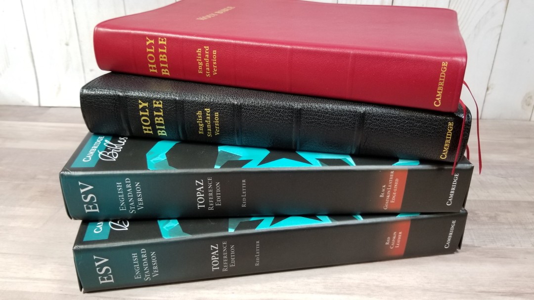
It’s available in several covers:
- Black Calfskin – MSRP $285, ISBN: 9781108702270
- Cherry Red Calfskin – MSRP $285, ISBN: 9781108702638
- Dark Blue Goatskin – MSRP $335, ISBN: 9781108702263
- Black Goatskin – MSRP $335, ISBN: 9781108718165
Cambridge provided these Bibles in exchange for an honest review. I was not required to give a positive review, only an honest one. All opinions are my own.
_________________________________________________________
This book is available for pre-order at:
Amazon (affiliate)

and many local Bible bookstores
_________________________________________________________
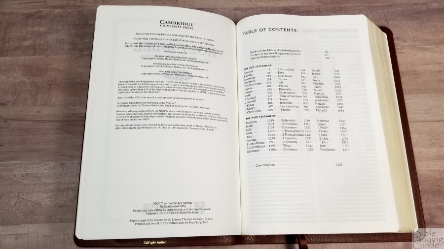
Table of Contents
- Video Review
- Cover and Binding
- Paper
- Typography
- References
- Presentation and Family Records
- Table of Weights and Measures
- Concordance
- Maps
- Comparisons
- Conclusion
Video Review
Cover and Binding
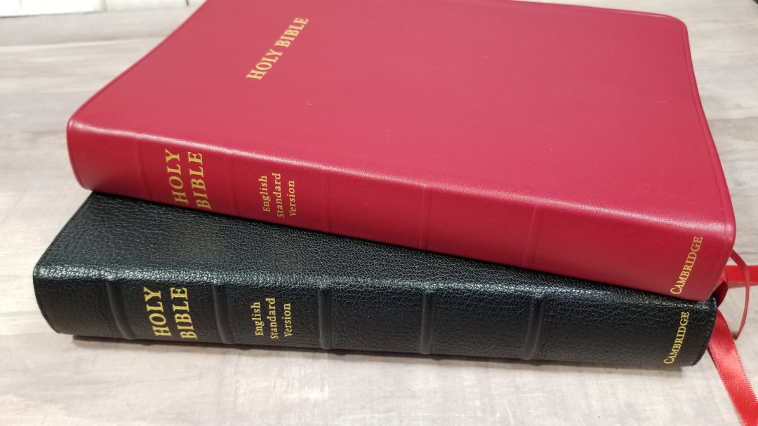
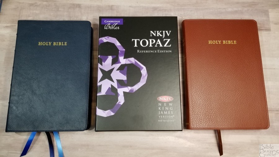
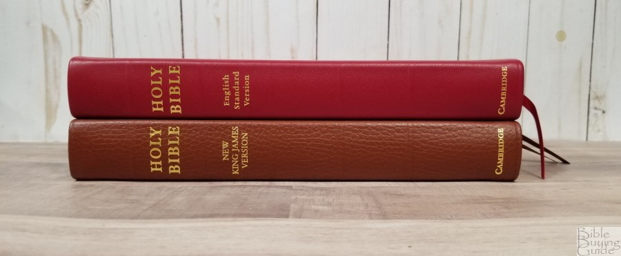
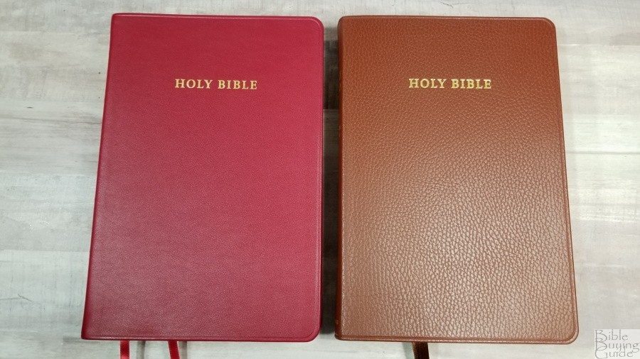
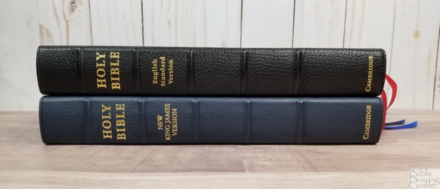
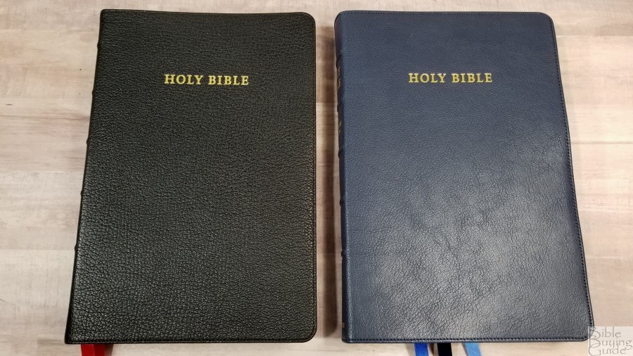
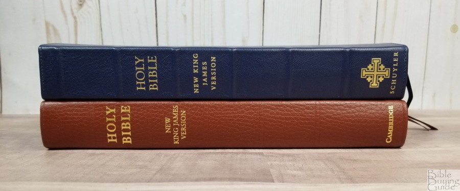
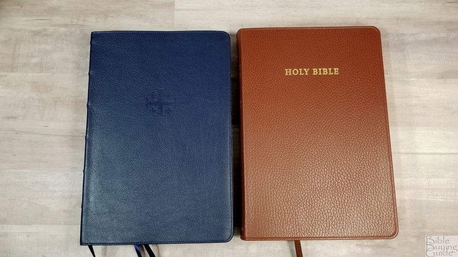
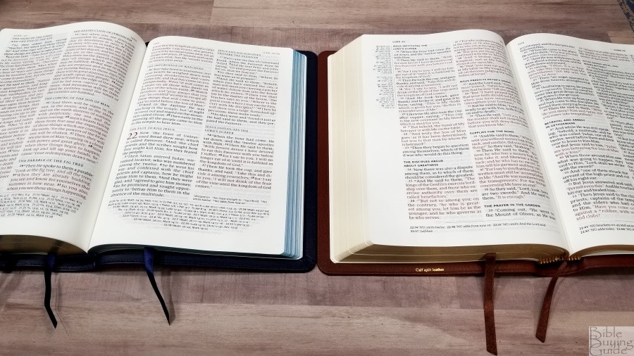
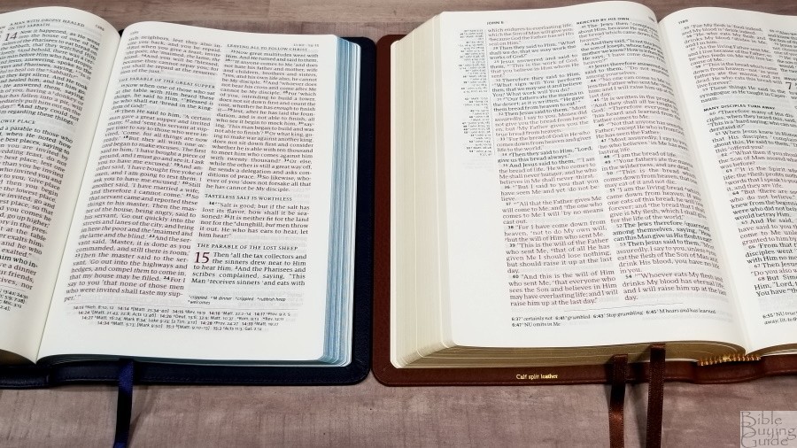
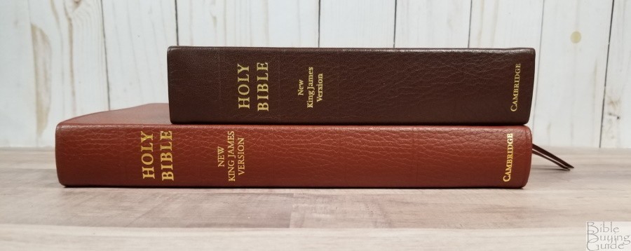
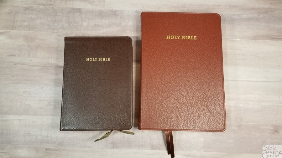
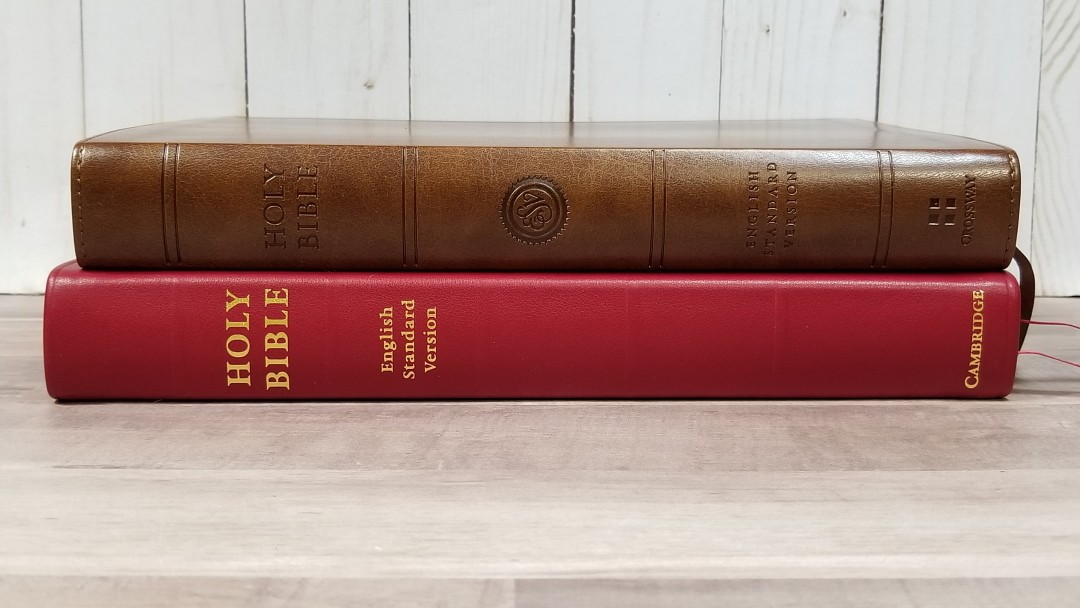
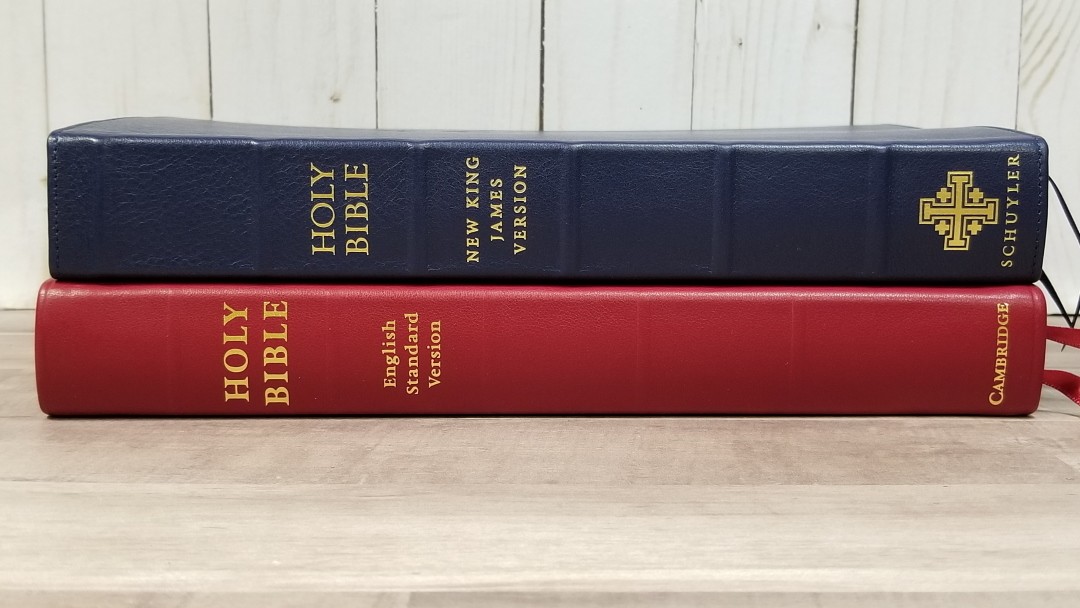
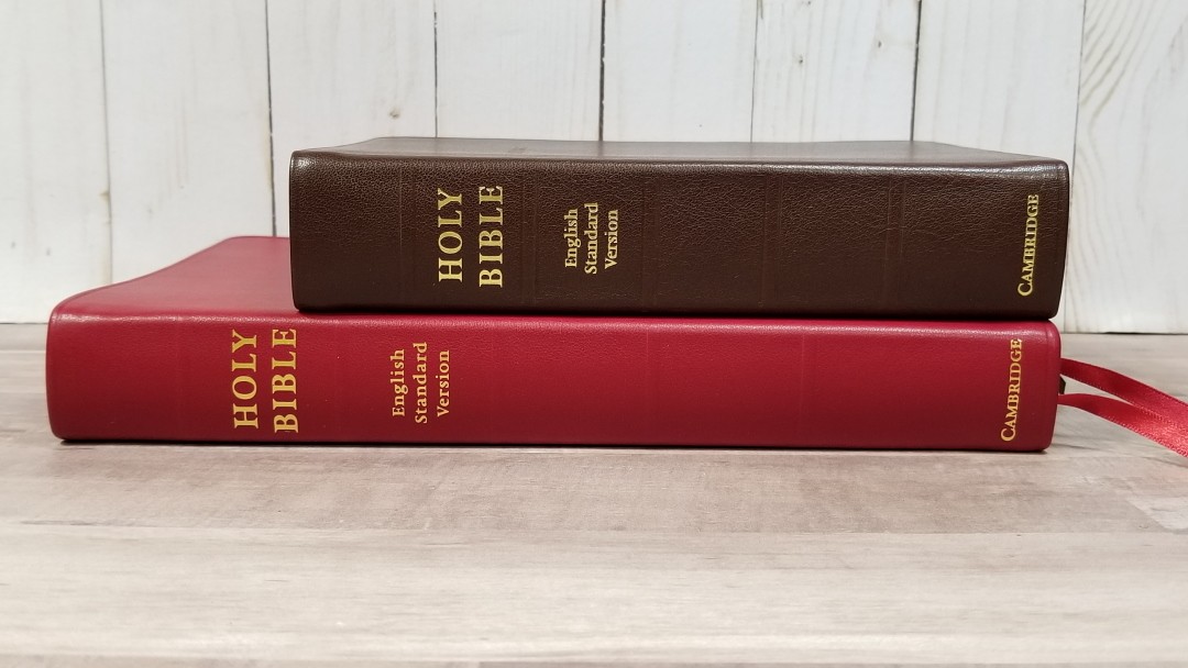
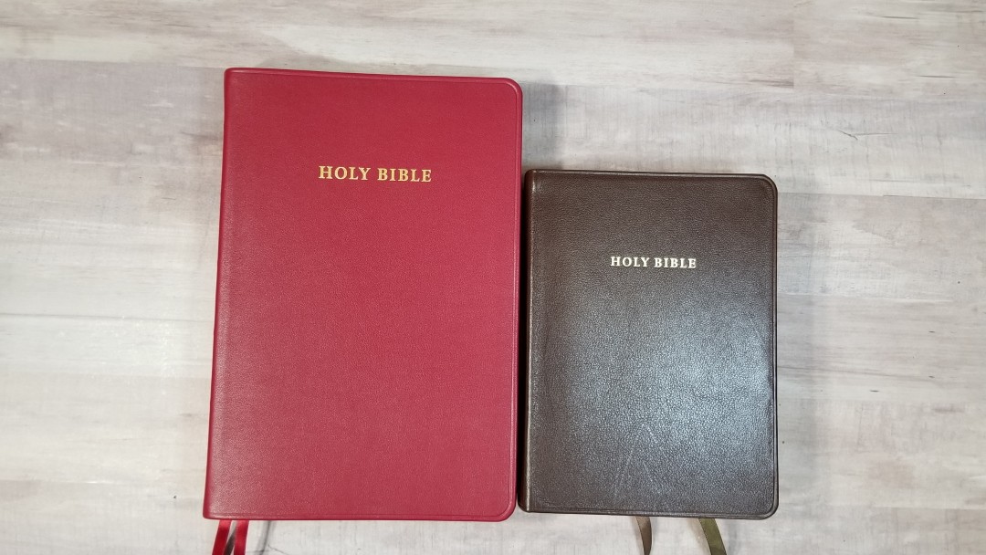
I’m reviewing the black goatskin and the cherry red calfskin. Let’s look at each one independantly and see what’s different between them.
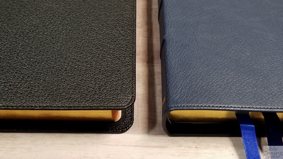
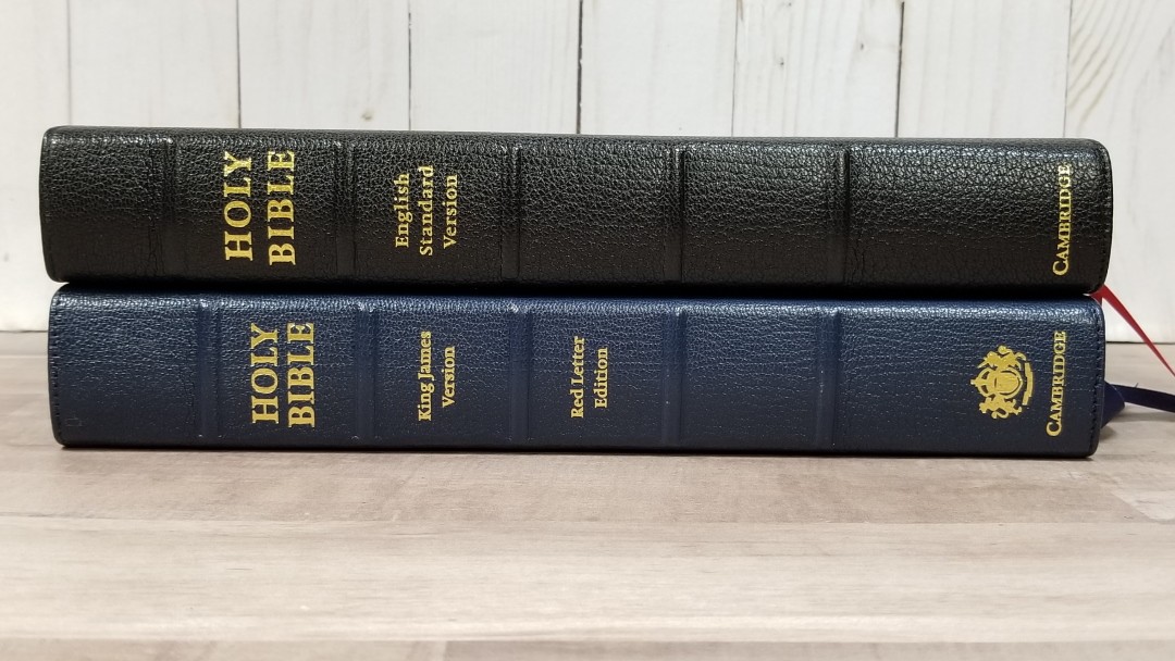
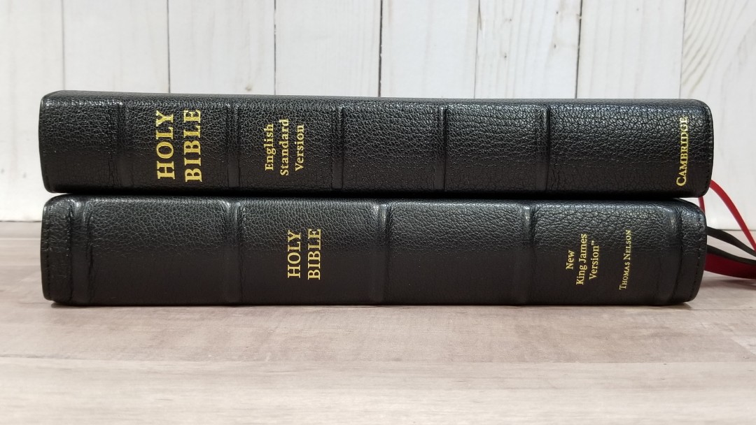
Black Goatskin

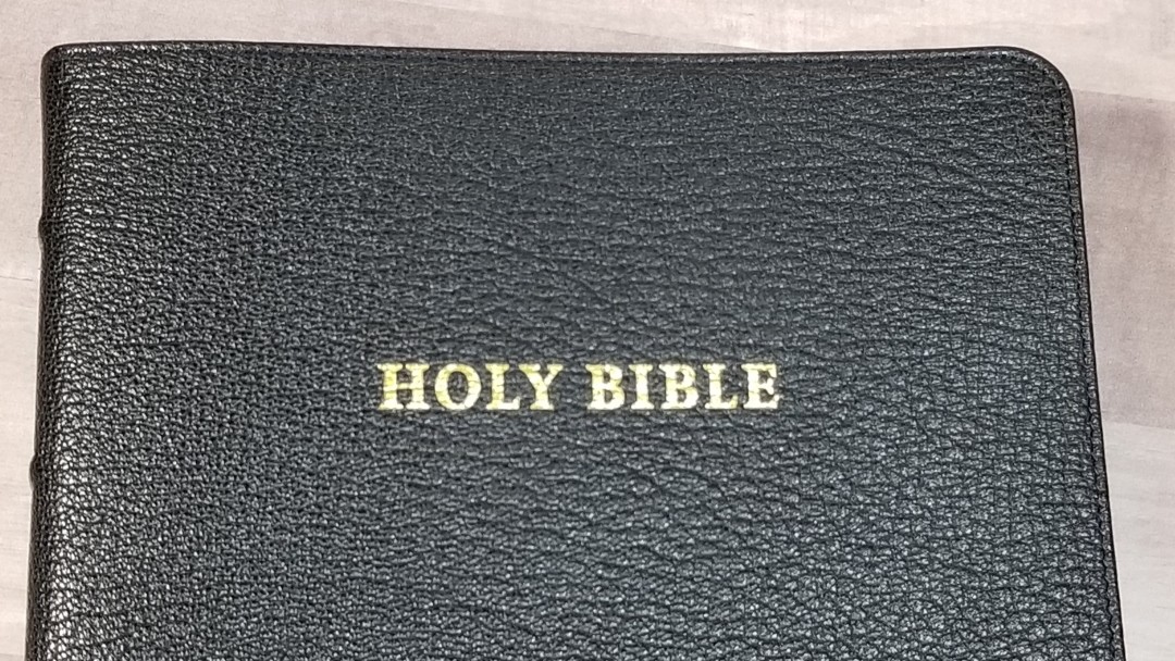
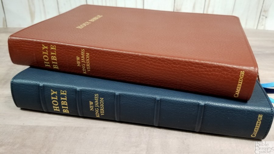
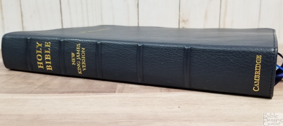
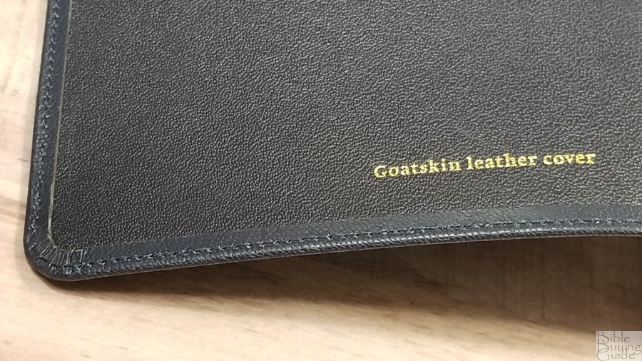
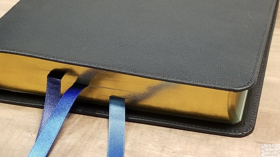
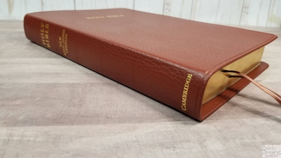
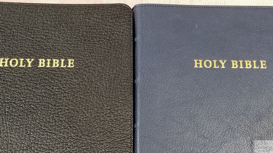
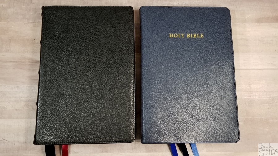
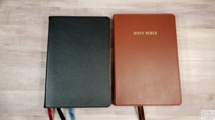
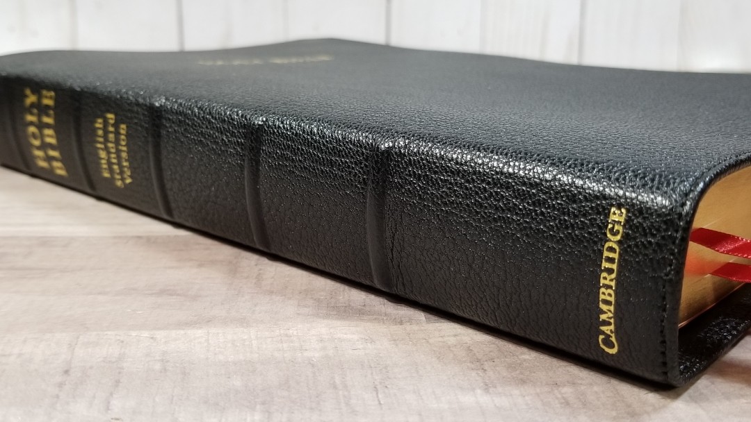
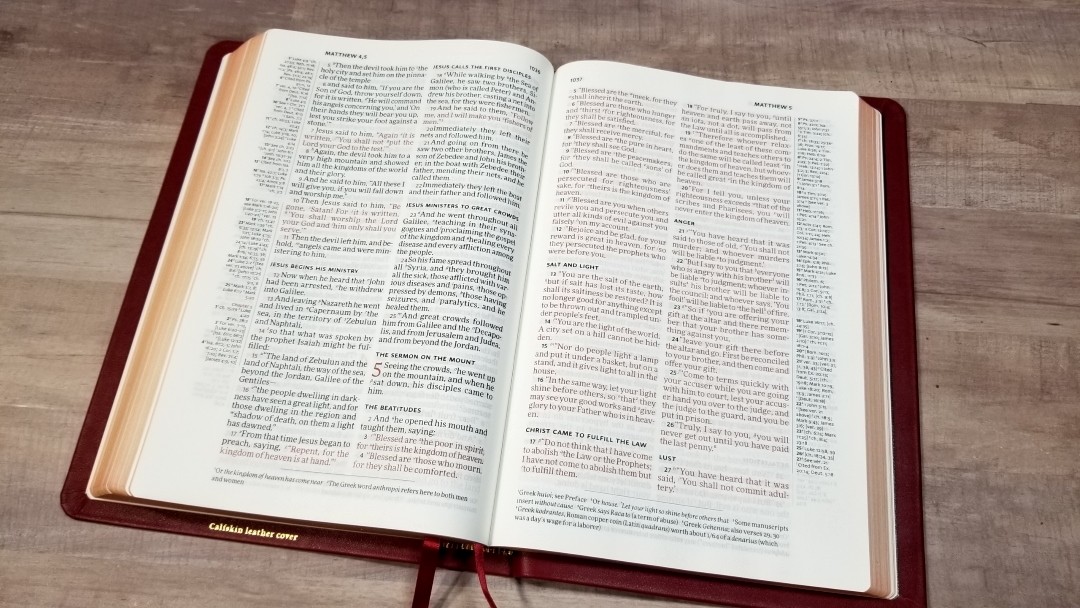
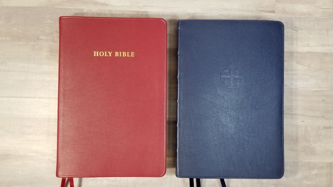
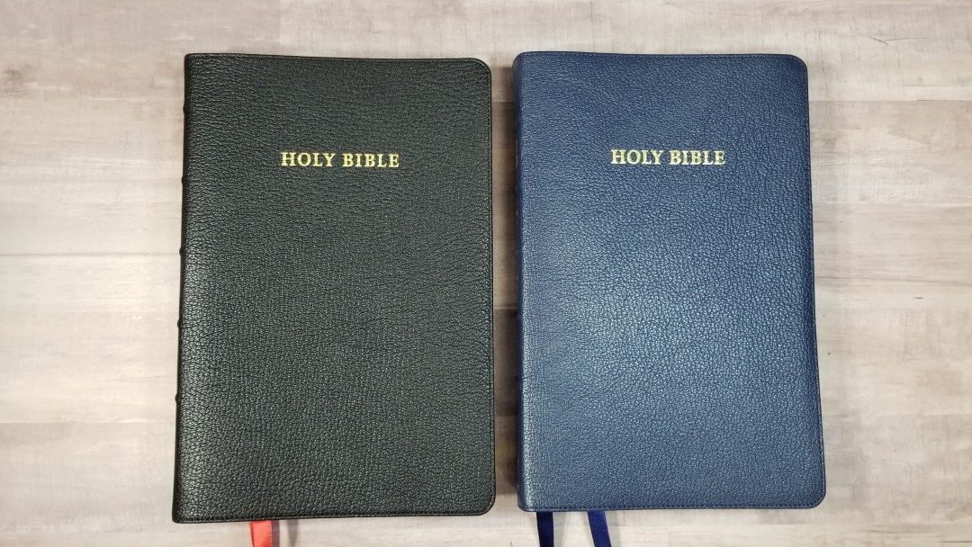
The black goatskin has a deeper grain than I’ve seen in most Cambridge Bibles. It isn’t as shiny as my Concord. I love the look and feel of this grain. It’s perimeter stitched and has a 5/16″ yapp. The front has HOLY BIBLE printed in gold. The spine has HOLY BIBLE, ENGLISH STANDARD VERSION, and CAMBRIDGE printed in gold. The spine also has 5 raised spine ribs. It’s flexible, but not overly floppy. I had no issues holding it in one hand to carry or read.

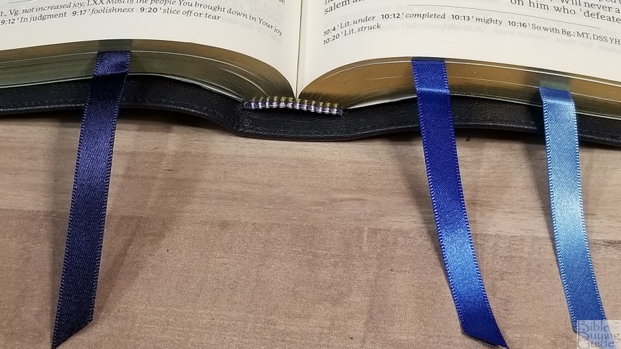
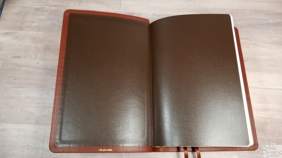
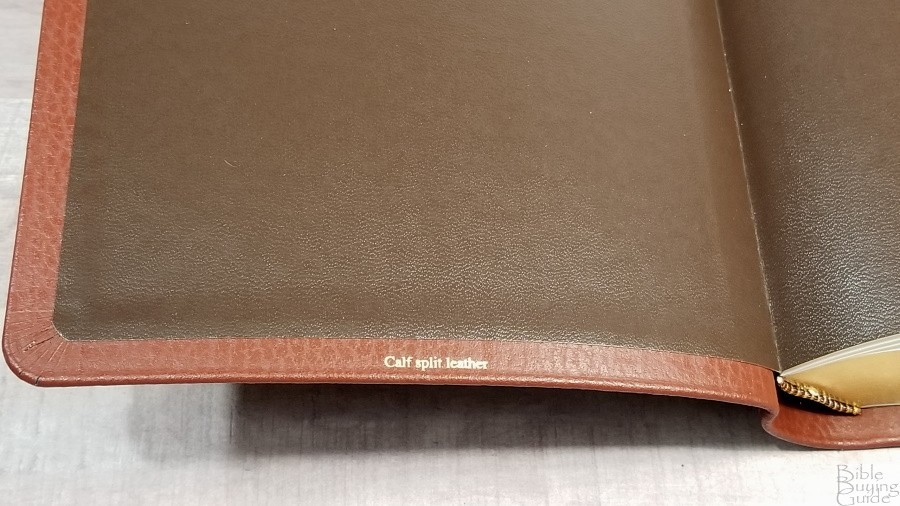
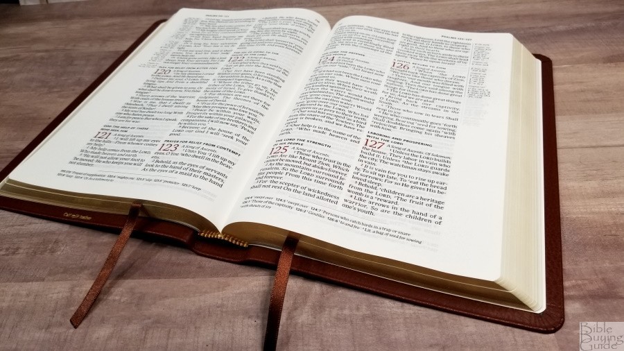
The liner is edge-lined calfskin. The edge-lined tab is a touch stiff out of the box, but it has no trouble staying open in Genesis. It’s Smyth sewn. It doesn’t have overcasting.
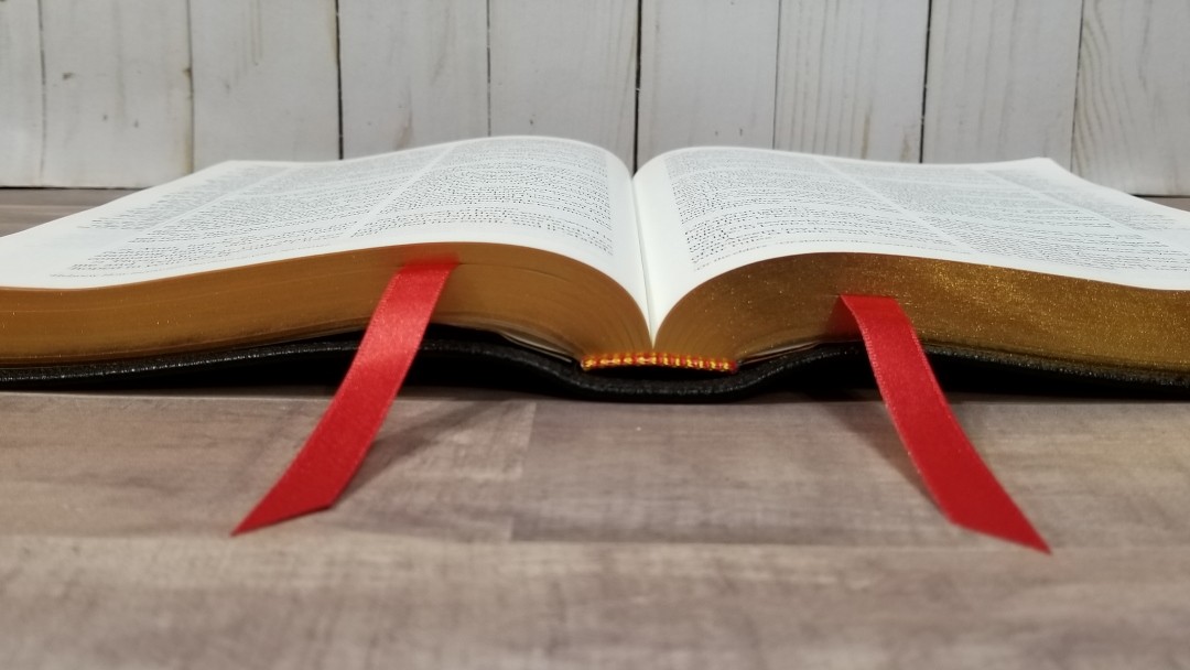
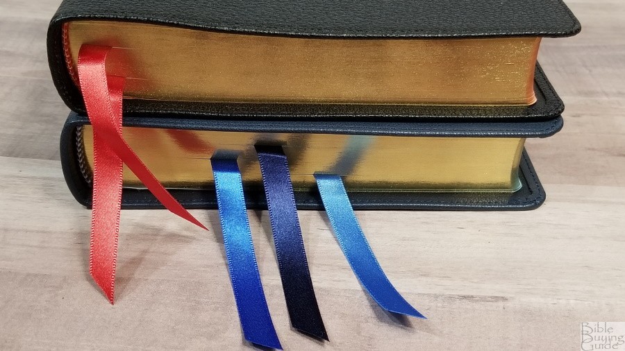
It has two double-sided satin ribbons in red. The red is slightly darker than the other ribbons I’ve seen from Cambridge. They have a touch of orange. To my eye, they fit with the black cover better because they’re not as bright. They’re long enough to pull to the corner and they’re cut at an angle. They’re made in the UK. They’re 3/8″ wide. It has red and gold head/tail bands. The overall size is 6 5/8 x 9 7/8 x 1 1/4″. It weighs 2lbs, 4.4oz.
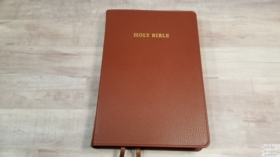
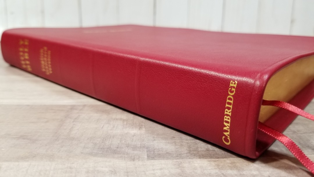
Cherry Red Calfskin
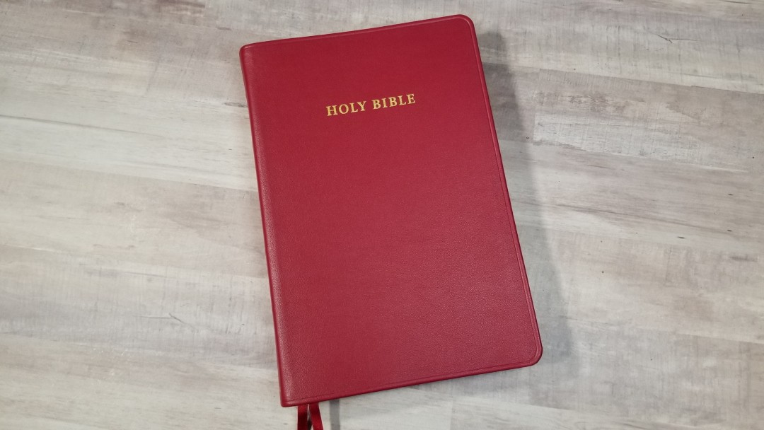

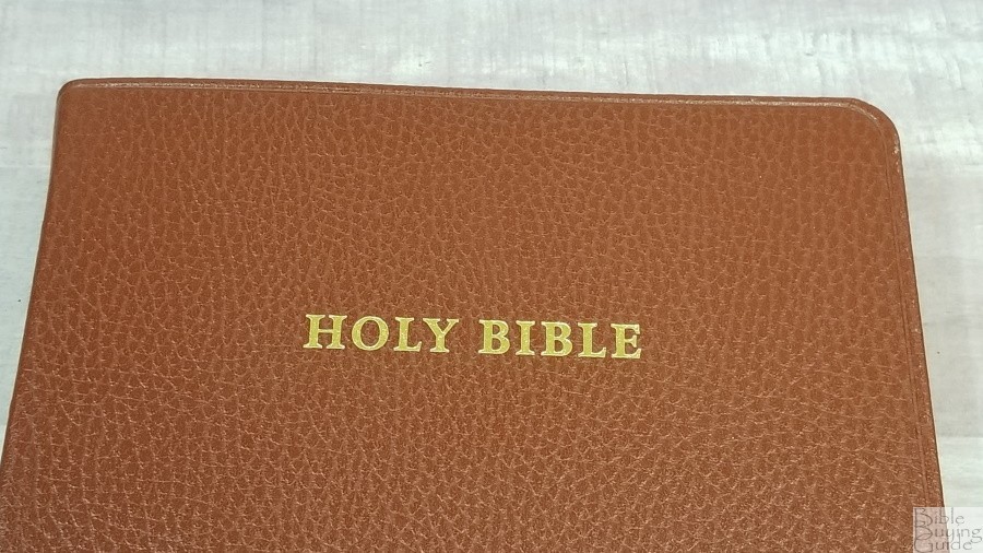
The cherry red calfskin has a smooth grain similar to the brown calfskin Clarion. It does have a noticeable texture, but it’s not as deep and grainy as the goatskin. The red is gorgeous. It has an indention around the perimeter to give is some style. The front has HOLY BIBLE printed in gold. The spine has HOLY BIBLE, ENGLISH STANDARD VERSION, and CAMBRIDGE printed in gold. It has 5 spine rib indications, but they’re not raised. It has a 7/16″ yapp.
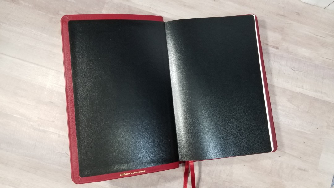

The liner is black pasted-down vinyl. It has no trouble staying open on page one. It’s easy to hold open in one hand. Of course, this one is also Smyth sewn.
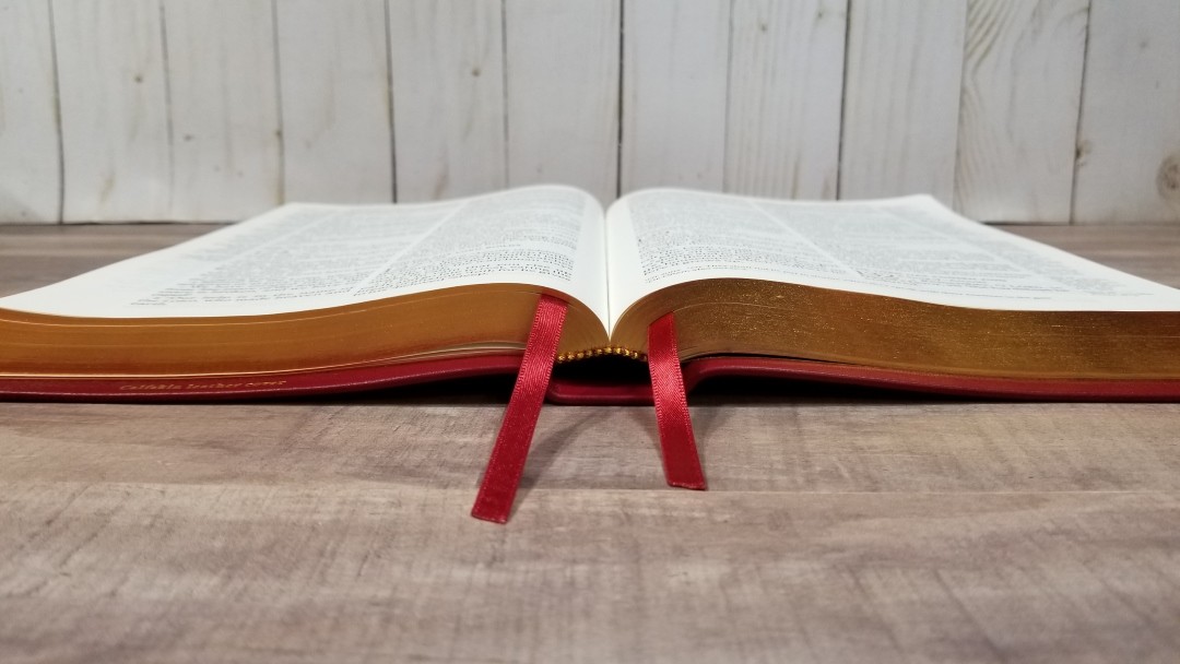
It has two double-sided satin ribbons in red. It’s not exactly the same red as the goatskin edition. It has a touch more burgundy. It looks nice with the red cover. These ribbons are 1/4″ wide. They’re long enough to pull to the corner and they’re cut at an angle. They’re made in the UK. It has red and gold head/tail bands. The overall size is 6 3/4 x 10 x 1 1/4″. It weighs 2lbs, 3.8oz.
Paper
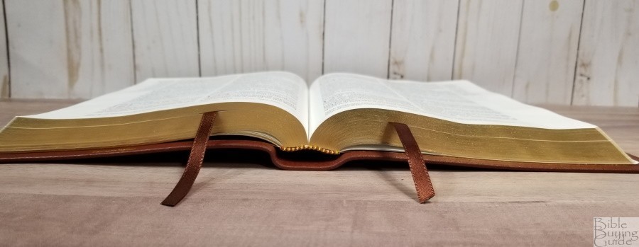
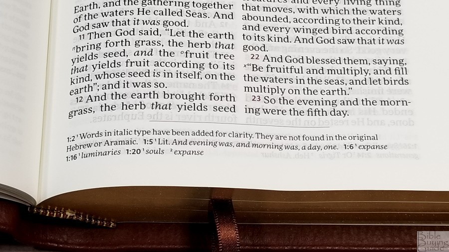
The paper is 28gsm Indopaque by Papeteries du Leman, Thonon-les-Bains, France. It’s silky smooth and, out of the box, I didn’t find this paper to be difficult the separate with my fingers. This is the same premium paper that’s used in many of the top premium Bibles including the Turquoise and newer editions of the Clarion, Pitt Minion, Concord, and many others. It’s ivory in color and it’s very opaque. The pages on both editions are art-gilt with red under gold.
Typography

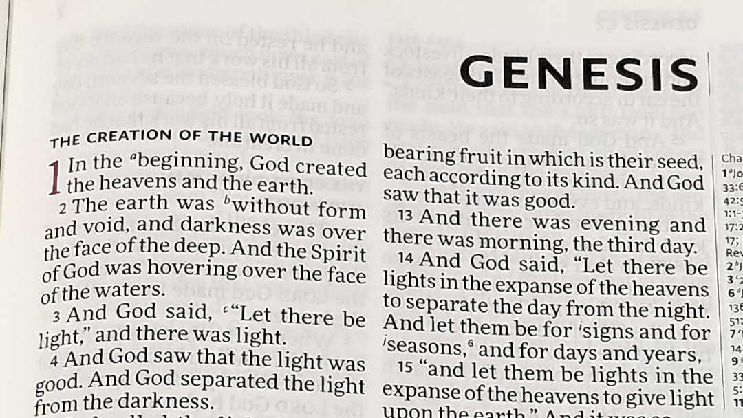
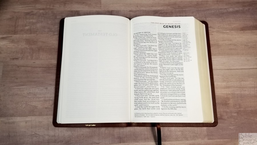
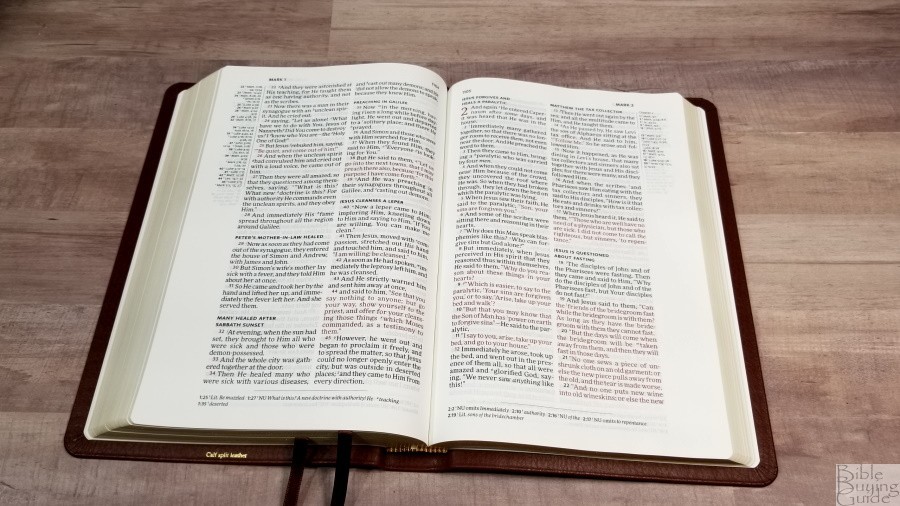
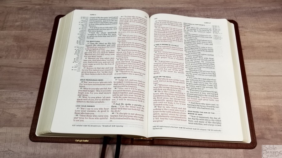
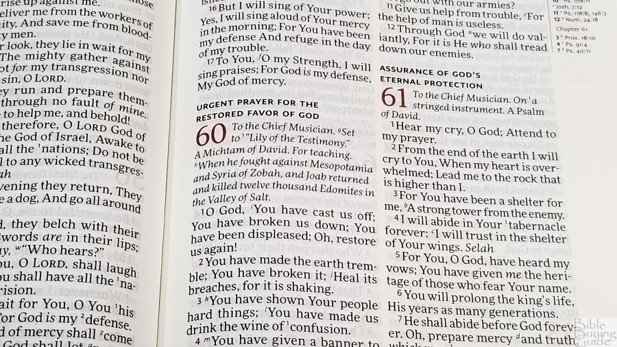
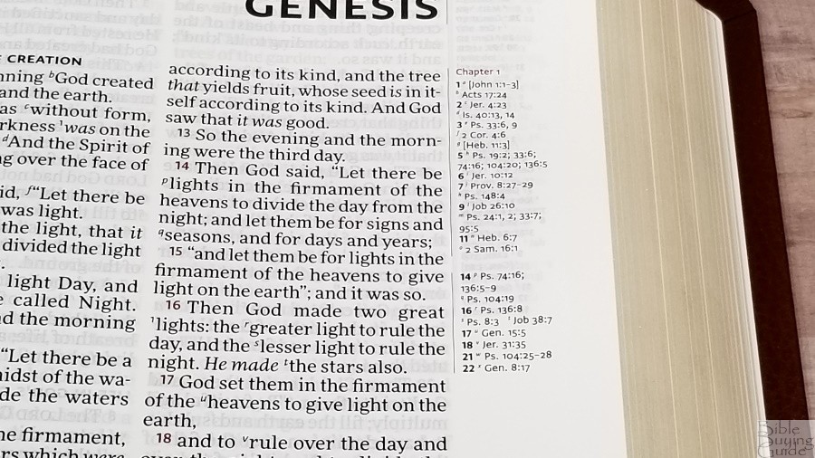
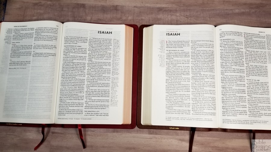
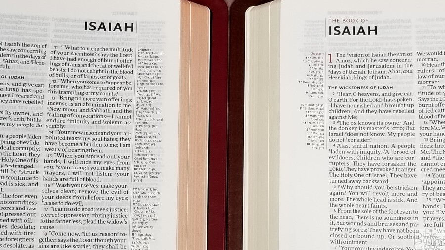
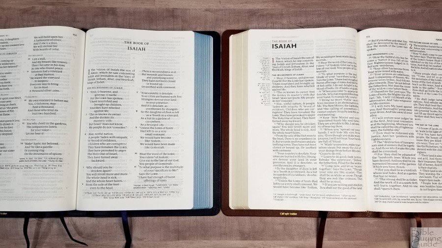
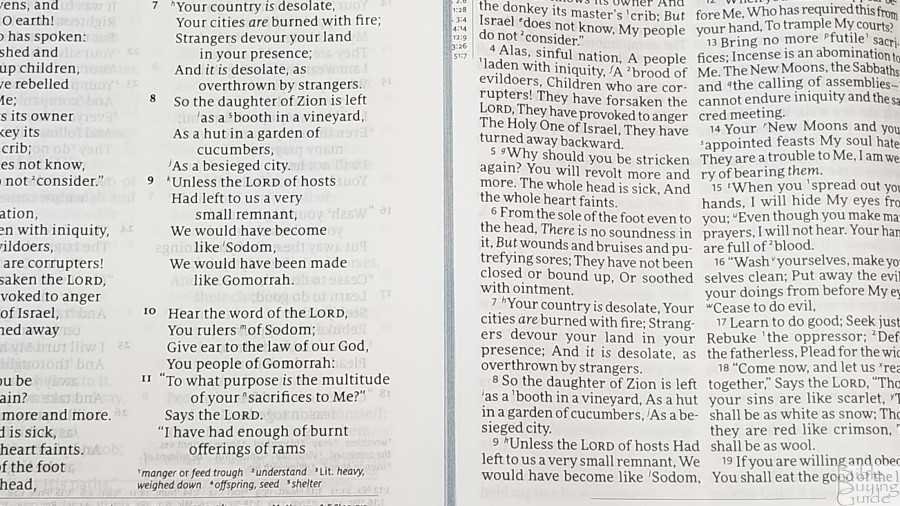
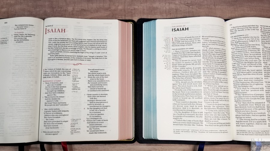
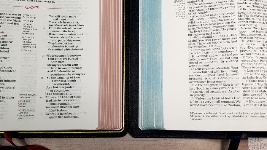
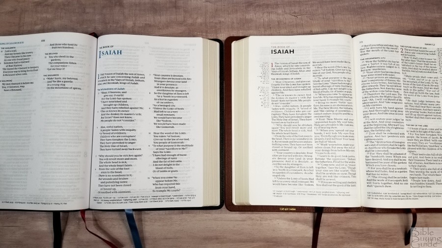
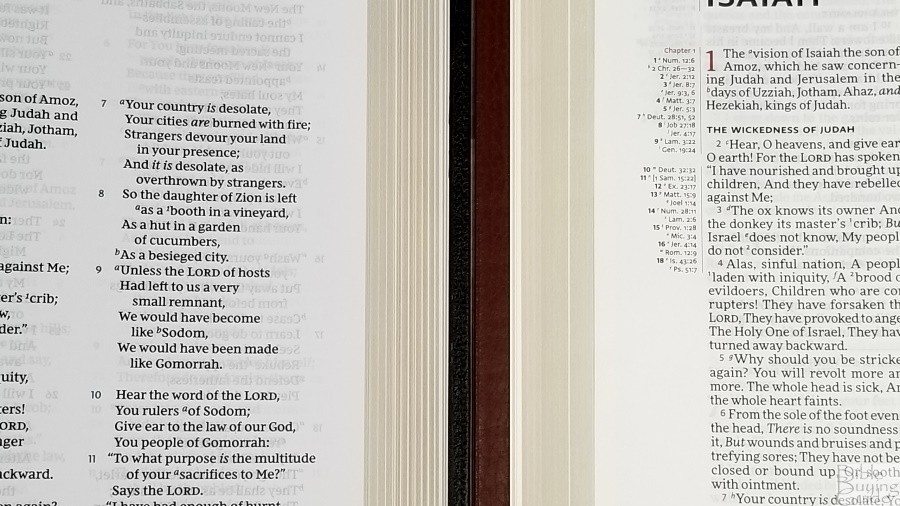
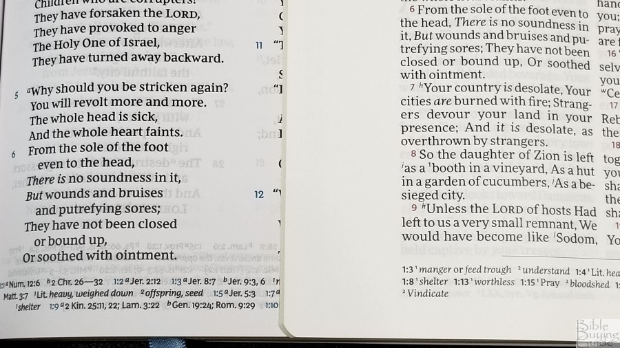
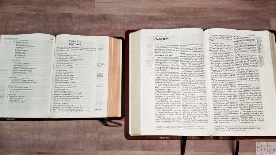
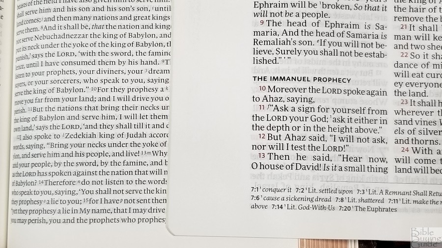
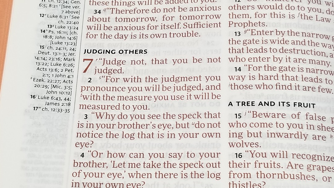
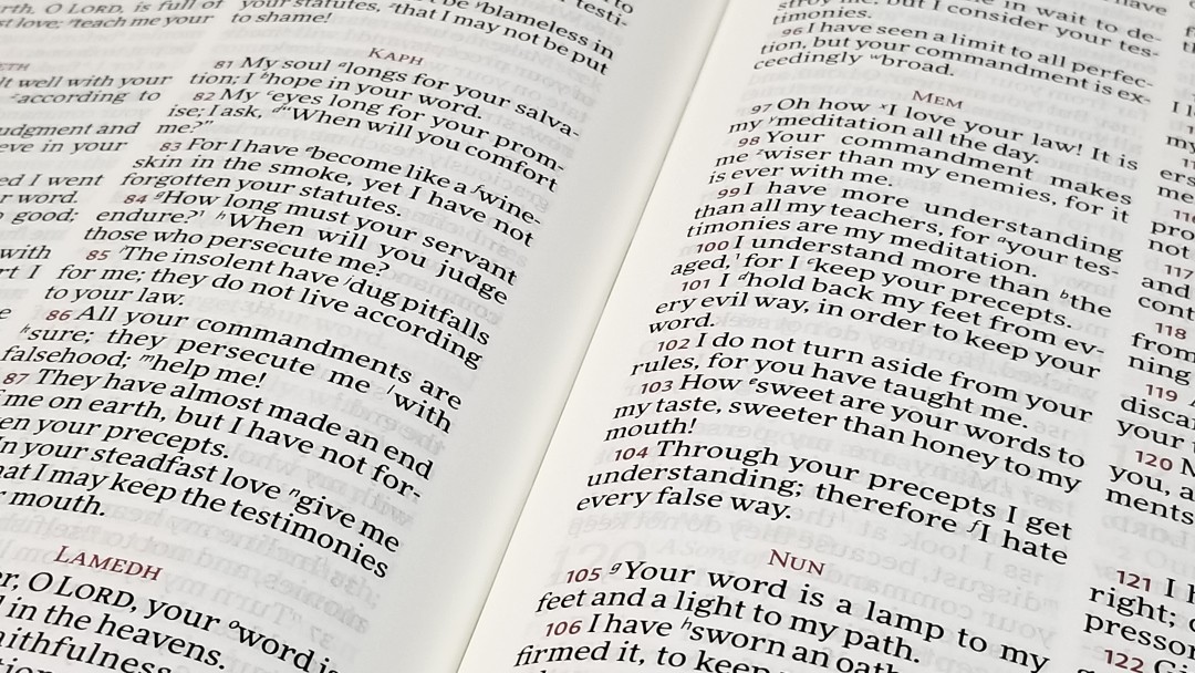
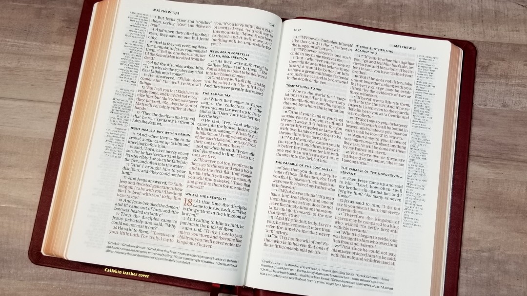
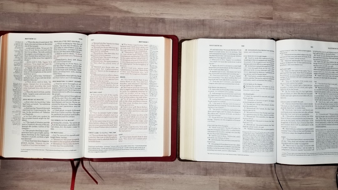
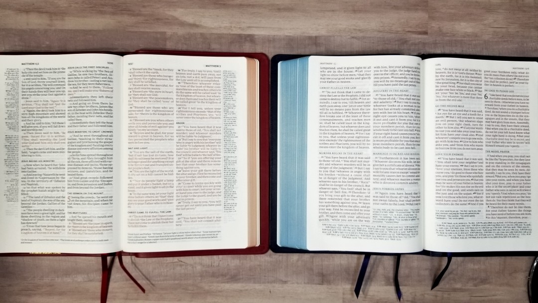
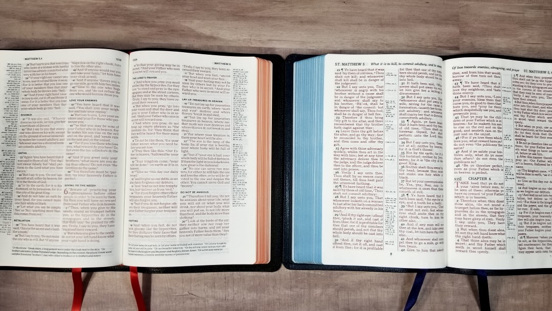
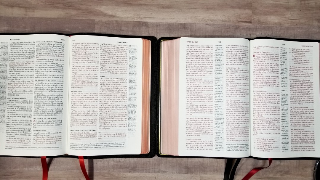
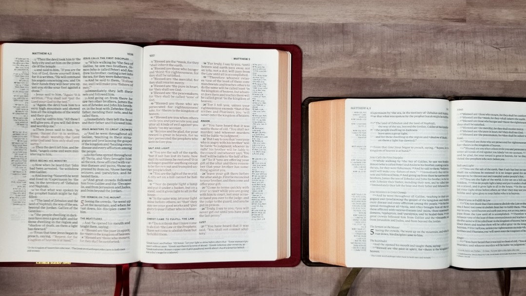
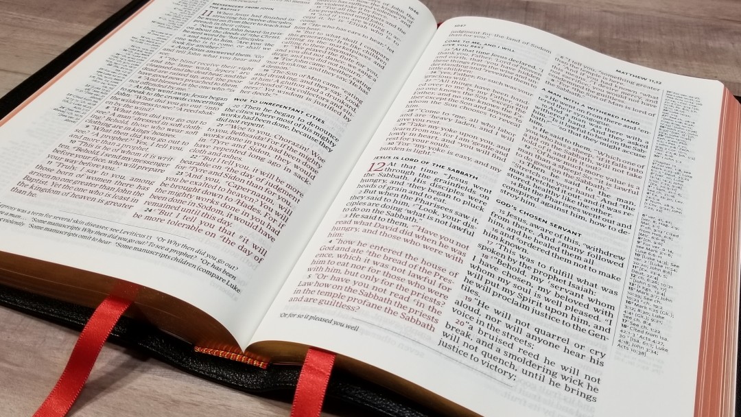
Unlike most modern translations and designs in anything other than KJV, this is a double-column verse-by-verse setting. It does not include paragraph markers, poetic settings, or any other settings to set different types of text apart. Unlike the KJV, each verse starts with a lower-case letter if the verse continues the sentence from the previous verse. It’s designed with preaching in mind.
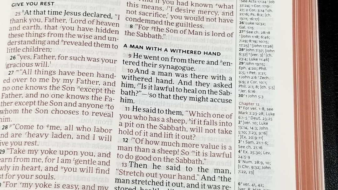
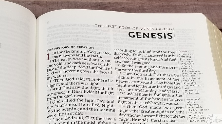
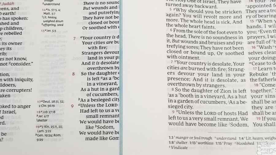
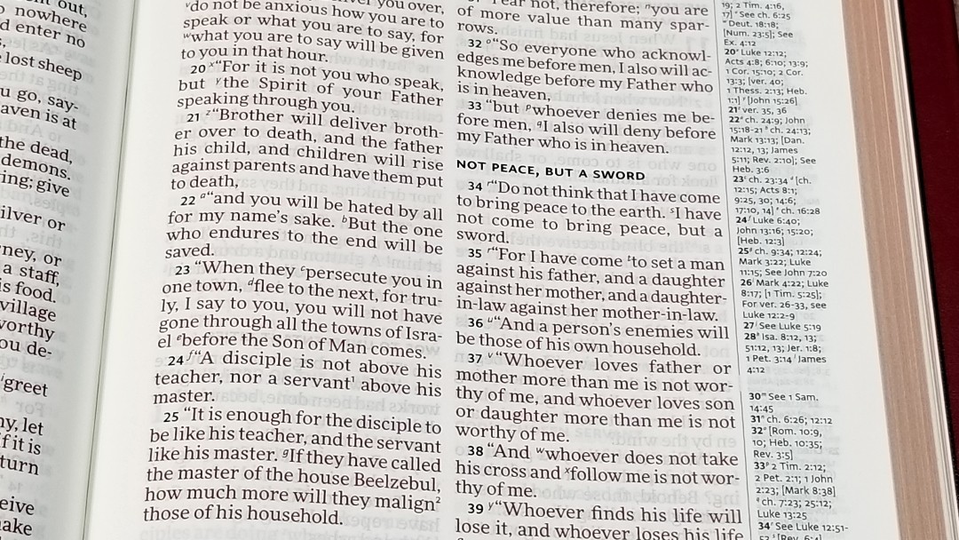
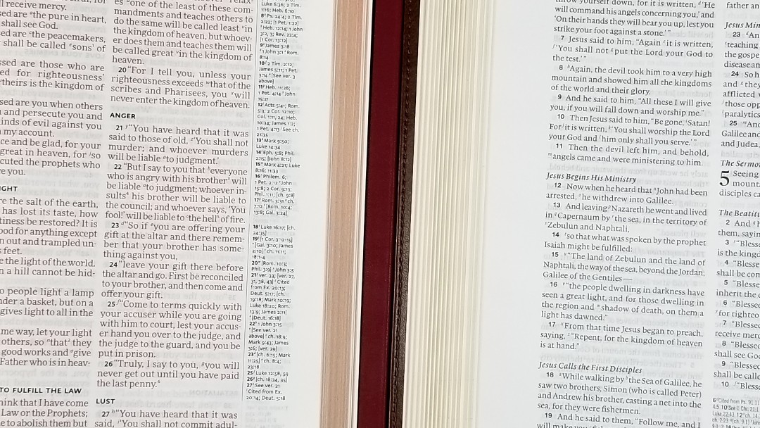
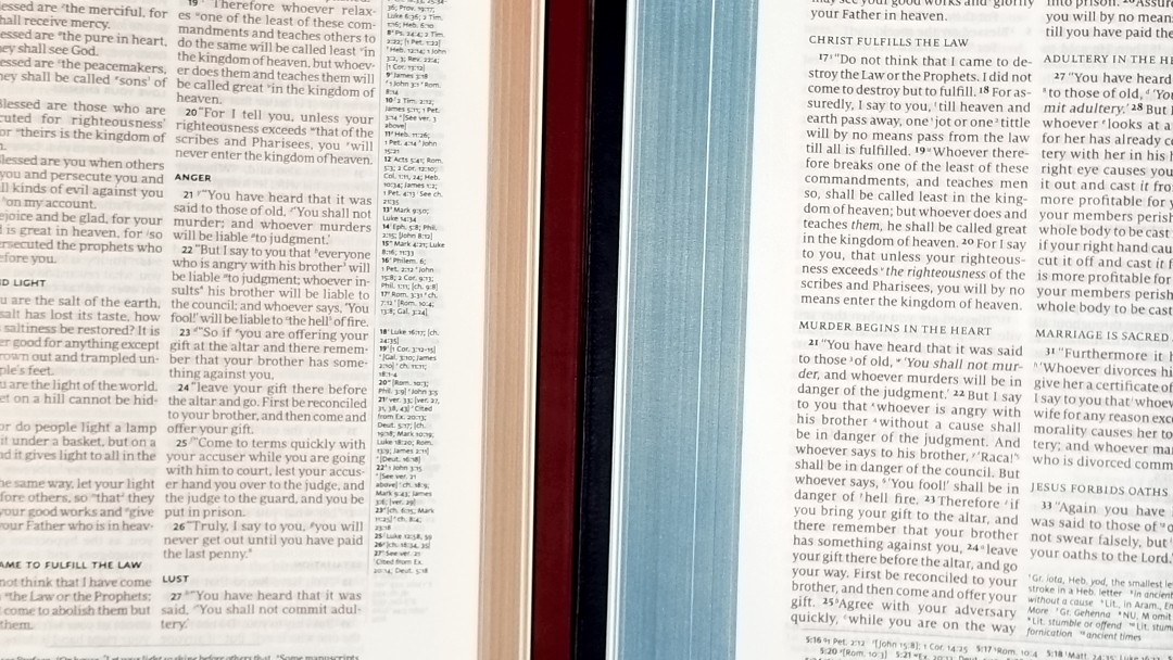
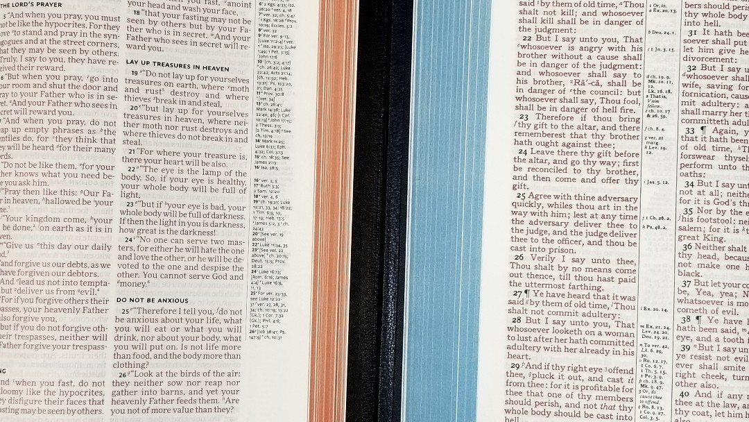
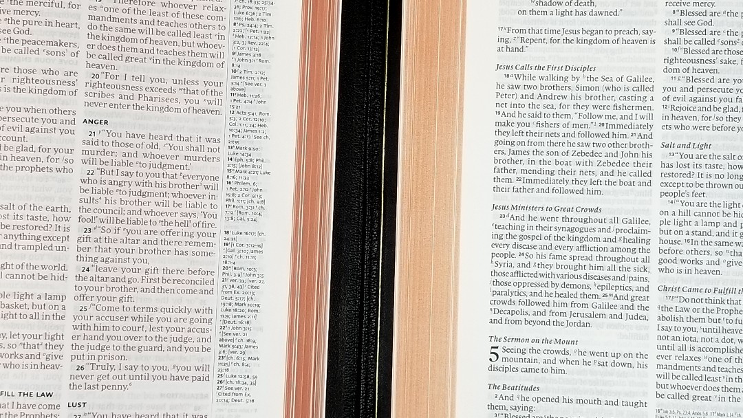
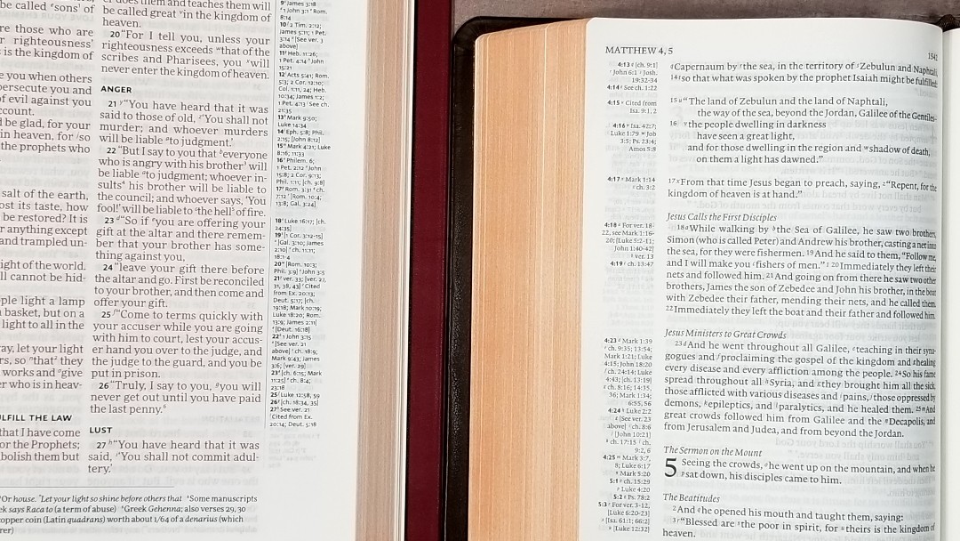
Cross-references are placed in the outer margin close to the top of the page. The advantage to this is all four columns of text are closer to each other, keeping you from having to skip over references to continue reading. Also, this leaves a lot of empty margin space that’s good for adding notes or references. The main disadvantage is you can’t write those notes near the verses, but this would not be possible anyway for the first half of the page. I probably won’t write in the margin, but it’s nice to have space, just in case.
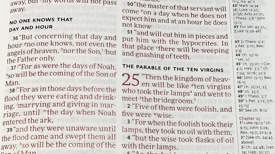
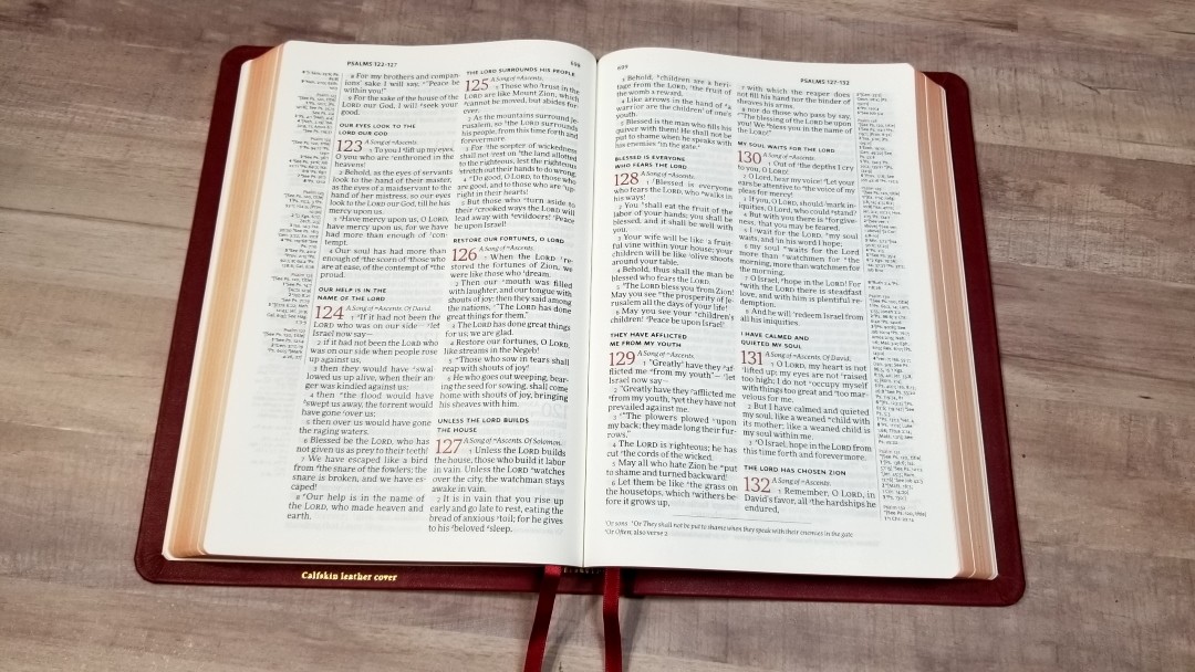
Chapter and verse numbers within the text are printed in red. If the text is red-letter, then the verse number will be black. The chapter number is still red. Chapter and verse numbers and page numbers in the header, and section headings in the text are printed in black.
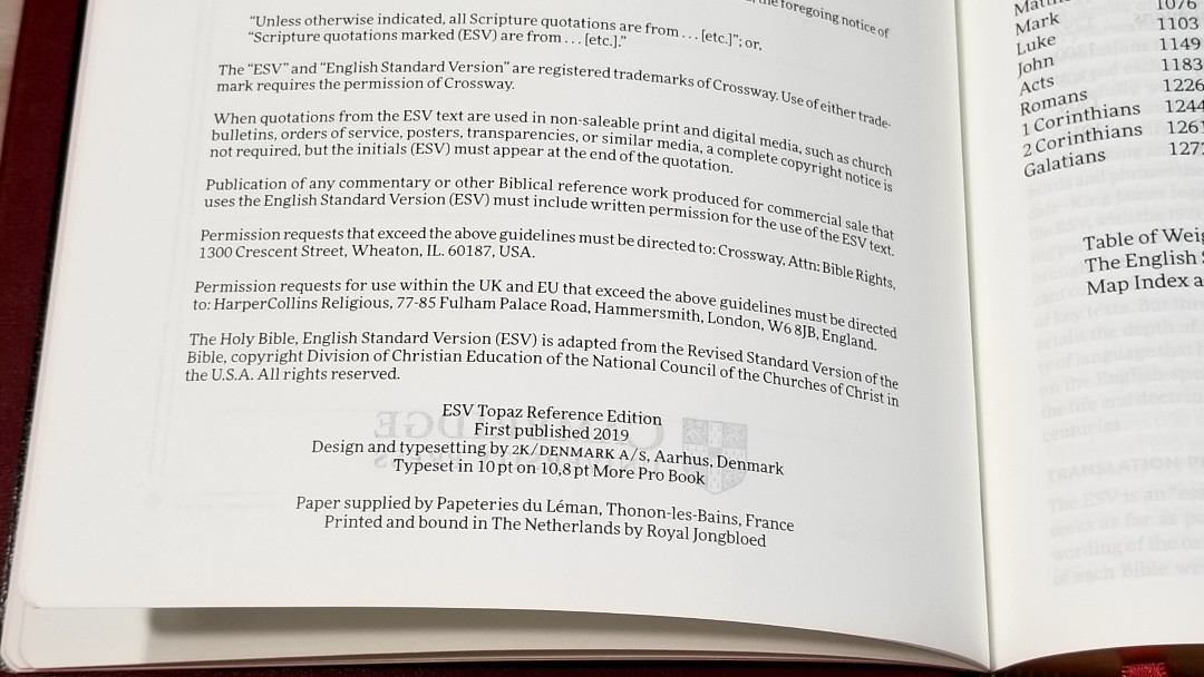
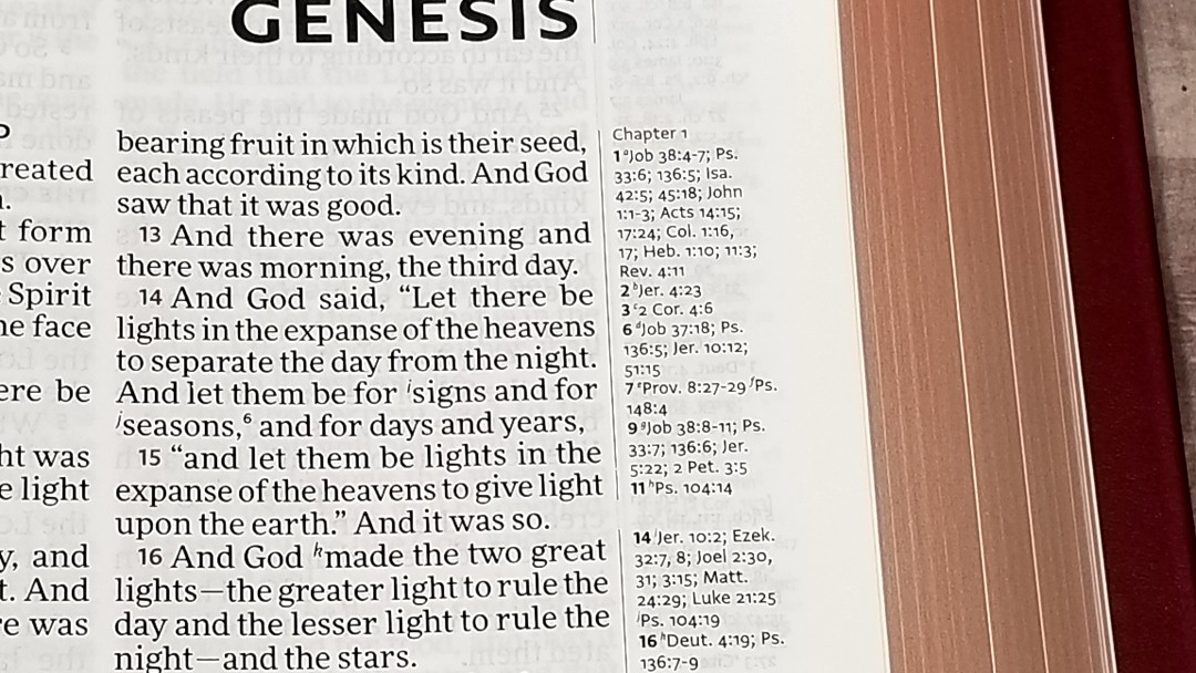
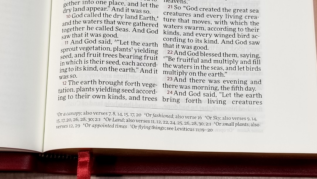
It was designed and typeset by 2K/Denmark in a 10-point modern typeface called More Pro Book. It was printed with a slow printing technique that creates a clean and consistent print quality. The black is dark and extremely consistent. The words of Christ are printed in red. This is the same red as the highlights, which is a medium to dark red. It’s also highly consistent throughout.

The typeface is slightly tall and narrow. At this size, it’s excellent for reading and preaching. It has a generous leading, and it has around 6-7 words per line with good spacing between the words. It does include reference and footnote keys in the text in superscript. I found them easy to ignore for reading and preaching. It’s line-matched to help reduce show-through.
References and Footnotes
It includes the standard ESV references, which is a lot of cross-references for study and sermon prep. These are the same references as the ESV Clarion and Pitt Minion. The pilot verse in the margin is bold. Cross-references are placed in the outer margin. Those at the top go with the inner column, while those at the bottom go with the outer column. They’re separated from the text by a line for each of the columns. Footnotes are placed under the last verse and are also separated by a line. I like that the references and footnotes are separated from each other. This gives more room for references and the footnotes are easier to find.
The footnotes are placed at the bottom of the page and are keyed to the text with numbers. They’re larger than the references. They provide alternate translations, literal translations, Hebrew and Greek terms, special uses of Greek words, the meanings of names, words where meanings are uncertain, clarification of additional meanings, grammatical points, supplied pronouns, English equivalents of weights and measures, and manuscript variations. I find them useful for personal study and sermon prep as they give insights on the text.
It has a lot of references that cover both words and themes. Here are a few examples of references to help you compare:
- Genesis 1:1 – Job 38:4-7; Ps 33:6; 136:5; Isa 42:5; 45:18; Jn 1:1-3; Ac 14:15; 14:24; Col 1:16, 17; Heb 1:10; 11:3; Rev 4:11
- Deuteronomy 6:4 – Cited Mk 12:29; [Isa 42:8; Zech 14:9; Jn 17:3; 1 Cor 8:4, 6]
- Isaiah 9:6 – Lk 2:11; [Jn 3:16]; ch 7:14; [Mt 28:18; 1 Cor 15:25]; ch 22:22; [ch 28:29]; ch 10:21; Deut 10:17; Neh 9:32; Jer 32:18; [Ps 72:17]; ch 63:16; [Jn 14:18]; Ps 72:7; [Eph 2:14]; see ch 1:6-9
- Matthew 17:20 – [Jn 11:40]; see ch 6:3; ch 21:21, 22; Mk 11:23; Lk 17:6; [ch 13:31]; ver 9; [1 Cor 13:2]; Mk 9:23
- Mark 11:23 – Mt 17:20; [Ps 46:2; 1 Cor 13:2; Rev 8:8]; Rom 4:20; 14:23; Jm 1:6; [ch 16:17; Jn 14:12]
- Mark 12:29 – Lk 10:27; cited from Dt 6:4, 5; Rom 3:30; 1 Cor 8:4, 6; Gal 3:20; Eph 4:6; 1 Tim 1:17; 2:5; Jm 2:19; 4:12; Jude 25; [Mt 19:17; 23:9]
- Acts 2:38 – 3:19; 20:21; 26:18, 20; Luke 24:47; ch 22:16; [ch 8:12]; See Mark 16:16; ch 10:48; see ch 8:16; See Mark 1:4; ch 10:45; [ch 8:15, 20; 11:17]; See John 7:39
- John 1:1 – Gn 1:1; [Col 1:17; 1 Jn 1:1; Rev 1:4, 8, 17; 3:14; 21:6; 22:13]; Rev 19:13; [Heb 4:12; 1 Jn 1:1]; 1 Jn 1:2; [ch 17:5]; Phil 2:6
- 1 John 1:1 – see Jn 1:1; [ch 2:13, 14]; Ac 4:20; Jn 19:35; ch 4:14; Jn 1:14; 2 Pet 1:1; Lk 24:39; Jn 20:27
Presentation and Family Records


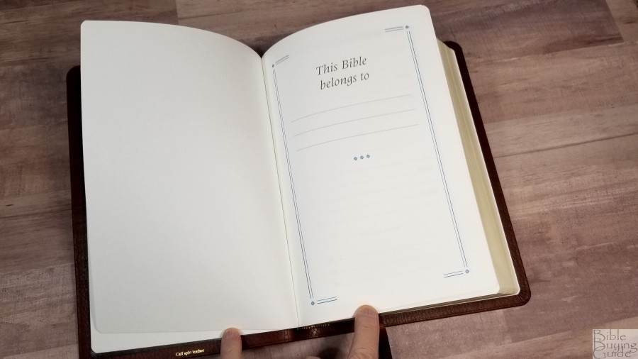
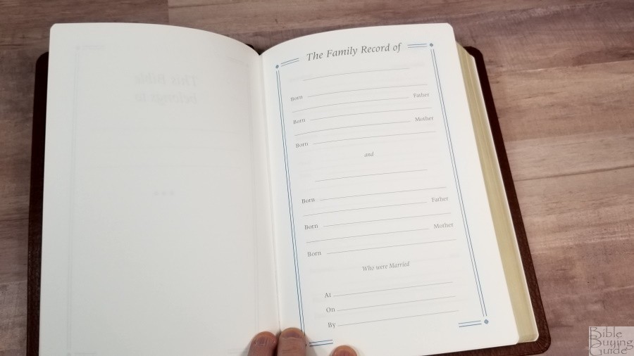
In the front are several pages for records. It includes a page to show who the Bible belongs to, a familay record, children, marriages, grandchildren, and deaths. They’re printed on thick paper that also help give the Bible structure.
Table of Weights and Measures
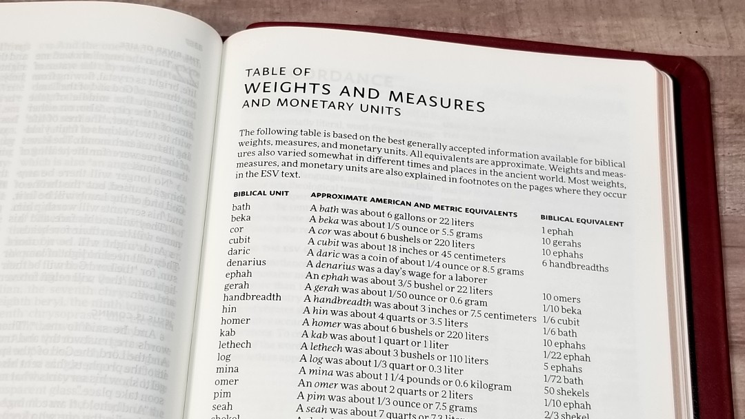
This is a one-page table that shows the biblical unit, approximate American and metric equivalents, and biblical equivalents for 22 weights, measures, and monetary units. Most are explained in the footnotes where they occur, but it’s always nice to have a quick reference table. This one is useful, but it is a simplified table. I’d like to see a few Scriptures added for examples of each one.
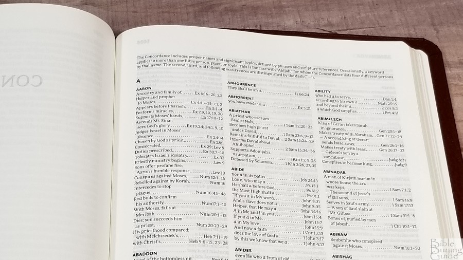
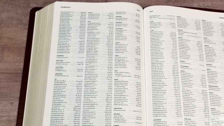
Concordance
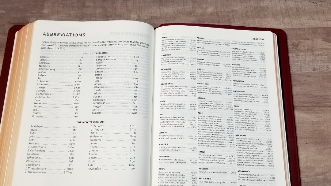
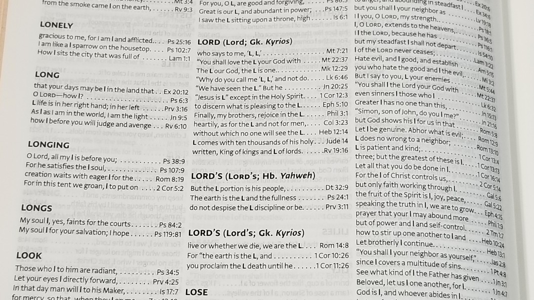
The concordance is 99 pages with 3 columns per page. It has lots of entries. It contains 3000 word-entries and 14,00 references. This is the same concordance as found in the Clarion. It has a lot of good material to help in study and sermon prep.
Sample entries include:
- Christ – 17
- Christ’s – 3
- Christian – 2
- Christs – 1
- Faith – 36
- Faithful – 12
- Faithfully – 3
- Faithfulness – 7
- Faithless – 2
- God – 56
- Goddess – 2
- Godliness – 6
- Godly – 4
- Gods – 4
- Praise – 11
- Praised – 4
- Praises – 3
- Praising – 4
- Pray – 13
- Prayed – 5
- Prayer – 11
- Prayers – 7
- Praying – 4
Maps
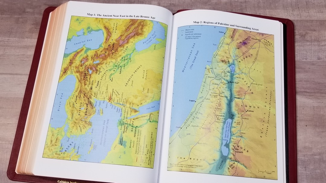

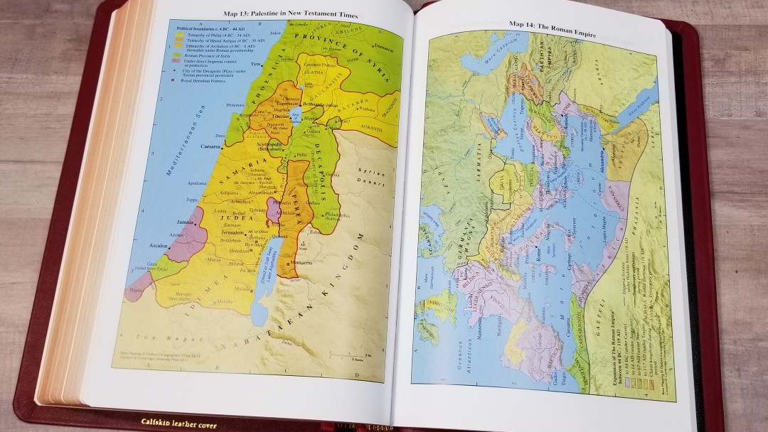
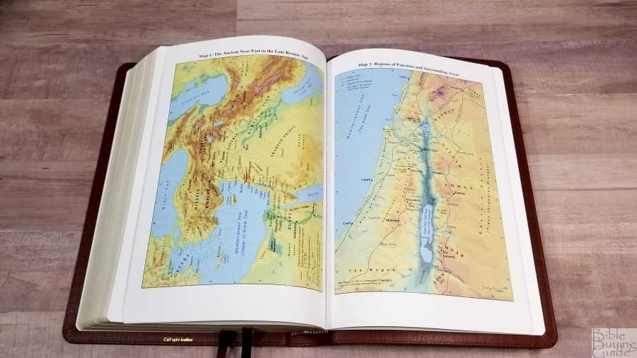
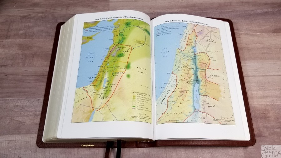
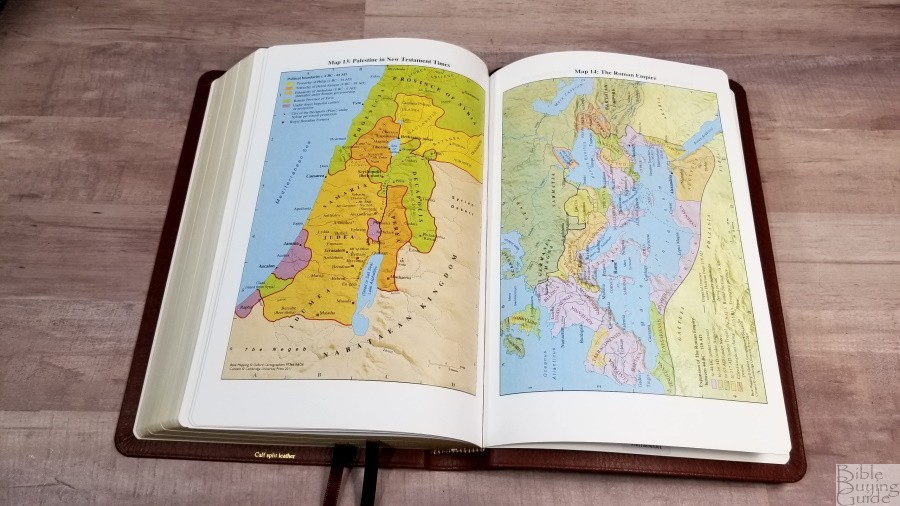
It has 15 pages of maps on thick semi-glossy paper. They are bright and colorful, but they don’t look cartoonish. I like these colors. They include borders, import commodities, dates, routes, passes, settlements, distance, topography, mountains, cities of refuge, cities, tribes, vegetation, kingdoms, battle sites, satrapy, cities walls, city gates, older city walls, seven Churches of Asia, etc.
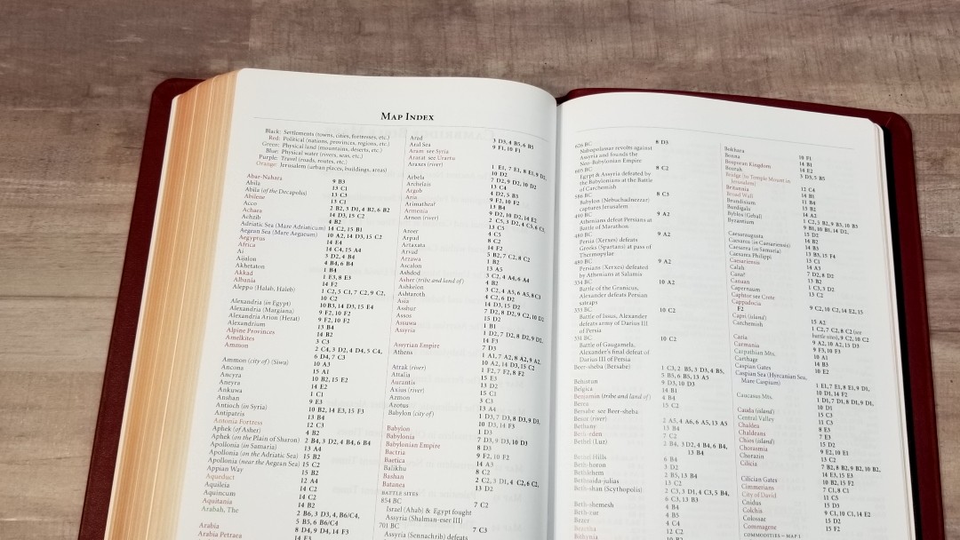
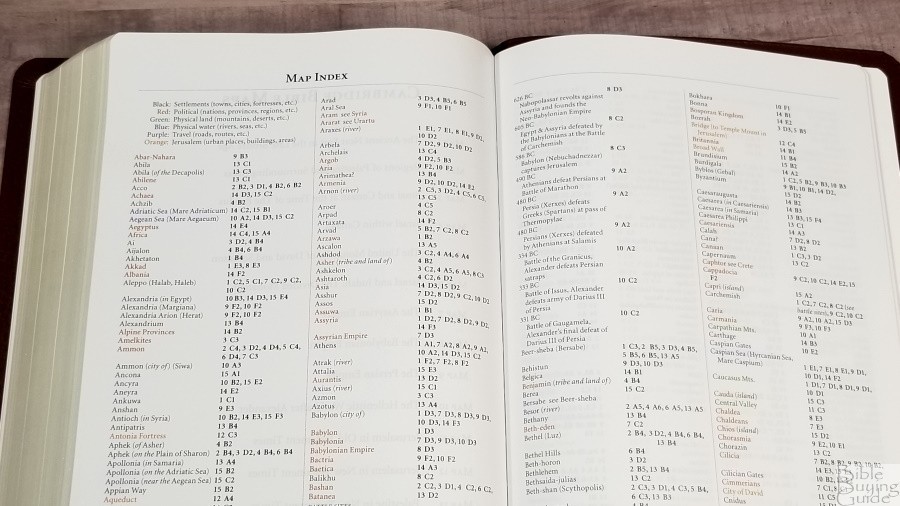
It also has an 8-page color-coded index to maps printed on the same paper. They identify settlements, political (nations, provinces, and regions), physical land, physical water, travel, and Jerusalem. I’m always glad to see a map index included and I find the Cambridge color-coded index to be one of the best available.
Maps include:
- The Ancient Near East in the Late Bronze Age
- Regions of Palestine and Surrounding Areas
- Sinai and Canaan at the Time of the Exodus
- Israel within Canaan
- The United Monarchy of David and Solomon
- Israel and Judah: The Divided Monarchy
- The Assyrian Empire
- The Babylonian Empire
- The Persian Empire
- The Hellenistic World after Alexander
- Jerusalem in Old Testament Times
- Jerusalem in New Testament Times
- Palestine in New Testament Times
- The Roman Empire
- The Eastern Mediterranean in the First Century AD
Comparisons
Here’s how the Cambridge Topaz compares to a few similar Bibles.
ESV Verse-by-Verse

The Crossway ESV Verse-by-Verse is a much cheaper Bible, but the price reflects that. I’m comparing design rather than materials. The Crossway is shorter and the width and thickness are about the same as the Topaz. It has a smaller font, but it also has almost an inch outer margin. References are placed under the last verse. It also does not have a poetic setting. It’s black letter and it isn’t line-matched. It has excellent paper for its price-point.
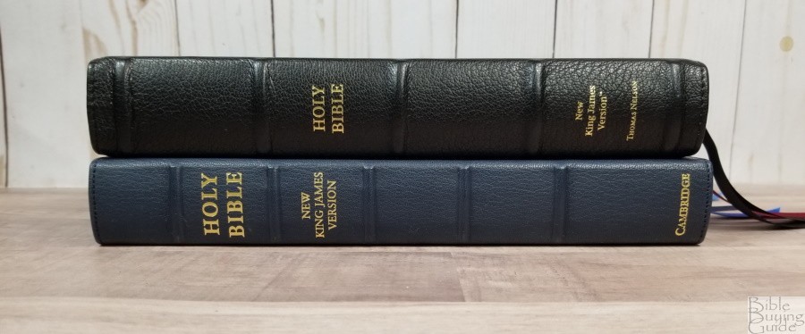
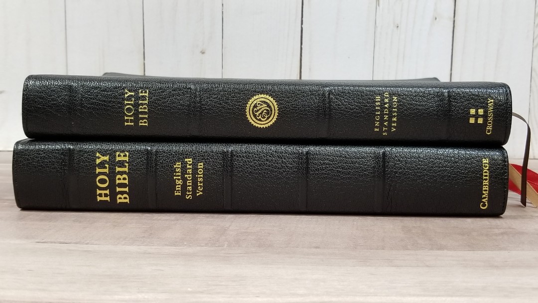
Quentel
The Topaz is slightly taller, wider, and thinner than the new NKJV Quentel. They have the same paper and the calfskin seems to be the same. The font size and darkness look to be the same. The Quentel’s red letter is a little darker. The ribbons are the same, but the Quentel has 3. The Quentel has raised spine ribs.
Turquoise
The Cambridge Turquoise is slightly thicker, shorter, and not as wide. They have the same paper. The Turquoise font is larger and darker (although I find the Topaz to be dark enough, and I’m extrememly picky with font darkness). The grain is elegant, but not as pronounced as the Topaz (although, I might not notice that if I didn’t compare them side-by-side). The ribbons look to be the same. The spine ribs are the same.
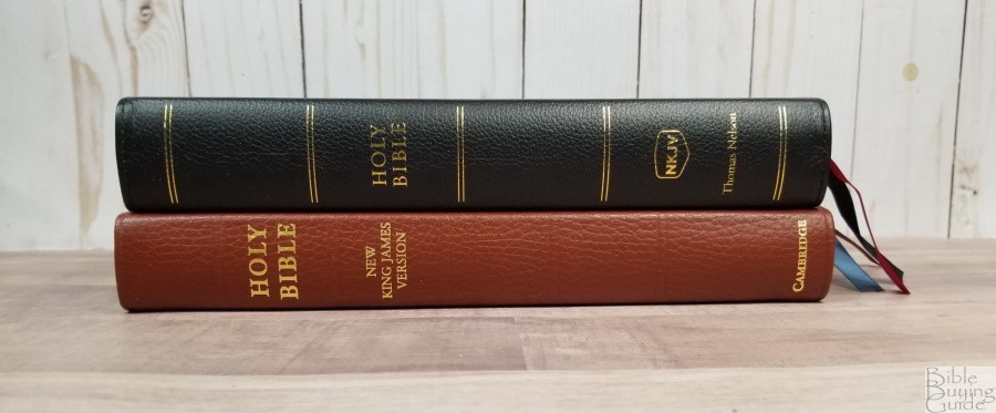
VBV NKJV Premier Collection


The Thomas Nelson NKJV Verse-by-Verse retains the poetic setting and indents letters. It’s about 1/4″ thicker. Both have a similar size typeface (any noticeable difference is due to font design). The Topaz does have higher quality materials and construction, but that’s reflected in the price difference.
Omega


The Crossway Omega has the same footprint and paper (my older edition has Indopaque), but it’s a thinner Bible. It has a paragraph format and a slightly smaller print. It’s black-letter.
Clarion
Until now, the Clarion was the largest print ESV that Cambridge produced. With the same paper, an 8.75 font, paragraph format, and hand-sized, it’s meant to be a personal size Bible for carry and reading. It’s a good companion to the Topaz.
Conclusion
The Topaz design isn’t new, but it is a unique layout for a modern translation. 2K/Denmark has done an excellent job of designing a layout that’s ideal for public reading and a format and size that’s easy to carry and use. It doesn’t feel like a large Bible, but the 10-point font is easy to read from behind the pulpit. The references in the outside margin and footnotes in the footer keeps the text together and even provides a little bit of space for your own notes.

The materials and construction are high-quality. The MSRP is just under the wide margin editions, and the retail prices will be much lower, but they’re currently higher than the wide margin editions. I’m hoping to see these prices drop as the Topaz becomes more popular. I do expect the Topaz to be a popular Bible for Cambridge. Cambridge has listened to the market on design and produced what many are asking for: a large print edition in verse-by-verse. In my opinion, there’s a need for all types of designs and the vbv layout is a welcome edition. I’m glad to see it join the Cambridge family.
_________________________________________________________
This book is available for pre-order at:
Amazon (affiliate)
and many local Bible bookstores
_________________________________________________________
Cambridge provided these Bibles in exchange for an honest review. I was not required to give a positive review, only an honest one. All opinions are my own.
The post Cambridge ESV Topaz Bible Review appeared first on Bible Buying Guide.